Counter-intuitive ideas in design
At the turn of the century, a breakthrough invention was introduced in Silicon Valley. For Steve Jobs, it was the most innovative product since the personal computer. Jobs offered the inventor $63 million for 10% of the company. After taking one look at the product, Jeff Bezos immediately got involved and told the inventor “You have a product so revolutionary, you’ll have no problem selling it.” John Doerr, an early investor of Google and many other blue-chip startups, poured $80 million into the business without hesitation, predicting that this “would become more important than the internet.”
If these “superhumans” had full belief in this invention, it was guaranteed to succeed, right? Wrong.
That product was the Segway, the two-wheeled, self-balancing personal transporter. The inventor projected that within a year, sales of his newest product would reach 10,000 units a week. But six years later, they had sold only about 30,000 units in total.
Time called it one of the ten biggest technology flops of the decade. It was supposed to transform lives and cities, but today it is used only in niche markets. So, what happened? How were these extreme geniuses wrong about this? Why did their intuition fail them?
Our intuitions are only accurate in domains where we have a lot of experience. In dealing with unfamiliar ideas or products, you need to take a step back and assess them. Sounds familiar? As designers, we step back and research, benchmark, test, get feedback from users. If you don’t step back to analyze but always follow your intuition, you will fail eventually, no matter who you are.
“Designers resist the temptation to jump immediately to a solution to the stated problem… Instead of solving that problem, they stop to consider a wide range of potential solutions.” Don Norman
Thinking that this will be a breakthrough in transportation; Gates, Bezos and Doerr adapted this intuitive idea, but the project ended up as a massive failure. This doesn’t mean that every intuitive idea is bad; but, be aware that intuitions often fail in the wrong domains.
You can trust your intuitions when (1) you’re in a predictable environment, (2) you have a vast amount of practice on a given field and (3) you can get immediate feedback on your judgment. If those conditions aren’t met, don’t trust your intuition, says Daniel Kahneman, author of Thinking Fast and Slow.
“Unless those three conditions are satisfied, the mere fact that you have an idea and nothing else comes to mind and you feel a great deal of confidence — absolutely does not guarantee accuracy” he adds. If you have gained expertise in a specific domain and if you are a competent designer, your intuitions on that specific domain may be right as well. So, an intuitive idea can be original and successful in the right setup as Kahneman suggests.
However, the design process itself is not predictable and it is not safe to rely solely on our intuitions. That’s why we rely on users to understand their actual problems, test & iterate our designs. Besides testing and iterating our design, there is one more thing that we can do: to change our mindset from time to time while designing. We have to learn to think differently in order to look from other perspectives; which is possible with counter-intuitive thinking.
Let’s think about the coffee drinking experience before Starbucks was there. People enjoyed drinking coffees at home and saw this as a consumption rather than an experience.
Starbucks has transformed coffee consumption into an experience. Howard Schultz recognized that people looked for an escape from the day-to-day problems of life. That’s why going to Starbucks has become more than a coffee, but an experience of enjoying the environment.
A successful application of counter-intuitive thinking by Schultz. But how did he manage to come up with this counter-intuitive idea? As designers, how can we adapt counter-intuitive thinking?
Counter-intuitive ideas usually come from non-conformist people, Adam Grant says. Those who reject the default and explore whether a better option exists. It all starts with curiosity. They wonder why the default exists in the first place. Economist Joseph Schumpeter states that advocating for new systems often requires creative destruction of the old way of doing things.
If you look closely, you’ll see lots of correlations between counter-intuitive thinking and design thinking. Design thinking suggests to flip things, invert things, shake them up, to think outside of the box. It also suggests rejecting the default to explore new ways of doing things.
As designers, if we adopt the principles of design thinking, we will start swimming in the stream of creative and original ideas. Don’t forget that successful counter-intuitive ideas changed the accustomed systems throughout history.
In 2008, Luxottica was nearly the monopoly of the eyewear market. Four friends wanted to get into the eyewear market and wanted to sell glasses online. During those times, no one was selling glasses online, and tackling this eyewear giant wouldn’t be easy. When they mentioned their idea to friends, they were blasted with a scorching criticism. Their friends didn’t believe that anyone would buy glasses online without trying them on.
Nevertheless, they launched the website in 2010 and called the company Warby Parker. What happened afterwards? GQ called them “the Netflix of eyewear”. They became the number one company in the list of the world’s most innovative companies in 2015; the three previous winners being Google, Nike, and Apple.
How did they break away from the conventional method?
To make customers more comfortable with the unfamiliar concept of ordering eyewear over the internet they have come up with a free home try-on program, instead of free returns. The difference between the two is if a customer bought the frames with lenses and then returned them, Warby Parker would lose a lot of money, as the lenses were unique to the customer. But if customers tried on only the frames and returned them, the company could reuse them. Customers could order the frames alone without any financial commitment and simply send them back if they didn’t like the feel or look.
The free home try-on program was so popular that Warby Parker had to temporarily suspend the program within forty-eight hours of launch, to satisfy the over-the-top demands.
Research has been done with over two hundred people with the task of coming up with ideas. 87% of those ideas turned out to be completely unique. This shows that we don’t necessarily suffer from a shortage of original ideas, rather we have a hard time choosing the successful ones. The skill of recognizing successful original ideas is as important as coming up with them. Most of the original ideas die because of wrong evaluation.
It’s highly important to know that if we face uncertainty, our first instinct is often to reject novelty because of the risk it holds. Especially C-level executives tend to play safe and escape risks: they focus on the costs of investing in bad ideas rather than the benefits of piloting good ones. This leads them to kill great and original ideas. They tend to evaluate novel ideas by comparing the new notion to ideas that have succeeded in the past.
Therefore, we have to be careful while evaluating original ideas. We must not be fooled by our intuitions that tell us to see the risks firsts and search for previous successors. We have to get into our counter-intuitive mindset and look from other perspectives, research and test it to evaluate correctly.
According to the Harvard Business School, market validation is the process of determining if there’s a need for your product in your target market. In fact, most businesses fail because of the insufficient amount of effort they put into problem and idea identification. The objective of idea any validation process is to see whether or not target users are interested in your ideas and having real-life problems with which your product idea aspire to solve.
The early product validation processes are crucial to simply understand if the product is worth creating or not. As a simple but effective method, it helps not to spend any resources, money and time, on a useless idea. Besides, validation processes also eliminate the uncalculated risks, guide you to define improvement areas for possible iterations and ultimately create solutions towards fulfiling user needs.
When you have a business idea, it is always good to start with a set of fundamental questions before you buckle down and begin working on the solution. First off, you need to get in touch with your prospective users to explore their mental models and how relevant your solution is to their daily lives.
Validation actually means testing your assumptions and mitigating the risk of failing. So, when it comes to choosing a proper method and tool for your endeavour, there are lots of idea validation methods. And, essentially, what to choose depends on your solution. But, as Julia Kylliäinen explained in her article, it is important to test the riskiest assumptions first. Therefore, you need to articulate your assumptions as a first step, and then go out and look for a validation method that would suit your expectations. Even though there are a plethora of idea validation methods, but the process generally has three main steps:
In this first step, you are expected to define your goals and frame what you want to learn. It always makes sense to try to find out the root causes of the problems you want to solve with your idea:
Let’s say you defined your goals and made a list of your assumptions, from riskiest to the most benign one. Now, you are ready to create hypotheses based on your goals. A good hypothesis is a testable one that often includes prediction so that you should start with a critical assumption that does have direct consequences. For example, Apple’s primary assumption back in the day was users would prefer a phone without a keyboard in exchange for a wider screen area.
After you create your hypotheses, you should also set your minimum success criteria. Without measuring the results quantitatively, you’d not have a solid picture that gives you an input. So, it’s equally important to set realistic expectations for your research before start conducting any activities.
You’ve got a list of goals and just created your hypotheses. The next step, start testing. Now you should run tests in this stage based on your hypotheses and iterate your ideas based on the test results. Below you can find some of the techniques you could employ, taken from Itamar Gilad’s article on LinkedIn:
Even though any idea validation process does not guarantee your product’s success, you can gather a lot of information and feedback for your business idea, and make early adjustments before spending valuable resources. You can even find out that your idea is not valid and give up on it and move onto the next idea.
Just remember, it may turn out to be a complex product development process if you don’t use any idea validation method and have a clear picture of user needs and expectations. You could easily spend a lot on something that basically does not fit into users’ lives. So, use the power of idea validation and make data-informed decisions rather than listening to your gut feeling.
“Emotions shape all activity in adaptive ways. In the absence of emotional markers, decision making is virtually impossible.”
Saver & Damasio (1991)
When it comes to the human mind, there are a plethora of things that are really interesting. But especially our decision-making process, and how external factors can influence it, is truly an astonishing subject. For one, we tend to think that we are rational, logical beings, always with sound reasoning; however, there are some solid studies that posit “emotions constitute potent, pervasive, predictable drivers of decision making.” On top of that, we also know that emotions are not untouchable and can easily be influenced by many external factors. So if that’s the case, how can we utilise design to persuade users to take specific actions?
Let’s look at the concept of persuasive design and discover how some of the psychological gimmicks that influence how we behave can be applied to the field of design.
One of the strongest influences on human behaviour is the principle of social proof. Robert Cialdini states in his renowned book, Psychology of Persuasion:
“We view a behaviour as more correct in a given situation to the degree that we see others performing it. Whether the question is what to do with an empty popcorn box in a movie theatre, how fast to drive on a certain stretch of highway, or how to eat the chicken at a dinner party, the actions of those around us will be important in defining the answer.”
So, to factor in this principle, we could take advantage of social proof in our designs. If we’re designing a user flow for a non-profit company that depends on taking donations from the company’s website, for example, adding a persuasive pattern by displaying the number of contributors, e.g. “128 people have donated today!”, may prove effective in directing users to desired outcomes. You can also see similar examples on a lot of e-commerce websites as well.
The critical part of this approach is we also need to consider the level of persuasion as it could become manipulative in certain situations. While incorporating elements to display social proof, the emphasis should be on the objective facts rather than creating a FOMO effect or simply misleading users with non-factual information.
There is an interesting experiment conducted in 1975 by Worchel, Lee, and Adewole, where the researchers asked people to rate chocolate chip cookies, to understand how the concept of scarcity affects the decision-making process. Briefly, what they did was:
“They put 10 cookies in one jar and two of the same cookies in another jar. The cookies from the two-cookie jar received higher ratings—even though the cookies were exactly the same.”
Also, there is a famous anecdote, the so-called Water-diamond paradox, that sums up the subject pretty much:
“…we purchase water, which is necessary for our survival, very cheaply, whereas we pay much more money for a diamond, even though it is not required for our lives at all (Smith 1776/1937). This paradox critically points out that object value is not merely determined by usefulness but also by availability.”
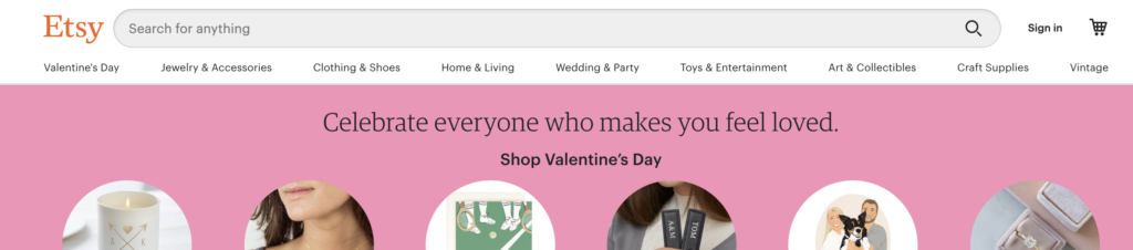
So, it safe to say that this principle, creating the illusion of scarcity, automatically triggers a kind feeling of urgency and an increase of value in our minds so we perceive objects that are scarce as more desirable and valuable. User experience designers can make use of this psychological effect to create similar results. For one, you can see etsy.com using badges like “Only 1 available and it’s in 1 person’s cart”, or amazon.com displaying a counter that says “Ends in 10h 28m 15s”or “only 2 left in stock”, and so on…
There are many more examples out there, but as Nielsen Norman Group suggests, some common patterns you can use in your design include limited time and quantity, limited inclusion, and limited information.
Think about the podcasts you listen to, Ted talks you watch, the doctor you visit or maybe the professor at your university. A random person’s opinions may not be so valuable for you, but you most likely will listen to and agree with the views of individuals who are experts in their fields. The “authority principle” points out our tendency to respect or obey authority figures and highly value their taste & opinions.
As Nielsen Norman Group points out: “UX professionals can take advantage of the authority principle to increase the credibility of their designs. A few elements that can increase trust: “
You can also add list certifications, awards, prominent customer testimonials, etc., to the list to take advantage of this principle if you want to get your users attention more quickly.
The human mind is a mystery, and we’re still exploring how it works. There are other elements and concepts exerting influence on the decision-making process like reciprocation, commitment & consistency, liking, and there will be many more as we understand how the human mind works better. Yet, tested and validated, the concepts of social proof, scarcity and authority may be helpful for you to create more persuasive products. And remember that persuasion in design is just a little nudge to users’ direction, not manipulation or trickery.
Before reading this post, if you didn’t have the chance to take a look at 5 Smart Google Analytics Tips to Improve User Experience about tracking users in your digital product via Google Analytics, now is the time to go.
There are many ways to understand user behaviour and how they react when they’re interacting with the web interfaces. Google has come a long way so far with GA4 that it has just launched to the professionals. It is still one of the best free tools you can use to conduct quantitative user research to get in-depth insights today.
Today we know that considering a website design as “just a website design” is easy.
So is that right?
Work goes even deeper when user experience is included.
While it is said that the most important metric for a website is the conversion rate, if your users don’t have great experiences interacting via mobile phones or desktop devices, unfortunately, you can’t have the conversions that you expect.
This means that a UX design team needs to know what users are doing in their products. It is necessary to know where the target audience comes from, how long they stay in the product, and how they can improve conversions.
So let’s look at what you can learn from Google Analytics as a UX designer before starting a design project, and how you can form a basis for the user experience.
Any digital product has multiple metrics to track in order to improve the user experience. However, Google Analytics can open a door to improve how a digital product performs from the moment a user lands on a webpage to the moment they leave.
The action-based information obtained here will help optimize the user experience of the website.
Here is the first one:
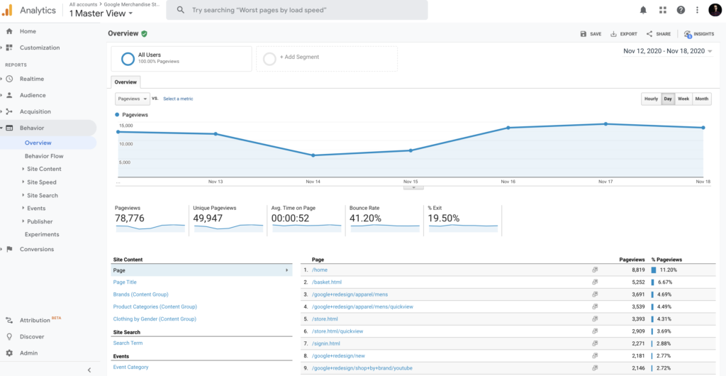
This report is perhaps one of the most useful pieces of data user experience designers can get. It gives you a crystal-clear snapshot of who your target audience really is.
So, how does the target audience data you get here help user experience designers? Here are a few quick tips:
Location:
If you are getting enough session volume to your website from different countries, you may want to consider adding a second language to your site. This way, your website has a chance to welcome users from that region in their native language.
Time of Day:
For instance, if you’ve observed that your website visitors mostly visit at midnight, you can also run a night mode for your website, as Reddit did before.
Browser & OS:
For example, you can view the browsers of users who visit your website in this area. You can examine the performance of metrics such as the bounce rate, average session duration, goal completion in Google Analytics for browsers. This way, you can analyze the type of browser users have, and how well they experience your website through it. If there is a result that surprises you, it may be useful to focus on this area in a design.
2020. What a year. History is happening around us, and Google? Well, Google keeps on revamping to focus on real user experience in the product. But this time it’s a little different. Google also made it clear this year that the site owners care about the speed experiences of their pages. Besides this boiling point, the company has taken the business so far that it announced that it has added the page experience offered by its websites as a ranking factor as Core Web Vitals.
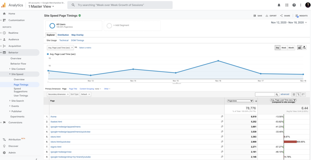
Page Timings
If there is a negative situation above the average from the pages on your site, you can get a report through Page Timings via Google Analytics. The density of the CSS codes used on the page or the visual solutions you use in the design may have slowed your website unintentionally. Google Analytics here also offers website administrators their own advice.
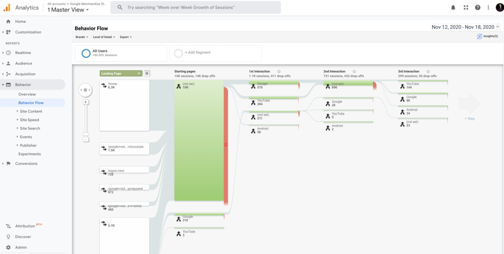
A behavior flow is a report of your users’ journeys from the moment they enter your website.
The behavior flow simply answers your questions below.
Behavior Flow helps identify the pages that bring you the highest traffic volume while providing you with insight into where your users drop off the most. This way, it helps designers to optimize the user experience in order to make the user’s journey more comfortable.
SHERPA knows very well to measure humans’ reactions rather than clicks, which often means a departure from more than Google Analytics. However, we love to take advantage of the power of analytical tools to define our way to improve user experience.
One of the indicators of how much users enjoy their experience within the product that will meet the expectations of the product offered to the users is the improvement in retention.
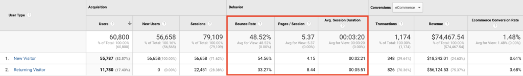
Looking at the behavior of these two segments tells useful insights into the content, structure, and design of your website. And it can reveal better approaches to providing value to your audience through new vs returning visitors’ reactions and interaction points in the interface.
In conclusion, rather than creating a design based entirely on instincts and assumptions, I have to say that our greatest strength lies in our decisions based on rational data.
And Google Analytics, though usually associated with marketers, is a treasure trove for designers.
According to the metrics above, progressing in the design processes will also strengthen your rational decision-making direction.
It is a pleasure for me to share our favorite feature of SHERPA with you.
At the end of the day, it is all data driven.
“You are not the user!”, that is a phrase that most of us wanted to express at some point of one of the projects we participated in (hopefully, there is more than just one) or read about an influential article about the value of UX research, or in any UX-related subject. As UX professionals, we hope to begin any project with a discovery phase and incorporate quantitative or qualitative research to understand user needs, challenges and desires. Of course, all projects have limitations that may affect our timelines and budgets this way or another. These limitations not just apply to the beginning, but to the process of the project itself. Eventually, these constraints may affect our needs of inquiry in decision-making processes such as ideation and solution generation for building products with better user experiences. One of the best ways to mitigate effects and risks against understanding the real user experience is to approach UX research with a different angle, and strategically integrate it into the design process. Notably, discovery and ideation are the best stages in a project timeline. There are multiple methods and techniques to include user research, but for a kick-start, let me present you some ideas on how to acknowledge business goals, get onboard with stakeholders about the value of empathizing with users, investigate assumptions, and test user experience preventing conflict of interest among parties.
Stakeholder interviews allow you to ask about long and short-term goals, define the success criteria in terms of business, and boil down all these to UX vision and goals. Collecting insights about the business objectives enable you to empathize with different stakeholders and identify risks and opportunities. So, stakeholder interviews will ensure that your project has a clear start with a certain vision and predefined goals that every participant of the project has agreed on which will also assist you to incorporate key stakeholders into the design process.
Stakeholder interviews should be focused on the project scope. Therefore, you should carefully choose your key interview participants according to their influence on the success of your project. Those stakeholders having control over the budget of the project or sponsoring it in that organization are critical to talk to before giving a start to any project. At the end of the stakeholder interviews you should expect to understand capabilities and limitations of the organization, uncover critical roles, skills and experience and align all with business objectives.
Key stakeholders have limited time for a dedicated interview, so be prepared with your interview goals and questions designed especially to point out these objectives. Face-to-face interaction is the best way to communicate your purpose. Besides, you can observe your interviewee enriching the insights you collect even if due to the COVID-19 pandemic restrictions you have to run it remotely using an online communication tool such as Google Meet or Zoom. Each session should take no more than an hour and less than thirty minutes, ideally. To find the available slot, it would be better if these meetings are scheduled one or two weeks before the session. Since stakeholder interviews are designed to inform and align project participants with the main goals and facilitate focus on success, it is important to inform them about the results of in-depth analysis in a proper template either in a report or presentation.
Qualitative research methods are best suited for inquiry of in-depth inquiry of user behaviors. Qualitative data offer a deeper understanding about the meaning behind user actions which leads us to user needs, challenges and desires. In addition, these kinds of research often require bigger budgets than e.g. surveys as in time and effort. Typically organizations that rely on quantitative findings in their decision-making processes have doubts about the validity of qualitative data. At that point “triangulation method” is just what you need.
The thing with triangulation is that you look for specific qualitative insights that are consistent with the data you collected via quantitative methods or vice versa. For example, if you are using one-on-one interviews to understand the pain points users have on an online shopping website and discover some patterns, you can also design and launch a quick and short poll about the volume of users having similar pain points. Thereby, you can present your valuable qualitative data linking to the percentage of your potential audience. Even if it’s not the purpose of your research, it is sometimes the best way to communicate about the importance of your findings to dig further with follow-up research and to make your arguments stronger in terms of your quantitative-mindset colleagues or stakeholders.
To have proactive user research at the very beginning of a project is invaluable, however there is never enough time, budget or managerial support to initiate with proper research. What I mean by proper research is that developing a deep understanding about user needs to make design decisions easier, thereby hindering personal judgements and assumptions about what users want or have difficulties with. Making quick decisions based on assumptions – in the name of agile (yes, we all have been through this) – that are not validated with data would only seem to be doing it the right way. In fact, neither stakeholders nor designers are the real users and heuristics are not enough to lead design decisions at some point.
For creating ideal solutions for users, uncovering the problems that mostly affect the experience is the key. Therefore, you should bring your UX research skills onto the table to test the assumptions ahead. With proper UX research methods, you can test all the ideas generated in ideation and ground the most usable options to user data. Let me give you an example of a case. If you are a researcher in an e-commerce project about a category that users are not familiar with, you could offer a card sorting test to build an understanding of their mind maps and present your findings to your team and stakeholders to make better decisions about site navigation. Before taking such an initiative, you should be careful not to apply the wrong method, facilitating a biased study, or simply asking the wrong questions to the wrong people. Let’s say you should be precise about the basics of UX research design.
Definition of done is a critical notion either in a feature release or a redesign project. If your team or just the development team is working agile, then the notion becomes more important and affects all of your research. That is because UX and agile have different understandings when it comes to definition of done. For agile delivering a working software means that the task is completed, whereas for UX testing the interaction with real users is a must before it actually means “working” whether with a working prototype or a manually crafted model. When we put time, budget and support issues that we have discussed above into the equation, as you can see these two definitions become conflicting.
Here is the tip to overcome this challenge; prioritize the most questionable patterns in the design decisions principally with your UX team and development team and test those patterns with users. Depending on your timeline and budget you can run usability tests moderated or unmoderated, focusing on your personas or just guerilla sampling. However, you should be able to rationalize your reasons to include or exclude personas in concern of the validity and reliability of your study. At the end of your research be prepared to deliver your findings to design and development teams with spotting areas of improvement.
The potential of research methods is almost unlimited. You can either conduct one-on-one interviews or launch online surveys depending on your research questions responding to the needs of the project. Although there are some constraints such as time, budget, or support against UX research, the benefits strongly outweigh them. With all this in mind, you can show those benefits while strategically integrating research into the design process. You can use other techniques to align with stakeholders and business goals, denoting the value of user interviews as a data collection method and running quick tests for both investigating assumptions and preventing a conflict of interest among parties.
“Designing search” doesn’t sound like a big deal for one who hasn’t given deep thought to the task: “You just type stuff into a box, and it shows you results!”, right? Not that simple. It is actually a big deal and way more of a complex task than it sounds or looks, but fortunately, it’s a fun piece to design.
As Baymard Institute highlights; “it’s important to recognize that returning a handful of highly relevant matches to the user’s search query isn’t enough.”
So how does one design a proper search system that meets users’ expectations, and offer a smooth experience?
Generally, a search box simply consists of three elements; an input field, a button, and an icon. Although it has such basic elements, its impact may be huge. As NNgroup highlights in their article; “the usability of the search on intranets accounted for 43% of the difference in employee productivity between intranets with high and low usability.”
As simple as it may sound, a search should be in the form of a box. That is to say, we should avoid just using an icon, or a link if we have available space because our mental models are already used to looking for a box we can type in when it comes to searching stuff, which is usually placed on the top of the screen. We are also used to seeing a search icon (the magnifying glass) that sits inside the search box, which purposefully makes a search bar more recognizable and easier to find for the users. Avoiding an icon-only search approach also prevents the users from waiting for a search field to appear and look for where to type in the search query; thus decreasing the cost of interaction.
OK we got the basics, but how do we design a system that provides users relevant information that matches with their search queries? Think about companies that have thousands of products to choose from, like Amazon, Walmart, or Ebay. Say the user just types a simple, single word: “turtle”. What does she mean, really? Turtle tank accessories? Turtleneck sweater? Ninja turtles? What if she misspells the word? Or what if there are no results, what then?
So let’s get into some details to discover how we can design better search systems in order to enhance the user experience.
The logic you’ll design for the search results will mostly determine the quality of your search system. But even if you do your best, users are not going to just type in a perfectly written product name as in your inventory or well-thought-out title because most users are very poor at query reformulation.
What’s more, especially in e-commerce, users are in their purchase-decision process where they haven’t decided on, or simply don’t know what they’re looking for yet. This adds extra significance to organizing search results and presenting relevant items. In the “turtle” example we’ve given above, it’d be a good start to label a few most searched items according to their categories, and move onto the less-likely ones:
“turtle tank accessories — in pet supplies
“ninja turtles” — in toys
“turtleneck” — in clothing
turtle night lamp
turtle gifts
turtle sweatshirt
…
For a side-note, if we know that the user has searched for, say a clothing item before, we can make a decision to prioritize the “turtleneck sweater” in the search result hierarchy to increase the usability.
Google defines search predictions as “possible search terms related to what you’re looking for and what other people have already searched for.” And one of the key aspects of developing a well-designed search system is to consider the auto-complete suggestions. We now know that if users don’t get good results on their first try, later search attempts rarely succeed, so it’s vital to help and guide the user for a better search experience. It is also especially useful for people using mobile devices, making it easy to complete a search on a small screen where typing can be difficult. We should make sure that the search suggests relevant and guiding, and even minor typo mistakes are covered.
As Baymard Institute shared about the autocomplete-design in their blog;
“During usability testing, autocomplete suggestions were often observed to slow down users in typing and selecting their search query. However, spending a few seconds extra to construct an accurate and detailed search query — through the help of the autocomplete — saves users several wasted minutes on the otherwise often overly broad search queries they tend to submit on sites that don’t have search autocomplete.”
Here are 13 important and actionable tips from the same article:
If the user types a search query that has no corresponding result and comes to a dead-end, it’s not enough to say that “no results found.” To provide a good user experience, it’s important to inform the user about alternative options, or the next steps she may take. To prevent the users from leaving your digital product, you can suggest categories that the user may want to try out, which should also be based on the user’s search query.
For instance, if there’s no result for “purple summer shirts” because there are no purple products, a link to a product list of “shirts” with the “summer” filter pre-applied may be suggested for the users.
There is a huge segment of people that designers may disregard when crafting an experience: People with disabilities —one of the largest user groups in the world. According to a fact-sheet released by the World Health Organization (WHO), there are over 1 billion —about 15% of the world’s population— have some form of disability. When designing a search system, it is important to take accessibility into account from the very beginning. As the web accessibility guidelines of Carnegie Museums of Pittsburgh puts it, “search bars can be a way for users of assistive technology to quickly find answers without tabbing through the navigation or reading all the content of a web page.”
*ARIA (Accessible Rich Internet Applications) is a set of attributes that define ways to make web content and web applications (especially those developed with JavaScript) more accessible to people with disabilities.
There are a lot more aspects to consider when designing search systems; from deciding on “how many characters should we wait for the user to type in order to start showing the results”, to “how many results to show on mobile devices to avoid scroll bars”. Though every problem needs a unique solution, I hope these will give a brief overview of what to keep in mind.
James J. Gibson, a prominent perceptual psychologist, coined the term ‘affordance’ when referring to the feasible properties between the environment and an actor (the user). The word thus recognizes the human instinct to look at their surroundings to achieve their objectives. In his book The Ecological Approach to Visual Perception, Gibson first used the term “affordance” and later built on this definition, describing affordances as all “action possibilities” implicit in the system, focuses on observable and independent of the capacity of the person to recognize them, but always about actors and, thus, dependent on their capabilities, abilities and cognitive pathways. For example, the pencil would not afford writing if the actor is a newborn because a newborn would not know how to write.
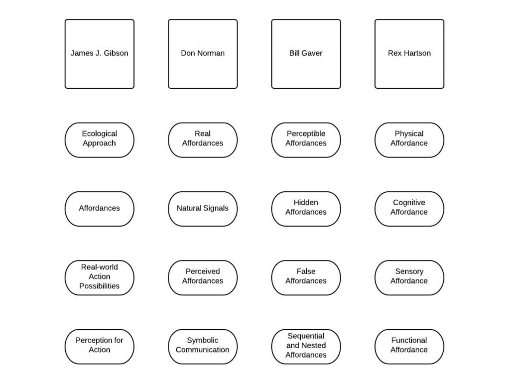
Image by Interaction Design Foundation
The relationship between affordances and human-computer interaction was born with Don Norman’s use of the word in The Design of Everyday Things (1988). Interaction designers have appropriated the concept almost as a design philosophy, illustrating the need for clear and definite signals to explain to the consumer what they should do with a computer or inside a system. Interactive components such as scrollbars, command keys, connections and icons inside a user interface, for example, must be configured to give the user enough indications about what they can do with these interactive elements and how they can communicate with them (e.g. moving up and down, clicking, and pressing). We can criticise a design for lack of immediately perceptible affordances or confusing users with false affordances. Therefore, designers need to understand what we mean by affordance and how to apply it to strengthen old and new designs.
Motivation is another key factor for affordances. We are likely to miss or forget to think about them without the drive to check out the potential uses we may have for an artefact. For instance, when you want to write something on a rough surface, you immediately search for an object that provides you with a suitable surface. In that situation, you search for an object that affords you to write easily. We are not searching or thinking about a flat ground that provides easy writing, eating, or working experience in our daily lives if we don’t need it. Still, we are alerted by our goal and encouragement to consider the unique affordance of all items available to us.
Perceived Affordances in Graphical User Interfaces Image by Interaction Design Foundation
As Don Norman states, the word affordance applies to the perceived and real characteristics of the object, precisely those fundamental characteristics that decide how the thing might actually be used. Thus, we say the actual properties of objects by real affordances, rather than the properties recognized by an actor/agent/user as belonging to objects. For example, gripping and pulling are provided by a door handle, which are the user activities needed to open a door. Graphical user interfaces (GUI), on the other hand, can be stated to have perceived affordances when the user perceives that their activity would have a significant effect within the system/software/website, based on experienced correlations between perceptible elements and the result(s) of communicating with them. For example, touching the control screen to use a graphical user interface is perceived affordance, and a touch screen successfully affords it. Perceived affordances in the graphical user interface depend on the system feedback for the user to understand that they produce or do something meaningful, not trying to understand the meaningfulness of their actions from their perceptible properties of the display alone.
Norman’s other concept is symbolic communication. Apparently, artefacts, names, instructions, and other supplementary ‘clues’ in graphical user interfaces are necessary for situations where the actionable properties of physical artefacts require an agent who does not have sufficient knowledge to identify the intended means of interaction. As semiotically clear objects, images, and vocabulary are used to express the affordances and intended interaction methods to accomplish these purposes. Providing additional knowledge is referred to as symbolic communication. Nevertheless, as mentioned by Don Norman, “The design has failed when simple things need images, labels, or instructions.”
Gaver outlined the relations between experience and behaviour in Technology Affordances (1991) and stressed the crucial role that perceptual knowledge (including visual, auditory, tactile/haptic, and, to a lesser degree, taste and scent information) helps us evaluate the affordances of an item. In HCI, Gaver (1991) distinguished three kinds of affordability: perceptible, hidden and false affordances.
In order to access the content of this interface feature, one of the first connections we experience in HCI (human-computer interaction) is between a desktop icon and the affordability to double-click. The notion of perceived affordances described by Norman is equivalent to the notion of perceptible affordances by Gaver, but the latter definition includes all affordances that can be calculated from sensory data, which may also include real affordances. Despite this distinction, the significance of explicit and essential perceptual knowledge in design is highlighted by both definitions. Merely catching users’ interest is not sufficient; the details must be connected to the affordance in order to form an essential and easy-to-understand relationship between the presentation and the planned action.
Other examples of perceived affordances in HCI are the computer sounds, button colours and design metaphors (pages, documents, scissor, turning the page in a tablet). According to Gaver, when the interaction between an object and its affordance is correctly described by perceptual knowledge, the subject can immediately recognize what they can do with an object and communicate accurately.
Hidden affordances are where there is no sufficient perceptual knowledge to enable the consumer to assess the probability of action. For instance, certain affordances are hidden in the design of the graphical user interface, and the user must rely on the expertise or trial-and-error activities to recognize a clear probability of action. For the novice or new users, perceptual knowledge is extremely relevant, but users need less perceptual signals over time since they can depend on familiarity to better direct their behavior. Hidden affordances can be used as a way to minimize confusion when communicating with advanced consumers, but typically there should always be signs accessible to the consumer to allow them to decide how to access the hidden affordances.
The user is prone to make mistakes if the visual signs are available, but the corresponding affordance does not occur. Designers must ensure that the perceptual knowledge used to signal an affordance’s presence correctly reflects the possibilities of intervention accessible.
Rex Hartson developed and built on the concept of perceived affordances by Don Norman. He used the term cognitive affordances to highlight the effect of product features on our thinking processes and ability to determine what we can do with or in an interface and particular features of graphical user interfaces. Cognitive affordances, to paraphrase Hartson, are the design characteristics that assist, aid, support, facilitate, or allow thinking and/or realizing about something. Cognitive affordances are also the design characteristics that lead to our ability to decide whom we can engage with, anticipate the effects of our behavior, and therefore improve the general usefulness of a product or graphical user interface.
The physical affordance principle of Hartson reflects on the actionable components of screen-based interfaces, such as command keys, and how these affordance attributes enable us to decide the actions we can execute and the outcome(s) of these connections. Although the actual affordance definition of Hartson is relevant to the real world, it differs from the real affordance principle of Don Norman, as Norman sees visual features in graphical user interfaces as symbols of abstract communication, such as images representing such actions, or perceived affordances, which are properties that we interpret as afforded.
Sensory data refers to the ‘top’ aspects of items that help us interpret stimuli in our world. Sensory affordance is a notion present in all affordance schemes, but Rex Hartson is the first to treat it as a different affordance from other affordance categories. In all cases of evaluating the cognitive and physical actions we may execute, sensory input processing is the first step. The lack of sensory affordance can curtail our capacity to perceive cognitive and physical affordances since it plays an important and supportive role in all these phases. Sensory affordability examples include scale, colour, perceived loudness, and sensation. In addition, sensory affordance plays a critical role in the successful user experience correlated with a design within the GUI.
Hartson can approach as distinct terms the four modes of affordance identified and segregated, but they are interrelated, and allow us to determine the functions we will play within a show, how and when we can do so. For example, sensory affordances involve text size and readability that allow us to read instructions (cognitive affordance) and identify what happens when we engage with an active component (physical affordance), and subsequent interface upgrades help us establish functional affordability, such as adding a product to our online shopping basket.
Since Don Norman presented the design world to James J. Gibson’s theory, there has been intense discussion about the definition, forms, and potential use of the word affordance in human-computer interaction. The above topics and arguments made by the other researchers only point to the main parts involved in this discourse, but the other relevant topics allow everyone to see how vital the mechanism of communicating, exchanging ideas, and proposing new methods is for a coherent and accepted collection of models and frameworks.
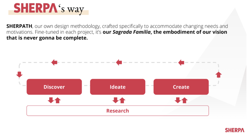
We are a digital design studio, based in Istanbul & London, focusing on “the experience”. We create memorable products that work best for both users’ needs and business goals. Abiding by our home-cooked design methodology SHERPATH, we challenge ourselves in three areas: product & service design, UX consultancy, and UX training. And, to us, design thinking is a manifest of continuous improvement, and investment in UX should never cease.
The thing is, design studios are not well-equipped for adapting to a changing landscape. No plan survives contact with the enemy and project-based quotes, fee-per-page pricing models do nothing but add up to the complications that arise from a sudden change of direction in plans.
That’s why we invented our way of doing business: DaaS, Design as a Service, a subscription-based fee model to keep the ball rolling, nonstop.
With ever-changing user needs and evolving business models, having a user-centric perspective at the core of your business is the way to get results. And, in a world where needs and expectations are constantly changing, companies are in a search for plug & play task forces that possess all the necessary skills to collect user feedback, ideate on digital solutions and deliver insight-led products.
In a way, it’s another “Don’t give me the fish but teach me how to fish” case, where giving a fish means employing design thinking only to come up with solutions for specific problems. You can always hire an elite team to solve your problems; but acting with a user-centred mindset, taking on each challenge with a UX perspective is the key today to meet the user needs while working towards your business goals. Before having the best chef cooking a stellar dish for you, you should set up a kitchen with the right toolset and ingredients for sustainability and scalability.
In a long story short, we dug deeper to understand the ways of working with our project owners and came up with the DaaS model, where we offer a vast array of UX skills and an opportunity to transfer user-centred design thinking into your company rather than working with an agency for a defined task like a landing page or a mobile app.
Imagine this: Project owner comes to us and explains the details of their project. Most of the time, they’ve got three key variables that affect their decision making: time, budget, and scope. Upon understanding each variable in detail, we come up with a resource allocation proposal for their project including a fee for our services. Yet, differently enough, what we do here is just giving a ballpark estimate in terms of hours to hit the milestones as regards to the needed resources.
All in all, our proposals could be boiled down to one sentence similar to this one: “For your project and requirements, we propose 150 hours per month for 6 months to come up with insight-led solutions to your expectations.”. In those 900 hours, we essentially offer discovering business goals along with user needs, ideating on solutions and a UX Strategy, and creating interaction solutions & interfaces.
We know that every pre-defined project scope is subject to change with the user insights obtained at any time in a project, and confidently claim that no one can give you a laser-cut proposal if you are looking for a truly user-centric solution. If understanding user behaviour and building user-centric products is a priority, then project owners should adapt to changing scopes and have the flexibility resource-wise. That’s why we offer SHERPA’s UX skills with a time & material pricing model regardless of the project you’ve got.
First off, the elevator pitch: DaaS (Design as a Service) is a transparent business model in which we allocate “hours” to project owners upon deciphering their needs. It is simply a subscription-based model, where we take on any brief at hand in line with an allocation bandwidth.
DaaS is flexible. We are not limited by scope and can adapt to your changing priorities, the only constraint being the number of hours allocated to your project per month.
DaaS is transparent. At the end of each month, we provide highly detailed timesheets (based on person/task/minute spent) to our project owners to justify the ROI of UX services we delivered.

DaaS is user-friendly. One way or another, if 100% of a project’s monthly resource allocation is not delivered, we take its remaining part starting from 50% and add it to the following month. We don’t like inefficiency, nor any kind of waste.
There are two things we know about building a product: Diversity creates value, and resource allocation requires flexibility.
Therefore, whether or not there is an in-house UX team on board, we believe that grabbing additional resources from a UX studio will pan out nicely in the grand scheme of things. Aside from the operational advantages, there are three main benefits production-wise for those who are interested in working with our DaaS model.
The secret to building digital products is simple, having strong product teams. Culturally diverse, cross-functional teams are behind today’s top products.
In our case, as a team of UX experts, we strive to bring our unique experience to the table while collaborating with product teams. In a sense, our collective memory is a repository for those who seek to find a relevant solution-set regarding their project. And as consultants, we work on multiple projects spread across several industries, which eventually unlocks a great opportunity; rapid testing of our assumptions and fine-tuning every aspect of our work in a relatively short amount of time. Therefore, as practitioners, who “have been there before”, we can catalyze a reaction fairly quickly than a product-specific team.
The number of problems in your agenda can quickly reach alarming levels, requiring an expansion of the talent to deal with it. Yet, it might not be always feasible growing headcount to handle the work, because bringing talent without thoroughly considering the consequences may paralyze a team for a couple of reasons.
First, it’s not easy to find talent. Without spending an enormous amount of effort on talent acquisition, you’re not going to be able to form a team, coming from a relevant background to take care of your problems. You need someone who “has been there before.”
Second, you probably need a temporary solution to carry the workload. You do not want to set anything on a stone if you do want to get financially tied up. That’s why interim teams come in handy to alleviate the pain stemming from an overfilled backlog.
We shorten the time needed to find talent and soften the blow on your talent acquisition activities for a simple fact: we’re talented, we are relevant, and we’re only there as long as you need us with the power of DaaS.
From initial launch to late maturity stages, each milestone in a product’s lifecycle demands a different set of skills to meet user needs. As a natural outcome of this process, a need for new skills gradually emerges. Similarly, the UX expertise you need changes in time while working on an idea. Instead of having high turnover rates to fill out gaps in skills, elite teams could come in to play to give a hand.
We are on a mission to understand users and find intricate ways to solve their problems, and the methods we utilize to do so are largely diversified. It would not be rational to expect all the necessary skills from a candidate or an embedded team. To cope with a skill deficiency or extend the level of UX maturity in a team, external teams with flexible business models like DaaS can provide unique value as temporary remedies.
DaaS is not something new on the shelves that is brought to you without a proper validation process. As the firm believers of iterative solutions, we validated our idea by simply using this model for projects varying in size, from a complete redesign to small research projects. Ever since 2015, we’ve been working with DaaS and creating better solutions for our clients relentlessly. Unorthodox it may seem, you should give it a chance with this mindset, with or without us. Change is constant, so should your efforts to keep up with user needs.
A Hobson’s choice is the necessity of accepting one of two or more equally objectionable alternatives.
Since a person may not accept what is offered in general, the customer is actually faced with two options in most cases. The first is to take something, which means he or she can buy it. The other option is to leave it, which means no buying.
And as we all know, most online users don’t buy the product; they go for the second option. The Hobson +1 effect is the way to counteract this “not converting” habit.
Hobson’s choice story comes from the 17th century from Thomas Hobson, a wealthy landowner and stable owner with more than 40 horses. He gave only one option to those who came to ride his horse and took the closest horse to the barn door. Why did he do that? Because he didn’t want the best horses to be overworked. If he let people choose for themselves, they would have chosen the best horses all the time. So he told visitors that they could only take the horse available for them, or not at all. Basically, he reduced the number of choices to give his “users” the bare minimum of the options.
In a similar vein, you may have heard the Choice Paradox from Barry Schwartz in TED before:
This thinking simply shows how people get overwhelmed when they have a lot of options to choose from. The important part of the Paradox of Choice concept is that it comes into play after only three or more choices. The fact is that giving people two or more choices is altogether better than offering just one or nothing at all.
Many studies have shown that when faced with Hobson’s choice, we are more likely to go from the “take it” option to the “leave it” option. Whereas if a second option is added, we tend to choose one of the options available to us. This cognitive bias is explained as follows: When faced with the “take it or leave it” option, people use all of their mental energy to decide whether to buy a product or not.
Additionally, the same research has shown that we use the same mental energy to compare these offers rather than consider the “leave it” option given the two options. This increases the probability of making at least one of the “active” choices. When there is only one option that is often said to be the same as “take it or leave it”, choosing between taking what is offered to you or not taking anything is presented with two options. There is no other alternative.
Another example of a Hobson’s choice would be from Henry Ford’s book titled My Life and Work. He says:
“Any customer can have a car painted any color that he wants so long as it is black”.
Henry Ford
Generally, the more options you have, the worse you will feel the buyer’s remorse after purchasing.
Why is that? Because your standards have risen. And now all you can think about is how good the other options could be. An article written by Thomas Van about human psychology even goes so far as to say that choice is the root of all unhappiness.
So, I believe I made my case, and now move onto sharing some tips that could increase your conversion rates of your digital products
You know why Mark Zuckerberg wears the same t-shirt every day. He said many times, like Steve Jobs, that it was not a smart decision to choose a different t-shirt each morning. It takes some energy every time we make a decision.
The more options a consumer is presented with, the longer the decision-making process takes. And this demands more and more energy. At the end of the day, we prefer the option that seems the safest and easiest. Try to make your flows easier for your users. Give them fewer and fewer opyions, and see if this increases your conversion rates and sales.
The ultimate goal of design is clear communication. As an experience design studio, we always focus on maximizing the discoverability of information and the legibility of the content. Since words are usually an integral part of our designs this way or another, we want them to convey information in the best way possible. So understanding typography —one of the most significant and fundamental parts of visual communication— becomes even more crucial because it can make, or break any design. So let’s look at a few points on how we can utilize typography in our designs effectively.
As Wikipedia’s definition; “Typography is the art and technique of arranging type to make written language legible, readable, and appealing when displayed. The arrangement of type involves selecting typefaces, point sizes, line lengths, line-spacing (leading), and letter-spacing (tracking), and adjusting the space between pairs of letters.”, and there is more. Apertures, ligatures, ascenders, swashes, x-heights, line quality, and more… Typography has its own unique language. In order to clear some of the clouds of confusion about this complex field, let’s start with some definitions:
X-height
As Monotype’s explanation of x-height; the height of the lowercase letters, disregarding ascenders or descenders, typically exemplified by the letter x. The relationship of the x-height to the body defines the perceived type size. A typeface with a large x-height looks much bigger than a typeface with a small x-height at the same size.
Leading
Leading describes the space between two consecutive lines of text.
Ligatures
Special characters that connect two or more letters to form a glyph; primarily decorative.
Em box
It is a part of the font files where the glyphs live within. When we play with the font size with CSS, the Em box is actually what becomes our font size.
Ascenders and Descenders
As Google Material Design‘s definition; ascenders are an upward vertical stroke found in certain lowercase letters that extend beyond either the cap height or baseline. Descenders are the downward vertical stroke in these letters. In some cases, a collision between these strokes can occur when the line height (the vertical distance between baselines) is too tight.
Let’s not visit every single term, but here is the important takeaway: By knowing a typeface’s qualities, you can select the appropriate one for your project’s needs.
For example, “Gothic Sans Serifs are space savers. Designed with varying widths, these typefaces have minimal contrast, vertical stress, and a large x-height.” If you have the chance to select a typeface and say you’re designing for mobile, you can opt for this strategically. Even saving a single line of text can seal the fate of the call-to-action (CTA) button in terms of its visibility above the fold.
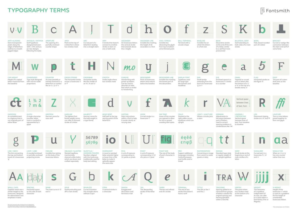
If you’d like to get lost in the endless terminology, check out this beautiful infographic:
Thanks to the work in cognitive psychology in recent years, there are a few word recognition models that describe how the human eye recognizes words; which in turn can affect our typographic decisions in our designs. For instance, according to an article published in Eye Magazine;
“Experimental data that supports the Word Shape Model is that lowercase text is read faster than uppercase text. On average people read lowercase text five to ten percent faster than uppercase text. This supports the word shape model because the lowercase text has unique patterns of ascending, descending, and neutral characters, while the uppercase text has less variance in text size and shape.”
This is actually a trick that is already being used on big road signs you see when you’re driving. If you think about it, you only have milliseconds to “recognize” a word’s shape and make a decision. Think about where you can apply this perspective in your digital designs! It can derive your design decisions to use uppercase or lowercase letters in strategic areas.
As I’ve also stated in the article “Accessibility in user experience design”, people with disabilities form one of the largest user groups in the world. According to a fact-sheet released by the World Health Organization (WHO), there are over 1 billion —about 15% of the world’s population— have some form of disability, and visual impairment is one of many. One of the things we can do to utilize typography is to check contrast in our designs:
According to WCAG (Web Content Accessibility Guidelines); for “normal” sized text or images of text, we should use the minimum contrast ratio of 4:5:1, and for “large” text (or images of large text), the minimum contrast ratio should be 3:1. We can easily check whether the typographic colors we use in our designs have enough contrast by online contrast checker tools.
As Norman Nielsen states in their article about Typography for Glanceable Reading; “Typographic designs that are legible even in suboptimal conditions can help users greatly.” We can at least keep in mind their thoughtful suggestions while designing our interfaces:
Typography is always about communication, and it’s only successful when it’s able to clearly convey its intended message to its audience. Let’s not forget that we have even less than a second to effectively influence the users’ perception, so we should pay attention to every single detail in our designs, starting with the typography.