
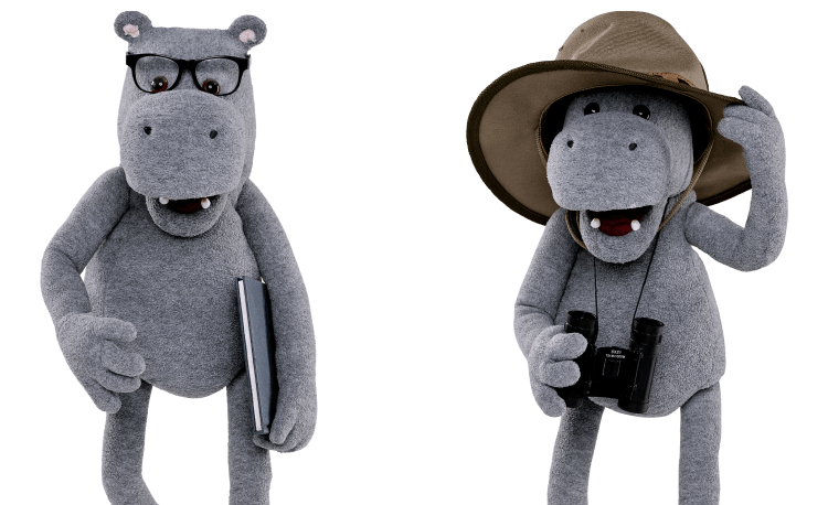
Let us introduce you to Hippo
Launched in 2007, Hippo.co.za is South Africa's first comparison website and currently the leading comparison website that compares insurance and other personal finance products from a wide range of South African brands. Before Hippo.co.za, consumers had to call around for hours to find the cheapest quote to suit their needs.
Hippo.co.za is part of Telesure Investments Holdings (TIH), but they are a completely separate business and pride themselves on always being unbiased and impartial. Most of the leading comparison websites around the world are owned and run by an insurance group, providing stability and expertise in the insurance industry. TIH owns and operates several of South Africa's leading insurance brands.
From 3rd Party to UX Team
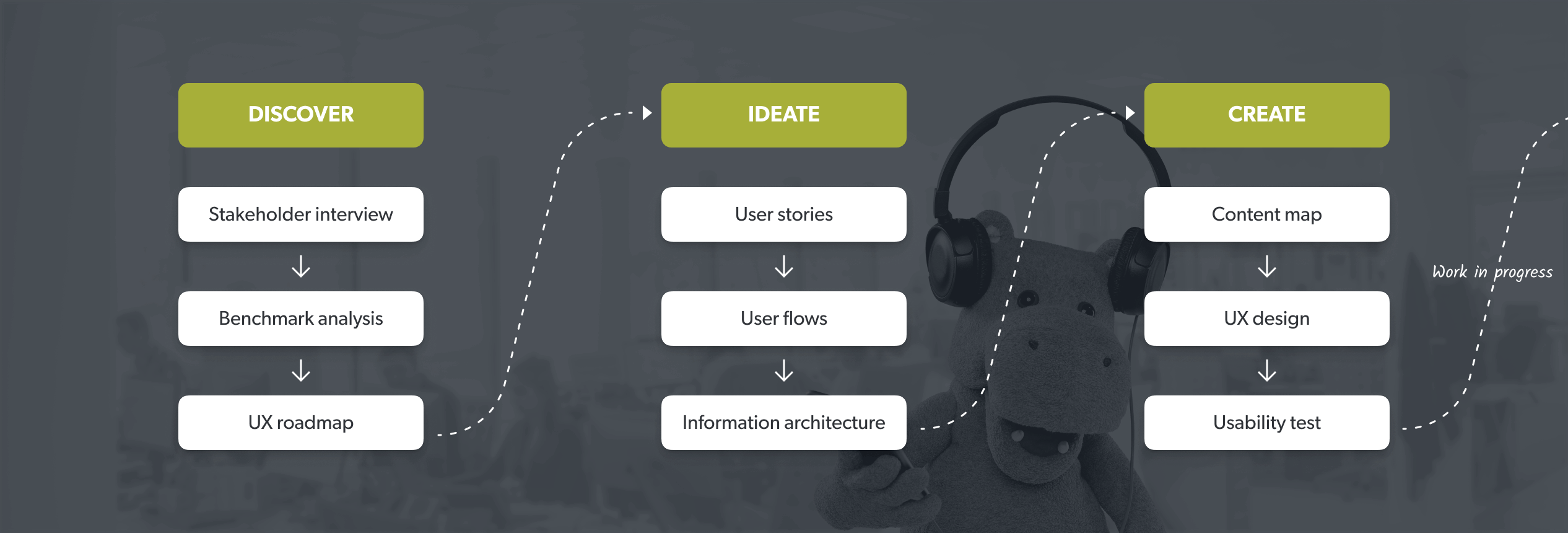
Design at SHERPA starts with a thorough discovery process to understand user expectations first. And we never hesitate to change project scopes based on our research outcomes. Same thing happened here, and we decided not to stop at merely redesigning flows, as we never did.
Applying our methodology SHERPATH, we’ve identified additional areas of improvement that would not only improve the website’s usability but also how these usability improvements can be measured and optimized. We’ve started with building out Hippo's analytics approach, cleaning up their traffic sources and working on several optimization initiatives to help them measure our UX efforts.
After a period of constant UX optimization efforts, we started to see that our work has already begun giving its fruits, increasing the functionality and performance of the website by 10-11%. By the end of the year 2019, we were no longer a design agency fixing the website’s usability issues and designing screens; but Hippo’s UX partner, in charge of the health and prosperity of their ecosystem.
How it is going
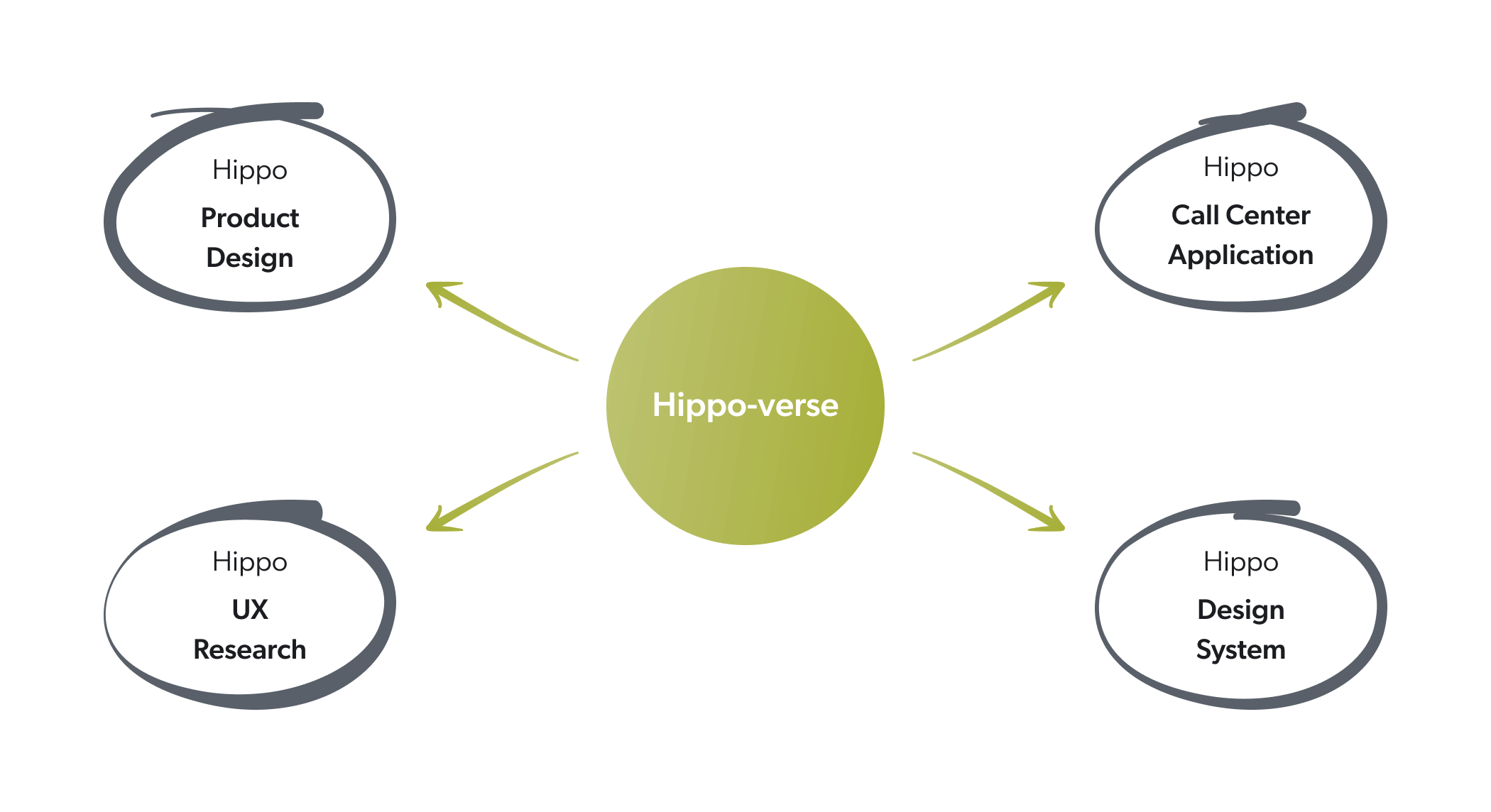
Since then, we have had a chance to work hard and pave the way towards the big picture, the Hippo-verse together. Responsible for different aspects of the experience design initiatives of the brand, starting from UX Research to UX Optimization, we’ve strived to come up with insightful solutions to make Hippo the best player in the game, as if we’re their UX department thanks to our design model DaaS.
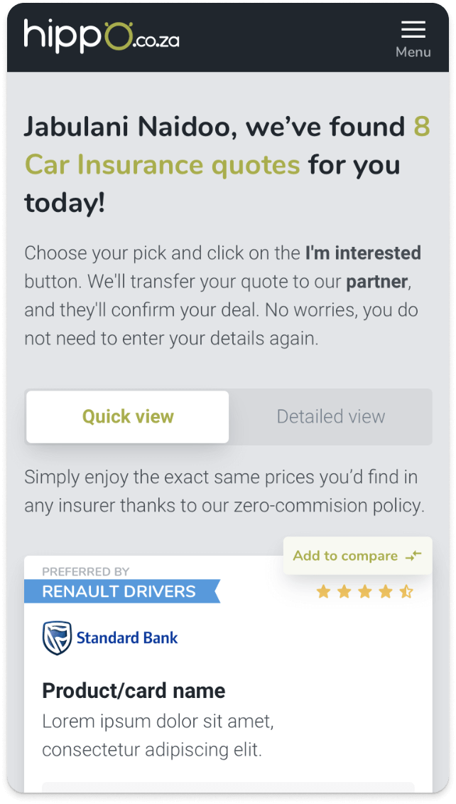
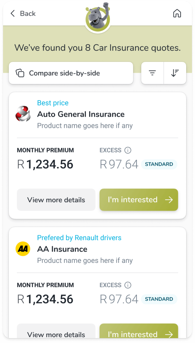
- We have redesigned more than 16 product funnels, including flagships like the Car Insurance and Medical Aid.
- To ground and support all of our work, we’ve conducted numerous remote research activities to understand the users better, whether they are a father who is looking to get a car insurance quote for their daughter or a call center employee helping users to find the right quote.
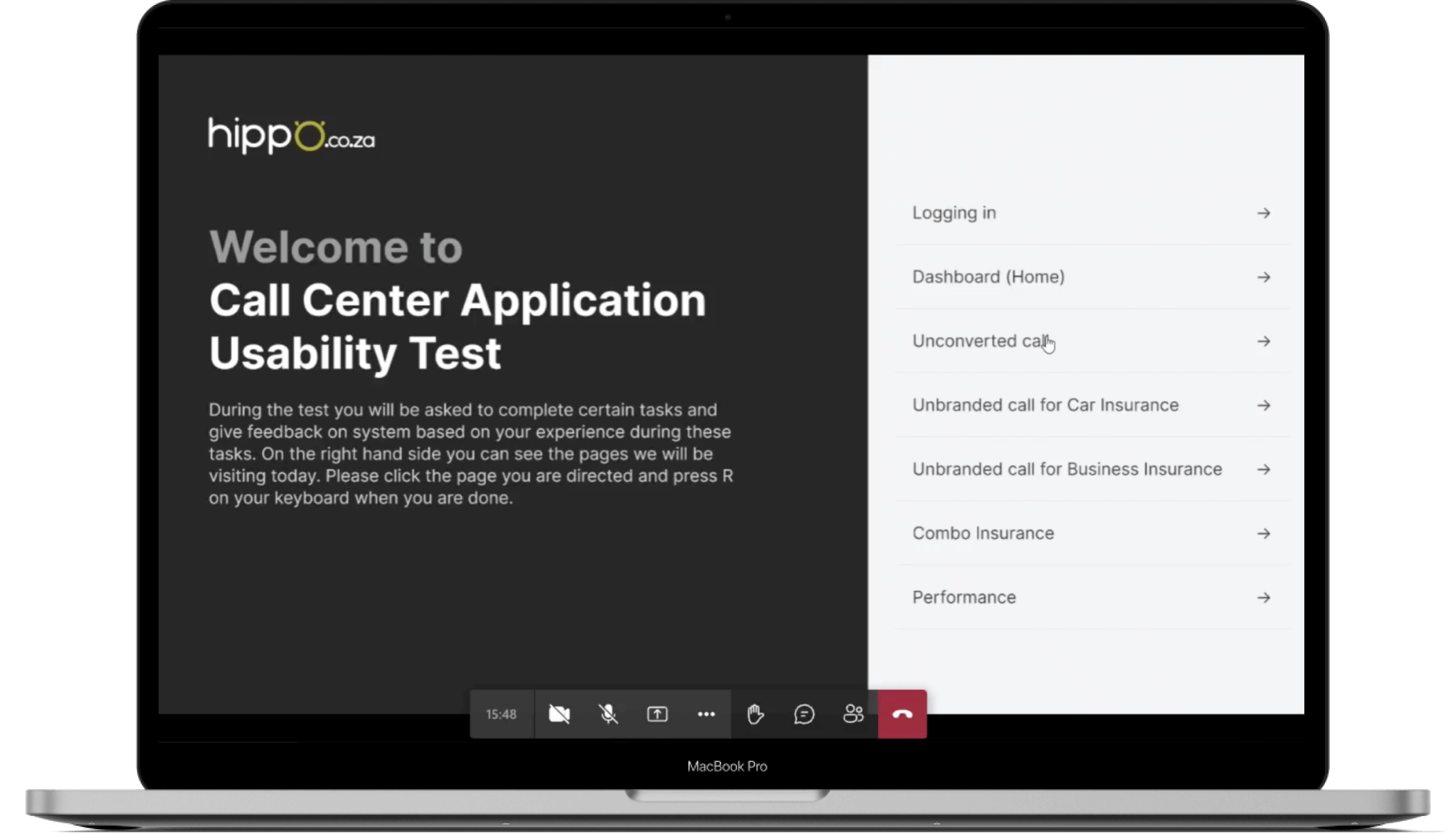
- To make work simpler and more efficient for Hippo’s backbone, the Call Center, we've designed a brand-new call center application from scratch.
- Built UI Kits and laid out writing conventions to define Hippo Design System to open up space for scalable and coherent solutions.
The bottom line is that operating from Istanbul and London and supporting a financial services company based out of South Africa for more than three years while working remotely has been a truly amazing experience, and we’re extremely proud and grateful for our continuing partnership with Hippo.
Redesigning for the better: iterating a new UX perspective
So far, we’ve redesigned 16 product funnels, ending up vastly improving the overall usability and experience of the website. However, in contrast to our overall effort, the things we’ve done on this lane is only the tip of the iceberg.
In 2020, when the spotlight hit on the shifting user behaviours and needs amidst the spreading pandemic, our strive for the better and love for the constant iteration made us reconsider the choices we had made not more than a year ago, as expected from a dedicated product design team.
To meet a new and heavily digitized user paradigm, we’ve decided to redesign the car insurance funnel, which we just have recently redesigned, with a new, more conversational approach. With this brand-new conversational approach, we aimed to provide the best usability and increase conversions from recently digitized users who were accustomed to buying or searching insurance products through human interaction and conversation.
By the power of our mutual trust, Hippo was already on board with the decision of redesigning the redesign. Even after the first tests, the results were already a story of success! The new conversational car insurance flow has seen up to a 10% increase in conversion performance compared to the old one, which made us begin redesigning the other flows under the light of our new UX approach.
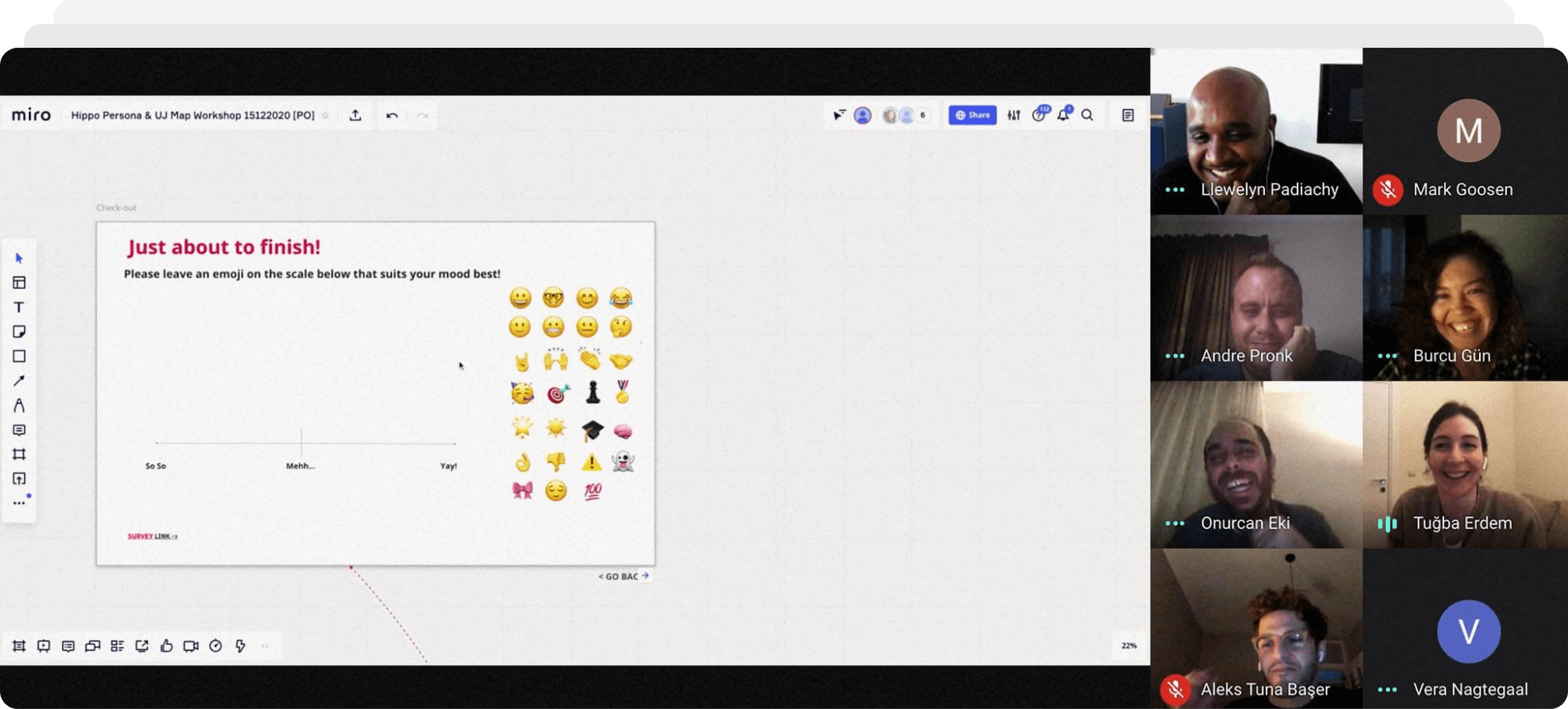
Remote UX research that brings us together
The constant challenges of being a remote UX team was not only physical but also the cultural barrier. To unlock the key to this cultural barrier, we’ve rigorously conducted many UX research activities with both stakeholders and users to understand their expectations, needs and pain points. These activities ranged from stakeholder workshops to user interviews to moderated usability tests, allowing us to gain insights into the lives of everyday users and their relationship with financial services.
Luckily, these research efforts were possible by going beyond the physical barrier with our expertise and adaptive work culture. These traits enabled us to embed remote working, which still many companies are trying to tap into inside our culture and workflows to run all of our research projects through remote tools.
Becoming the remote UX team of Hippo earned us the honor to be the first team to run such a remote partnership in South Africa.
The way forward:
building the future of Hippo-verse!
We continue our efforts to enhance Hippo’s ecosystem and expand Hippo-verse, following our design process SHERPATH.
On top of everything we’ve done so far, we’ve built the first version of the Hippo Design System, along with a UX writing rules convention, that is constantly being improved and adapted as Hippo’s needs change, and Hippo-verse’s reach extends.
Our job is not done. We’ve always said that investment in UX should never cease, and luckily we’re collaborating with such like-minded people. We may be biased, but working with the probably most user-centric company in SA is truly a worthy cause for celebration.