The ultimate goal of design is clear communication. As an experience design studio, we always focus on maximizing the discoverability of information and the legibility of the content. Since words are usually an integral part of our designs this way or another, we want them to convey information in the best way possible. So understanding typography —one of the most significant and fundamental parts of visual communication— becomes even more crucial because it can make, or break any design. So let’s look at a few points on how we can utilize typography in our designs effectively.
Typographic language
As Wikipedia’s definition; “Typography is the art and technique of arranging type to make written language legible, readable, and appealing when displayed. The arrangement of type involves selecting typefaces, point sizes, line lengths, line-spacing (leading), and letter-spacing (tracking), and adjusting the space between pairs of letters.”, and there is more. Apertures, ligatures, ascenders, swashes, x-heights, line quality, and more… Typography has its own unique language. In order to clear some of the clouds of confusion about this complex field, let’s start with some definitions:
X-height
As Monotype’s explanation of x-height; the height of the lowercase letters, disregarding ascenders or descenders, typically exemplified by the letter x. The relationship of the x-height to the body defines the perceived type size. A typeface with a large x-height looks much bigger than a typeface with a small x-height at the same size.
Leading
Leading describes the space between two consecutive lines of text.
Ligatures
Special characters that connect two or more letters to form a glyph; primarily decorative.
Em box
It is a part of the font files where the glyphs live within. When we play with the font size with CSS, the Em box is actually what becomes our font size.

Ascenders and Descenders
As Google Material Design‘s definition; ascenders are an upward vertical stroke found in certain lowercase letters that extend beyond either the cap height or baseline. Descenders are the downward vertical stroke in these letters. In some cases, a collision between these strokes can occur when the line height (the vertical distance between baselines) is too tight.
Let’s not visit every single term, but here is the important takeaway: By knowing a typeface’s qualities, you can select the appropriate one for your project’s needs.
For example, “Gothic Sans Serifs are space savers. Designed with varying widths, these typefaces have minimal contrast, vertical stress, and a large x-height.” If you have the chance to select a typeface and say you’re designing for mobile, you can opt for this strategically. Even saving a single line of text can seal the fate of the call-to-action (CTA) button in terms of its visibility above the fold.
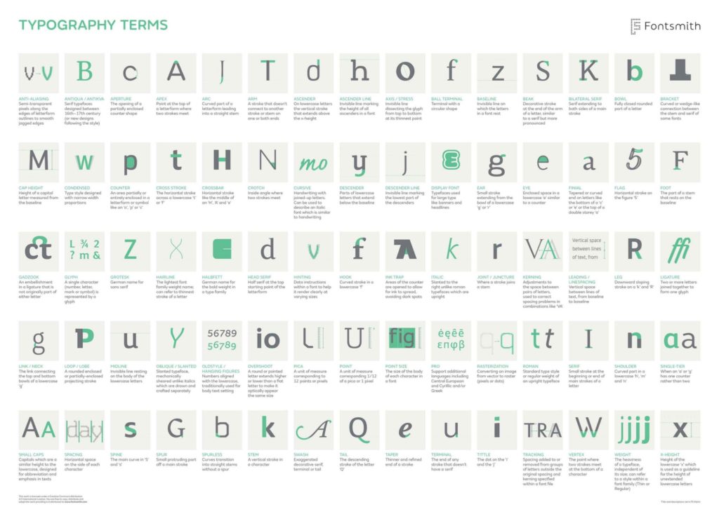
If you’d like to get lost in the endless terminology, check out this beautiful infographic:
Word recognition models
Thanks to the work in cognitive psychology in recent years, there are a few word recognition models that describe how the human eye recognizes words; which in turn can affect our typographic decisions in our designs. For instance, according to an article published in Eye Magazine;
“Experimental data that supports the Word Shape Model is that lowercase text is read faster than uppercase text. On average people read lowercase text five to ten percent faster than uppercase text. This supports the word shape model because the lowercase text has unique patterns of ascending, descending, and neutral characters, while the uppercase text has less variance in text size and shape.”
This is actually a trick that is already being used on big road signs you see when you’re driving. If you think about it, you only have milliseconds to “recognize” a word’s shape and make a decision. Think about where you can apply this perspective in your digital designs! It can derive your design decisions to use uppercase or lowercase letters in strategic areas.

Using typography to enhance accessibility
As I’ve also stated in the article “Accessibility in user experience design”, people with disabilities form one of the largest user groups in the world. According to a fact-sheet released by the World Health Organization (WHO), there are over 1 billion —about 15% of the world’s population— have some form of disability, and visual impairment is one of many. One of the things we can do to utilize typography is to check contrast in our designs:
According to WCAG (Web Content Accessibility Guidelines); for “normal” sized text or images of text, we should use the minimum contrast ratio of 4:5:1, and for “large” text (or images of large text), the minimum contrast ratio should be 3:1. We can easily check whether the typographic colors we use in our designs have enough contrast by online contrast checker tools.
Typography tips for glanceable reading
As Norman Nielsen states in their article about Typography for Glanceable Reading; “Typographic designs that are legible even in suboptimal conditions can help users greatly.” We can at least keep in mind their thoughtful suggestions while designing our interfaces:
- Use larger font sizes for anything that needs to be glanceable.
- Avoid all-lowercase text for anything that needs to be glanceable.
- Use larger-heading text in wider variants.
- Avoid the newer trend of all-lowercase text for headings and titles.
- Avoid condensed or thin typefaces, especially for applications that may be used in distracting environments (such as GPS navigation).
- For notifications, toasts, and feedback presented to users, use larger fonts in non-condensed variants to promote quick readability. Avoid all-lowercase.
- Especially when using small sizes (and typefaces that inherently have a small x-height), avoid all lowercase, as the combination of lowercase and small size exacerbates the problems inherent in either attribute.
Typography is always about communication, and it’s only successful when it’s able to clearly convey its intended message to its audience. Let’s not forget that we have even less than a second to effectively influence the users’ perception, so we should pay attention to every single detail in our designs, starting with the typography.