Designing search systems
“Designing search” doesn’t sound like a big deal for one who hasn’t given deep thought to the task: “You just type stuff into a box, and it shows you results!”, right? Not that simple. It is actually a big deal and way more of a complex task than it sounds or looks, but fortunately, it’s a fun piece to design.
As Baymard Institute highlights; “it’s important to recognize that returning a handful of highly relevant matches to the user’s search query isn’t enough.”
So how does one design a proper search system that meets users’ expectations, and offer a smooth experience?
Generally, a search box simply consists of three elements; an input field, a button, and an icon. Although it has such basic elements, its impact may be huge. As NNgroup highlights in their article; “the usability of the search on intranets accounted for 43% of the difference in employee productivity between intranets with high and low usability.”

As simple as it may sound, a search should be in the form of a box. That is to say, we should avoid just using an icon, or a link if we have available space because our mental models are already used to looking for a box we can type in when it comes to searching stuff, which is usually placed on the top of the screen. We are also used to seeing a search icon (the magnifying glass) that sits inside the search box, which purposefully makes a search bar more recognizable and easier to find for the users. Avoiding an icon-only search approach also prevents the users from waiting for a search field to appear and look for where to type in the search query; thus decreasing the cost of interaction.
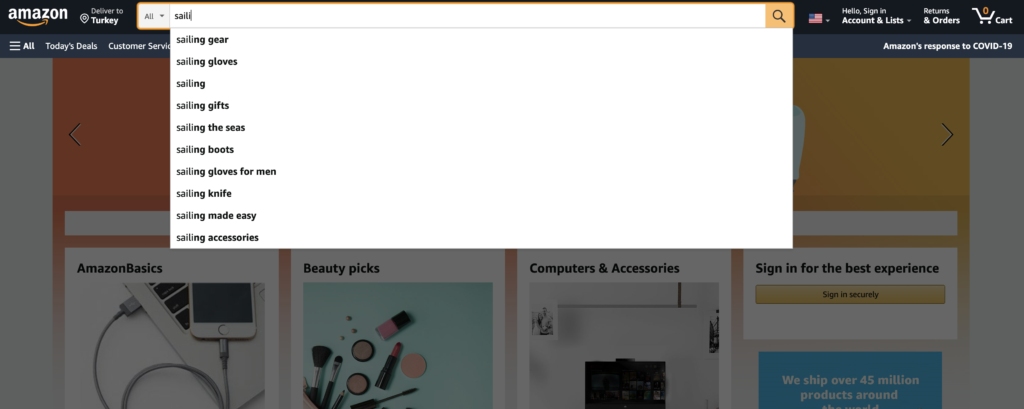
OK we got the basics, but how do we design a system that provides users relevant information that matches with their search queries? Think about companies that have thousands of products to choose from, like Amazon, Walmart, or Ebay. Say the user just types a simple, single word: “turtle”. What does she mean, really? Turtle tank accessories? Turtleneck sweater? Ninja turtles? What if she misspells the word? Or what if there are no results, what then?
So let’s get into some details to discover how we can design better search systems in order to enhance the user experience.
The logic you’ll design for the search results will mostly determine the quality of your search system. But even if you do your best, users are not going to just type in a perfectly written product name as in your inventory or well-thought-out title because most users are very poor at query reformulation.
What’s more, especially in e-commerce, users are in their purchase-decision process where they haven’t decided on, or simply don’t know what they’re looking for yet. This adds extra significance to organizing search results and presenting relevant items. In the “turtle” example we’ve given above, it’d be a good start to label a few most searched items according to their categories, and move onto the less-likely ones:
“turtle tank accessories — in pet supplies
“ninja turtles” — in toys
“turtleneck” — in clothing
turtle night lamp
turtle gifts
turtle sweatshirt
…
For a side-note, if we know that the user has searched for, say a clothing item before, we can make a decision to prioritize the “turtleneck sweater” in the search result hierarchy to increase the usability.
Google defines search predictions as “possible search terms related to what you’re looking for and what other people have already searched for.” And one of the key aspects of developing a well-designed search system is to consider the auto-complete suggestions. We now know that if users don’t get good results on their first try, later search attempts rarely succeed, so it’s vital to help and guide the user for a better search experience. It is also especially useful for people using mobile devices, making it easy to complete a search on a small screen where typing can be difficult. We should make sure that the search suggests relevant and guiding, and even minor typo mistakes are covered.
As Baymard Institute shared about the autocomplete-design in their blog;
“During usability testing, autocomplete suggestions were often observed to slow down users in typing and selecting their search query. However, spending a few seconds extra to construct an accurate and detailed search query — through the help of the autocomplete — saves users several wasted minutes on the otherwise often overly broad search queries they tend to submit on sites that don’t have search autocomplete.”
Here are 13 important and actionable tips from the same article:
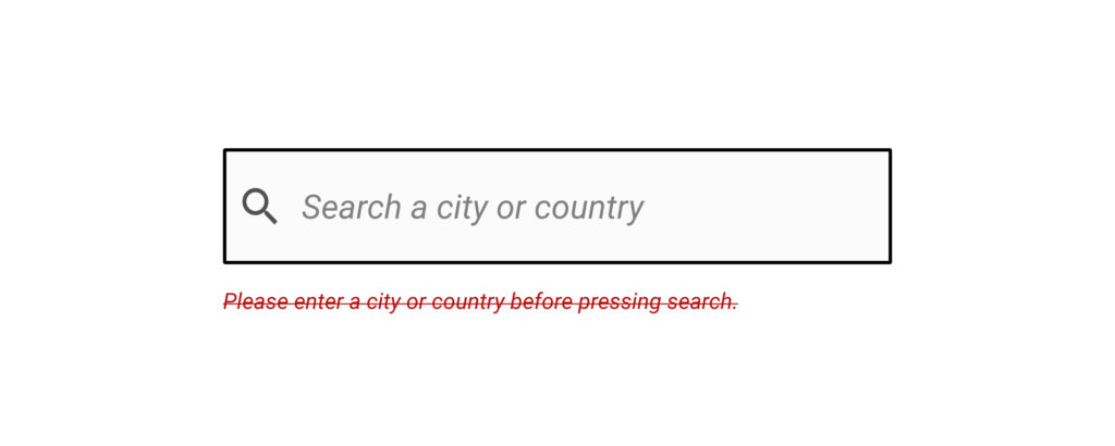
If the user types a search query that has no corresponding result and comes to a dead-end, it’s not enough to say that “no results found.” To provide a good user experience, it’s important to inform the user about alternative options, or the next steps she may take. To prevent the users from leaving your digital product, you can suggest categories that the user may want to try out, which should also be based on the user’s search query.
For instance, if there’s no result for “purple summer shirts” because there are no purple products, a link to a product list of “shirts” with the “summer” filter pre-applied may be suggested for the users.
There is a huge segment of people that designers may disregard when crafting an experience: People with disabilities —one of the largest user groups in the world. According to a fact-sheet released by the World Health Organization (WHO), there are over 1 billion —about 15% of the world’s population— have some form of disability. When designing a search system, it is important to take accessibility into account from the very beginning. As the web accessibility guidelines of Carnegie Museums of Pittsburgh puts it, “search bars can be a way for users of assistive technology to quickly find answers without tabbing through the navigation or reading all the content of a web page.”
*ARIA (Accessible Rich Internet Applications) is a set of attributes that define ways to make web content and web applications (especially those developed with JavaScript) more accessible to people with disabilities.
There are a lot more aspects to consider when designing search systems; from deciding on “how many characters should we wait for the user to type in order to start showing the results”, to “how many results to show on mobile devices to avoid scroll bars”. Though every problem needs a unique solution, I hope these will give a brief overview of what to keep in mind.