Our Ethos: Design with Google Analytics

Before reading this post, if you didn’t have the chance to take a look at 5 Smart Google Analytics Tips to Improve User Experience about tracking users in your digital product via Google Analytics, now is the time to go.

There are many ways to understand user behaviour and how they react when they’re interacting with the web interfaces. Google has come a long way so far with GA4 that it has just launched to the professionals. It is still one of the best free tools you can use to conduct quantitative user research to get in-depth insights today.

Today we know that considering a website design as “just a website design” is easy.

So is that right?

Work goes even deeper when user experience is included.

While it is said that the most important metric for a website is the conversion rate, if your users don’t have great experiences interacting via mobile phones or desktop devices, unfortunately, you can’t have the conversions that you expect.

This means that a UX design team needs to know what users are doing in their products. It is necessary to know where the target audience comes from, how long they stay in the product, and how they can improve conversions.

So let’s look at what you can learn from Google Analytics as a UX designer before starting a design project, and how you can form a basis for the user experience.

Major Benefits of Google Analytics for UX Design

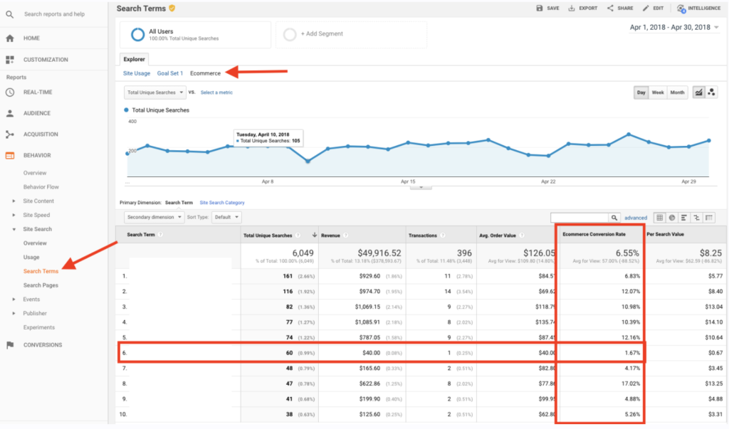
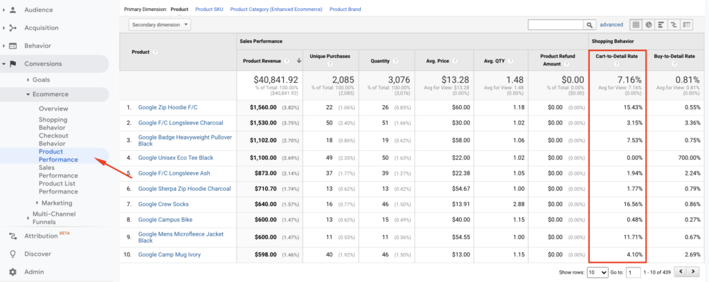
Any digital product has multiple metrics to track in order to improve the user experience. However, Google Analytics can open a door to improve how a digital product performs from the moment a user lands on a webpage to the moment they leave.

The action-based information obtained here will help optimize the user experience of the website.

Here is the first one:

Your audience, your power.

This report is perhaps one of the most useful pieces of data user experience designers can get. It gives you a crystal-clear snapshot of who your target audience really is. 

So, how does the target audience data you get here help user experience designers? Here are a few quick tips:

Location:
If you are getting enough session volume to your website from different countries, you may want to consider adding a second language to your site. This way, your website has a chance to welcome users from that region in their native language.
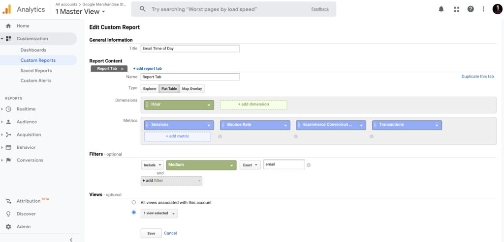
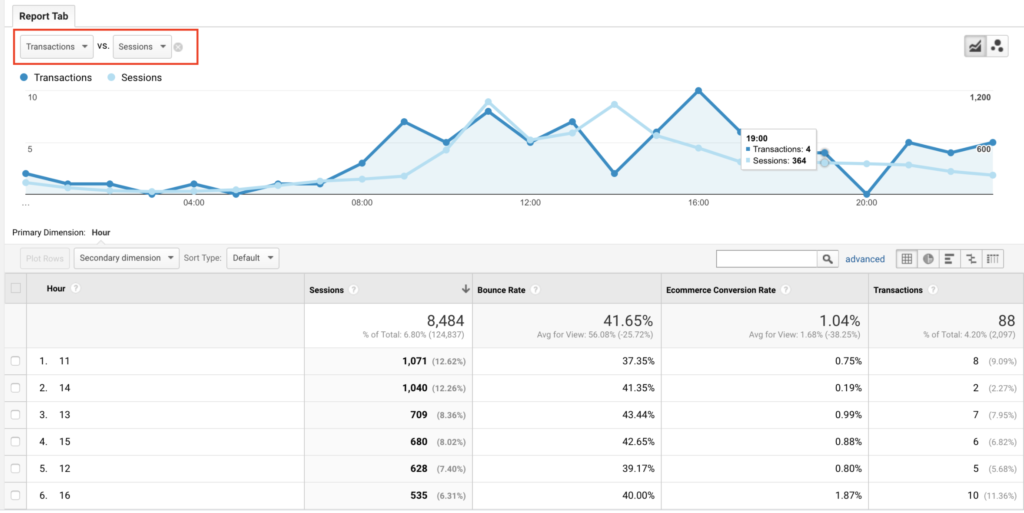
Time of Day:
For instance, if you’ve observed that your website visitors mostly visit at midnight, you can also run a night mode for your website, as Reddit did before.

Browser & OS:
For example, you can view the browsers of users who visit your website in this area. You can examine the performance of metrics such as the bounce rate, average session duration, goal completion in Google Analytics for browsers. This way, you can analyze the type of browser users have, and how well they experience your website through it. If there is a result that surprises you, it may be useful to focus on this area in a design.

Something wrong with your speed?

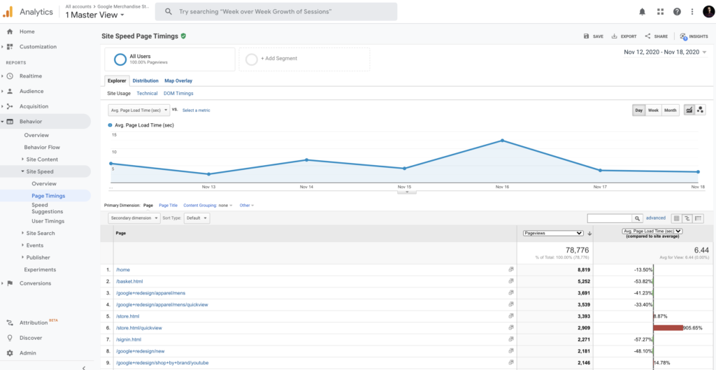
2020. What a year. History is happening around us, and Google? Well, Google keeps on revamping to focus on real user experience in the product. But this time it’s a little different. Google also made it clear this year that the site owners care about the speed experiences of their pages. Besides this boiling point, the company has taken the business so far that it announced that it has added the page experience offered by its websites as a ranking factor as Core Web Vitals.

Page Timings
If there is a negative situation above the average from the pages on your site, you can get a report through Page Timings via Google Analytics. The density of the CSS codes used on the page or the visual solutions you use in the design may have slowed your website unintentionally. Google Analytics here also offers website administrators their own advice.

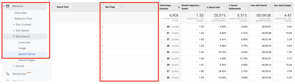
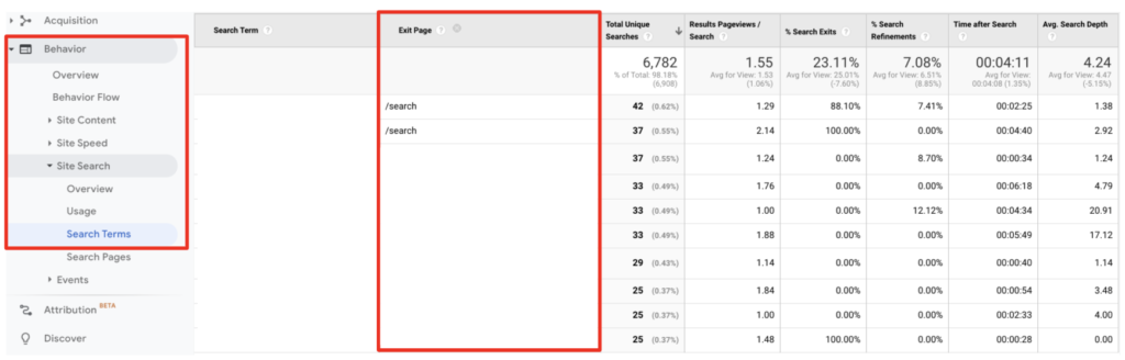
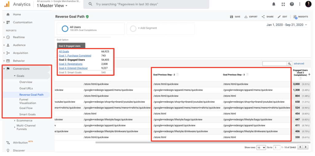
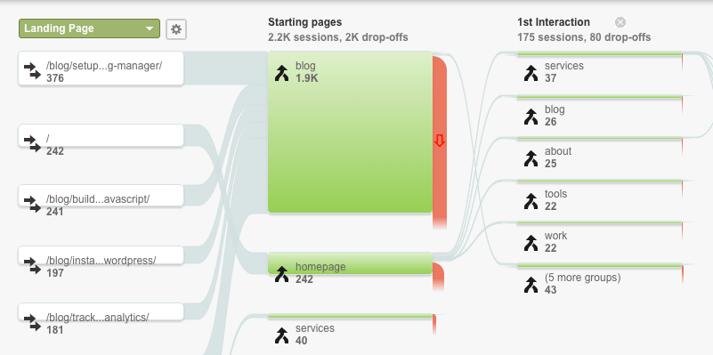
Where do users go after landing on your homepage?

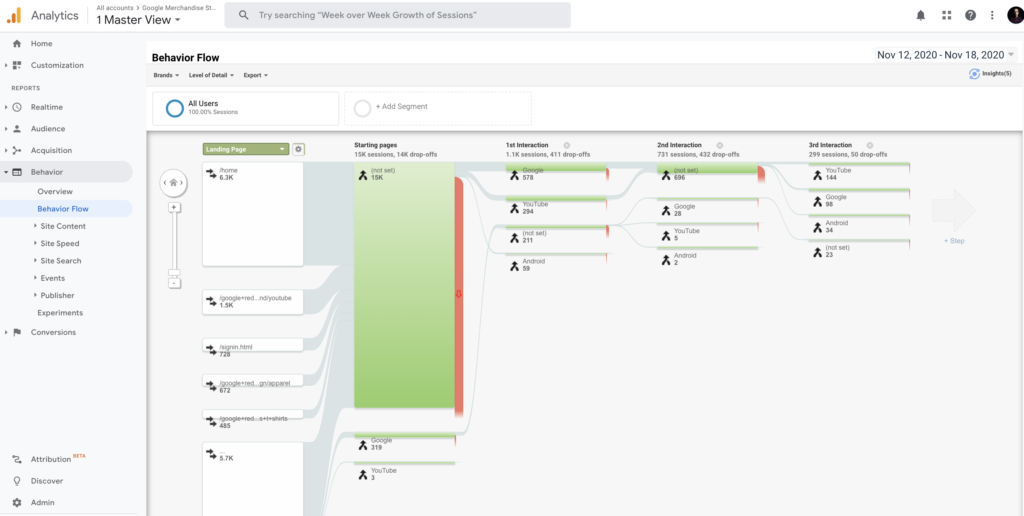
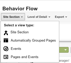
A behavior flow is a report of your users’ journeys from the moment they enter your website.

The behavior flow simply answers your questions below.

  • Where do your users visit after the home page?
  • Which links do they show interest in?
  • Have the same users visited again?
  • Where did your users spend the most time on the website?


Behavior Flow helps identify the pages that bring you the highest traffic volume while providing you with insight into where your users drop off the most. This way, it helps designers to optimize the user experience in order to make the user’s journey more comfortable. 

New vs. Returning Visitors

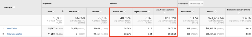
SHERPA knows very well to measure humans’ reactions rather than clicks, which often means a departure from more than Google Analytics. However, we love to take advantage of the power of analytical tools to define our way to improve user experience.

One of the indicators of how much users enjoy their experience within the product that will meet the expectations of the product offered to the users is the improvement in retention.

Looking at the behavior of these two segments tells useful insights into the content, structure, and design of your website. And it can reveal better approaches to providing value to your audience through new vs returning visitors’ reactions and interaction points in the interface.

In conclusion, rather than creating a design based entirely on instincts and assumptions, I have to say that our greatest strength lies in our decisions based on rational data. 

And Google Analytics, though usually associated with marketers, is a treasure trove for designers. 

According to the metrics above, progressing in the design processes will also strengthen your rational decision-making direction.

It is a pleasure for me to share our favorite feature of SHERPA with you.

At the end of the day, it is all data driven.

Hobson’s choice: Is “choice” the root of all unhappiness?

What is Hobson’s +1 choice?

A Hobson’s choice is the necessity of accepting one of two or more equally objectionable alternatives. 

Since a person may not accept what is offered in general, the customer is actually faced with two options in most cases. The first is to take something, which means he or she can buy it. The other option is to leave it, which means no buying.

And as we all know, most online users don’t buy the product; they go for the second option. The Hobson +1 effect is the way to counteract this “not converting” habit.

Where does Hobson’s +1 choice come from?

Hobson’s choice story comes from the 17th century from Thomas Hobson, a wealthy landowner and stable owner with more than 40 horses. He gave only one option to those who came to ride his horse and took the closest horse to the barn door. Why did he do that? Because he didn’t want the best horses to be overworked. If he let people choose for themselves, they would have chosen the best horses all the time. So he told visitors that they could only take the horse available for them, or not at all. Basically, he reduced the number of choices to give his “users” the bare minimum of the options.

In a similar vein, you may have heard the Choice Paradox from Barry Schwartz in TED before:

This thinking simply shows how people get overwhelmed when they have a lot of options to choose from. The important part of the Paradox of Choice concept is that it comes into play after only three or more choices. The fact is that giving people two or more choices is altogether better than offering just one or nothing at all.

Many studies have shown that when faced with Hobson’s choice, we are more likely to go from the “take it” option to the “leave it” option. Whereas if a second option is added, we tend to choose one of the options available to us. This cognitive bias is explained as follows: When faced with the “take it or leave it” option, people use all of their mental energy to decide whether to buy a product or not.

Additionally, the same research has shown that we use the same mental energy to compare these offers rather than consider the “leave it” option given the two options. This increases the probability of making at least one of the “active” choices. When there is only one option that is often said to be the same as “take it or leave it”, choosing between taking what is offered to you or not taking anything is presented with two options. There is no other alternative.

Another example of a Hobson’s choice would be from Henry Ford’s book titled My Life and Work. He says:

“Any customer can have a car painted any color that he wants so long as it is black”.

Henry Ford

Generally, the more options you have, the worse you will feel the buyer’s remorse after purchasing.

Why is that? Because your standards have risen. And now all you can think about is how good the other options could be. An article written by Thomas Van about human psychology even goes so far as to say that choice is the root of all unhappiness.

Simple tricks to increase conversions

So, I believe I made my case, and now move onto sharing some tips that could increase your conversion rates of your digital products

  1. Customize the social sharing buttons for your target audience and limit them on the page.
  2. Try to reduce the clickable items you list per page on e-commerce category pages.
  3. Define a goal based on a single CTA, an action that you will ask visitors to on each page. Try to eliminate the things that keep the users away from their main goals.
  4. Less may not always be better. Sometimes it works, sometimes it doesn’t. Sometimes you have to offer multiple pricing tiers and options. Find the right result for your product by testing it.

You know why Mark Zuckerberg wears the same t-shirt every day. He said many times, like Steve Jobs, that it was not a smart decision to choose a different t-shirt each morning. It takes some energy every time we make a decision.

The more options a consumer is presented with, the longer the decision-making process takes. And this demands more and more energy. At the end of the day, we prefer the option that seems the safest and easiest. Try to make your flows easier for your users. Give them fewer and fewer opyions, and see if this increases your conversion rates and sales.

5 Google Analytics tips to improve user experience

Time is one of our most valuable resources. And these user insights are not just about user experience. It provides indispensable data for startups, business owners, and marketers about user intent and how to optimize their digital products by addressing the most critical user pain points.

Based on practical ways; we will explain how to optimize your product for your users, share how to utilize Google Analytics to understand your users, and how to improve your product’s user experience with the following recommendations.

Ready?

Let’s start!

1. Site search insights

The “Site Search” section in Google Analytics can recognize significant areas of opportunity. The tool records that users composed into their own site searches. 

People who search for content or items on your site are more likely to consume that content or buy a product if they can find it on the first page of search results.

So these keywords from the behavior section in Google Analytics are telling you exactly what your users are looking for.

It means this is the GOLD.

In this section, we first need to recognize the following these:

  • Search Term: These are the words that users type into the search field on your website.
  • Start Page: These are the pages that your users start searching for.

This action lets you see a list of the search terms from your users that visited your website.

When you click the Ecommerce explorer option, you can see the words through which users made purchases.

And here are the start pages users searched for in this view: 

To get search trends, select “Search Terms” in the “Site Search” section and see all the actual words that are searched via your search field on your website.

Now here are the two things that I like to do in this step:

1. Select the “start page” as a secondary dimension. Now you can see the page visitors started searching.

2. Select “Exit Page” as a secondary dimension.

I know that if users leave the search results page, they cannot find what they actually need.

Gotcha!

There are two search terms that you can see who searched for something but just couldn’t find it. 🤔

Bonus action: 

  • Please try this on your own search bar on your website first.
  • If it’s a product or a category based keyword, then you can redirect this query directly to the relevant page. It’s a good start hah? 🙂
  • Decrease your interaction cost, suggest related searches, or auto-complete search queries to get better results.
  • Since you know that the data as your users’ pain point here is important for your users, you can use it both in your campaigns and in your SEO operations.

2. Product performance

You’ve achieved the dirty work of improved e-commerce up and running in Google Analytics. Now it’s time to take some action.

Whether you’re driving visitors to product pages via buying campaigns, retargeting, or some promotions on site, one of the most critical metrics is the percentage of add to cart actions. We call it “Cart-to-Detail Rate”.

Here is the quick way to see it in Google Analytics:
Conversions > Product Performance > and then click on the Shopping Behavior explorer option.

Bonus action: It will be useful to look at the products that fall below the average.
In the example above, although it is the eighth product with the highest revenue, we can see that the related product has a 0.48% Cart-to-Detail Rate.

OK. What should I do from here?

  1. Do you still have this product in stock? It may be helpful to check.
  2. Are there any major pricing issues, missing pictures, or description details?
  3. Bad reviews or minimal content around the product?
  4. When you check the page, what do you think could cause this result?

If you aren’t certain then on the minimal you may think to pause your campaign budget for this web page till you can develop a hypothesis around “why” that is appearing so poorly.

3. Email time of day performance

This insight will show you how to visualize sessions and transactions out of your emails.

Now please go to, In Google Analytics > Customization > Custom Reports > Create New Custom Report with the following settings:

You will see the report saved as below.

Also, you need to add sessions and transactions into your explorer tab shown in red:

The data shown over the 24 hour span of on a daily basis rolled up for the complete date range period. And you might have the table breakdown below the graph.

Insight action: How can you use this insight to your business?

  1. What is your average amount of time between send and opened mails? If a large percentage is opened within the first hour, you can try optimizing your emails for that time plan.
  2. What is your average amount of time between send and opened mails?
    If a large percentage is opened within the first hour, you can try optimizing your emails for that time plan.

4. Top converting content to improve internal linking 

Following the last few steps will help you identify the most popular way people are arriving at your site and navigating through. Executing these steps will help you capitalize on getting more visitors. 

The next logical insight is to effectively funnel this traffic into your primary goals or objectives to move your business metrics. 
And thank God, there’s a simple report buried deep that can help you connect these dots: 

  1. Go to your Goals > Reverse Goal Path section which is under the Conversions.
  2. Select the primary goal you’d like to view or analyze in this view.

Abra Kadabra: Now you’ll be able to see the previous pages people used before accomplishing your goal in your website. These show the pages your users were on before your goal converted.

Insight Action: You should lead the rest of your visitors from your popular pages to the pages that you’ve discovered which have the highest conversion numbers based on the primary action that you see.

5. Behavior flow

Behavior flow is a good resource to show your visitors’ moves on the website and where they went next. The report visualization is helpful for landing page optimization and to verify that your audience is viewing the best possible content.

And here’s what I like to do:

  1. On the top left corner of the Behavior Flow Reports, you can “Select a view type” and see the user flow according to content grouping, automatically grouped pages, events, or according to both pages & events.
  2. Let’s find out what each of the view types tells us.

Content grouping is a feature of Google Analytics that helps you to arrange your pages into specific segments so you can evaluate metrics aggregated under each group.

To see your content groups in your flow you need to first create your content grouping in your GA account.

Here is the quick way: admin >> view >> content grouping.

When you select “content grouping” in view type, the Behavior Flow Reports will show you a flow user navigates according to the content group you selected.

Conclusion

UX analytics is the first part of design-driven development. Sorry but it’s true, this is the first way to get more users to understand your users’ problems before running your ad campaigns. For this, you should first assign a meaning to your data and organize the things you see missing. Because raw data is meaningless. However, with this blog post —which you can access in 10 minutes— you can understand your users’ problems and create a more comfortable conversion path for them.

In our experience at SHERPA, many organizations do not have the ability to interpret the information they see in Google Analytics. Hope this content helps you develop insights based on your users’ footprints.

And best of all, all these insights are data-driven.

7 simple ways to optimize the mobile conversion rate of your e-commerce website

“Welcome to the new normal.”

We hear that often these days, right?

In a similar vein, here is another thing that is always in circulation.

“Future is mobile.”

Eagerly catapulted, yet both statements lack arguments to create actionable game plans. Personally, I don’t agree with the latter anymore. Cause, mobile is actually happening now. More disruptive than ever. Similarly, the things that have been labeled as “new” today, had been there, affecting our way of doing things substantially for quite some time.

So, here we’ll take a look at what mobile means, today, and how one should take any action not to miss the boat?

First, let’s start with a simple explanation. What does “mobile” mean?

Here, Chris Goward explains it:

Mobile differs in many ways, primarily the context. By definition, mobile implies the user is “out and about,” which means they have a greater distraction, less attention available, and different location-based needs.”

Especially in this time, most sellers need new and proven mobile conversion optimization strategies when the low touch economy makes itself felt day by day and the consumption of digital media is increasing. So, we are right here to make that moment of “Aha!”.

In this article, you’ll learn 7 simple and effective ways to increase mobile conversion rates of your website.

1. Optimize your mobile page speed

Painfully slow loading speeds of websites can frustrate any user, it’s obvious. A study shows that 40% of people abandon sites that take more than 3 seconds to load. However, the same study also found the 3 out of 4 mobile sites have load times of over 10 seconds.

So, first of all, try free tools brought by Google to understand how you can optimize your mobile page speed. If not convinced, learn more about how your page speed affects your revenue first, and then delve into optimization.

2. Focus on action buttons

Mobile users don’t surf the web on their phones as they do on desktop devices.

When people are on their mobile devices, they rarely have the time or need to view the entire content. They’re usually “busy”. In other words, they have no time like desktop users, so to speak. Therefore, you should think about this before making adjustments to optimize your mobile conversion rate.

If mobile users are directly visiting your product page: it’s an indication that they might have specific intentions.  In an optimal scenario, they first take a look at your page and then scroll down to learn more about your product via comments or other details.

At this point, one thing to do is not distract them with all the details of your product. Users are fond of progressive disclosure, even though they are not familiar with the definition. You need to show sufficient information at the right time, each time. That’s progressive disclosure, and you need to design your detail pages while keeping this method in mind.

Following a well-written product description, users generally spend time on reading reviews if there are any. And finally, if they’re convinced, they will add your product to their cart. Right?

But wait? Is your button at the right place to take advantage of intent-rich moments?

If you don’t make your action buttons easily accessible for mobile users, you may simply lose revenue. Thus, as a rule of thumb, make your buttons visible throughout your product pages and let users add or remove products from carts with ease.

Once you have buttons in place, do not forget to polish the labels to spur actions. Use action and power words to drive conversion.

3. Use behavior analytics tools to understand the “Why?”

Here is a fact: Mobile users don’t have a lot of time. 

So, in order to increase the add-to-cart rate of any product page, you should put all the information on a product to its page. And, in order to create well-written product page content, you just need to uncover what your users are after while they’re shopping.

The best way to uncover user expectations is to use qualitative and quantitative data sets together to make sense of your users’ needs and wants. Any analytics tools, including Google Analytics with a combination of behavior analytics tools, such as Hotjar or Fullstory, could come in handy following your users and what sort of clues they are leaving after once they check out your products.

Heatmaps, session recordings, and on-web page polls are great tools to look at how your visitors interact with web page elements and browse through your website or product pages in particular.  It’s also good to ask for direct feedback from your visitors on how they feel about the overall experience to get a sense of their perception of your products.

Thanks to the responses obtained through polls or surveys you can set up on any page, you can easily detect any problems or usability issues that your users are having a hard time before finalizing their purchases.

These sorts of analytic tools are the best for e-commerce stores for increasing mobile conversion rates of both versions of a website, desktop, and mobile.

4. Let your users type less with autocomplete

Yes, AI is already here. In the context of usability, it’s been here for a long time.

Simply put, if you can understand what your users want, then they’re much more likely to convert.

So, one useful approach is to use autocomplete features as a part of onsite search functionality, just like how Google works. As users type, they see likely alternatives and might quickly pick out one, reducing the time it takes to locate objects.

This is one of my favorite user experience actions that I come across regularly on e-commerce sites that are at the top of their class. Also, it’s a relatively quick hack for mobile conversion rate, considering how it shortens the path to find a product.

5. Do your best on product pages

You’ll find yourself optimizing your product pages a lot. I mean a lot.

When your mobile visitors come to your website to buy your products, then the mission is simple, right? You just need to make an excellent case for convincing them to buy an item from you and no longer from a competitor.

So, here are some hints for building high converting product pages to increase mobile conversion rates of e-commerce websites. 

  • Show your excellence in the product title
  • Add images to galleries from different aspects of the use
  • Put your security badges and other trust signals that you own
  • Include a detailed product description
  • Add shipping and product return processes information
  • Include different ways to pay

6. Improve your navigation

If your mobile website isn’t always smooth navigable, it could negatively affect your mobile conversion rates, period. You need to show all the options and exits to your users in any funnels to make them comfortable while searching for their needs. 

Mobile users have no time to explore your flows. And sorry, but, lack of options directly affects their enjoyment and would motivate them to leave your website in the blink of an eye.

However, if you can provide a better navigation flow and overall user experience design, it results in much higher mobile conversion rates for mobile devices.

Here’s an instance from Beauty Bridge, a beauty brand. 

You can see how smooth their navigation menu looks on the mobile web site and gives a clear message to users about where they are and what their options look like.

7. Test, test, test!

Statistics and theories can help you formulate the future changes to make on your website, however, only proper testing will let you inform if those changes are valid or not.

Running optimization tests to decide whether or not any changes you make results in measurable impact is the only way to improve your conversion performance. A/B tests allow you to see if your target market approves any decision you made on a design or when any upgrades should be rolled back.

Every detail you change must be tested before implemented. You can easily and freely utilize some of A/B testing tools in the market in order to run tests and make informed decisions. 

One of my favorite case studies is already here if you’d like to check out how we managed to increase the mobile conversion rates of a retail website with a simple change. See our story of success as the first Turkish partner of Optimizely in UX design in Zingat.com project.


To conclude, improving the mobile conversion rate is the key point for many e-commerce websites in today’s digital world. With these smart actions, you can return to the game more powerful. And don’t forget the use your data to know your customers better.