The intricacies of preparing a proper survey

In today’s digital world, it only takes 2 or 3 minutes to find out what parts of your product or service are frequented by your users, or what portion of your visitor base is represented by the ones that are contacting you. Accessing this type of digital data with close to %100 accuracy is very easy today, but you have to apply different research methods to find out why your visitors don’t communicate with you or why 80% of your users use only 20% of your product’s capabilities. One of the most flexible and practical research methods is undoubtedly the survey. However, the question is: How reliable are the results of your study?

There is no way to make sure that your survey results reflect one hundred percent truth. All you can do is to take into account the researcher-and-respondent-induced trends (bias) that lead to deviations in the results, in the survey preparation and dissemination phases, and to try to keep those deviations at the lowest possible level. I’ll list below the most common types of such variations, some examples, as well as tips that will help you avoid these trends as much as possible.

Response bias

You may encounter the response bias for many different reasons. It could be the survey content, or one of the target segments could be excluded due to their unavailability. There may be two main reasons for response bias, which is one of the respondent tendencies that cause the most significant distortions in the results.

One of them might be that your survey is on a sensitive matter (for some people). For instance, tax evaders will be reluctant to participate in a survey conducted by the Ministry of Finance. In this case, the results of the study will not include this group so it will not show the unbiased reality.

The survey medium may also lead to non-responsiveness. For example, illiterate people cannot respond to a written survey. Additionally, if the survey you share via e-mail is not displayed correctly on mobile phones, you will not be able to take into account the views of the people that manage their emails via mobile phones.

To minimize the response bias, make sure that your survey medium is in line with the target audience and if necessary, test it in advance. One of the most common methods used to collect data about sensitive subjects is to blend the questions about the topic with a set of questions that are entirely irrelevant.

Lack of knowledge

One of the most critical problems that can be detected is the researcher’s lack of knowledge regarding the audience and the survey subject. The survey is fruitless if the data collected does not overlap with the information required for market research. Multiple choice surveys present another set of problems if the researcher doesn’t include a common option the target audience is likely to pick.

For example, if you ask the audience who live in Turkey that “Which online shopping site do you use most often?” with options such as Amazon, eBay, Alibaba, Walmart and more (no choice originated from Turkey), you will not be able to find out which shopping sites are most popular among participants. The best way to avoid that is to conduct a preliminary survey including open-ended questions to a smaller group to get an idea of what options you should provide.

Respondent error

Two of the most common respondent-related deviations are incorrect or misleading answers. The first is that the respondent has incorrect answers due to not knowing the answer to the question. Other times, the respondent does not want to give an honest answer.

Everyone who responds to the survey may not have an answer to every question in it. For instance, a person working in a company’s customer support department may not know how many people work in the marketing department. Additionally, if you ask a person who doesn’t have a car about how many liters of gas are consumed per month, he/she might mark the option providing the smallest value. To prevent such cases from misleading the results of the survey, you must give an opportunity for the respondent to pass, such as ”I don’t know,“ ”I’m not sure” or “I have no idea.”

Nevertheless, there may be respondents that avoid picking such options out of goodwill and share the opinion of their alternate selves that would be addressed by the question. To prevent that, you should add screening questions to the survey. Considering the examples above; with questions such as “Which department do you work in?” and “Do you have a car?”, it will be possible to eliminate those who are likely to give the wrong answers to other questions.

On the other hand, the tendency of the respondent to give the correct answer is usually caused by social desirability. Respondents may choose to respond in ways that society (or researcher) will welcome, rather than responding to specific questions honestly. It is a type of deviation frequently encountered in intimate matters such as alcohol consumption, sexual orientation, and ethical or legal issues.

For example, a respondent might refrain from stating a negative opinion about disabled people to an interviewer in a wheelchair. Questions such as “Have you ever stolen?” that are at risk of causing legal consequences may not always be answered honestly. To minimize this tendency, an environment should be created to make the respondent feel safe, and questions should be formulated as impartially and in the most understandable language possible.

The survey-related deviations

In particular, in online surveys, all responses may not reflect the truth, since no interviewer is able either to help if the question is not understood correctly or to follow how respondents react to the questions. This may be due to many reasons such as how the questions are asked, the answer method such as scale, multiple choice or free text, how the options are provided, the visual structure of the survey and the question sequence.

The formulation of questions and the formulation of choices should be as neutral as possible and consistent throughout the survey. Assuming a scale set is labeled as “Good – No idea – Bad”, if another one in the same survey is labeled as “I like – No idea – I don’t like”, the neutral rating in the first sample and the emotional rating in the second sample may not be comparable, even though they are evaluated on the same 3-point scale.

If you have prepared a lengthy questionnaire, the details such as how many pages the survey consists of and how many questions are displayed on each page will affect the completion rate of the survey. Positioning difficult or complicated questions at the end of the study may cause fatigue-induced false responses. While there are five questions on the first two pages of a 5-page survey, if participants encounter 15 questions on the third page, the risk that participants leave the survey on this page increases.

Even if you have prepared your survey considering all of the reasons for possible deviations above, you should test it in a smaller environment before starting the research. Even then it’s important to have feedback from people with experience in survey/market research. Because, just as not having enough knowledge about the subject of the survey, being an expert in the subject of the questionnaire may raise the possibility that your questions and response options do not coincide with the facts.

SHERPA emerging as a global design company

We are a digital experience design studio based out of London and Istanbul where our users and results are the number one priority. We develop specialized solutions for our clients based on the market, their goals and their audience. We create measurable results for companies, startups, and online providers. We have a huge range of services to offer including requirement analysis, UX research, and conversion optimization. Through our hard work, we are honored to have been listed as a top UX designer by Clutch.

Clutch is a B2B rating and review firm in downtown Washington, D.C. Clutch’s goal is to connect service providers with possible clients. Clutch’s team of analysts achieve this goal by creating two scores for every service provider listed on Clutch’s website. The analysts then rank each service provider based on their industry and location. The Focus score reflects the success and accomplishments of service providers while the Ability to Deliver score is based on client reviews, market presence, and work experience. These scores are determined by Clutch analysts conducting interviews with previous clients of service providers. These interviews are crucial to generating an unbiased and accurate review. After conducting interviews with our previous clients, Clutch has given SHERPA a rating of 5 stars. Here are a few quotes from our satisfied clients:

“They bring a unique perspective and strong UX expertise to our project.”-Andre Pronk, Enablement Manager, Insurance Comparison Site

We don’t have any competition that’s close to our level of UX, thanks to SHERPA.”- Llewelyn Padiachy, COO, Insurance Company

They were responsive and truly the best agency I’ve worked with.”- Umur Korkut, Director, E-commerce Sports Company

Clutch also has a sister site which showcases SHERPA’s work. The Manifest publishes short summaries, prices, services, and clients of companies, and has listed our company amongst the top 100 UX designers.

We are very happy to be working with Clutch and hope to be connected with more clients soon. Explore our case studies further today to see what we can design for you!

The 9 key steps of customer experience (CX) journey mapping

A customer experience (CX) journey map can be created by predicting the respective behaviours of different personas, based on data collected by research, and it’s one of the most effective tools in UX design. In this post, we’ll take a look at the CX journey mapping process in 9 steps by using basic concepts.

While mapping customers’ relationships with a brand or its products and services, it is necessary to define the milestones of a CX journey – that is, to identify some specific constants. These touchpoints can be scaled up to accommodate various needs, but any and every customer experience journey map must include the five assessment criteria shown below as a base.

a

Example of a customer experience journey map

What is the difference between customer experience (CX) and customer journey?

Customer experience (CX) can be either pointing out the whole lifecycle of the user or in regards to just one touchpoint with a product/service. However, the customer journey is a presentment of the touchpoints a customer engage with a brand. Then, what are the five steps to map the customer journey?

a

Nielsen Norman Group: Customer journey mapping

  1. Timeline: Important turning points that map the changes in customer relations with the brand over time.
  2. Personas: Half-imaginary characters, typifying basic personal features of a wider customer group, based on data collected from user research, combined with web analytics.
  3. Emotion: Symbolic representation on the mood line of a customer’s emotional landscape at the moment of interaction.
  4. Channels: Entire vehicles of customer interaction and touchpoints with the brand.
  5. Touchpoints: Any and every moment of customer actions and interactions with the organisation or its products.

After defining the basics, it’s time to observe the customer experience flow and illustrate it as a roadmap. Megan​ Grocki​, Experience Strategy Director at ​Mad*Pow,​ explains the nine key steps of designing a CX journey map in a video she prepared for UX Mastery​​.

a

How to create a customer journey map

In summary, here’s how we can repeat these nine steps, which visually form the crest of a wave.

So, how to create a customer journey map?

1. Review the goals

Consider the goals of the CX journey mapping process, as well as the goals of the organisation and its product or service.

2. Gather research

Conduct research based on relevant resources, including both qualitative and quantitative findings, and gather the results together.

3. Define channels and touchpoints

Work on determining channels and touchpoints where your customer will interact with your organisation, product or service.

4. Create an empathy map

To understand your customer’s emotional landscape, focus on what s/he is thinking, feeling, seeing, hearing, saying and doing.

5. Look at it from different perspectives

Practise generating ideas quickly by looking at problems and scenarios from different perspectives.

6. Create an affinity diagram

Organise your ideas visually, and classify and categorise them cohesively.

7. Sketch the customer journey

Draw a sketch of the CX journey map to make it comprehensible for your team.

8. Refine and digitalise

Create a digital map to help clarify any confusing details from the sketch.

9. Share and put in use

Now you are ready to take a journey through the eyes of your customer.

Lastly, it would help if you remember that customer journey maps need to be updated as conditions change since they are based on existing data and personal experiences. For this very reason, no CX journey map can be accurate forever and applied in different instances in different stages of a project. In other words, each CX journey map is as unique as each customer of an organization. Therefore, you should –not only today but always– keep your data and data processing up-to-date to know your customers better.

Customer journey maps examples

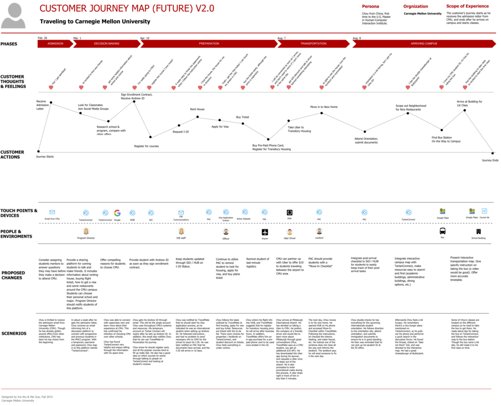
An example of a B2C customer journey map.

a

Customer journey map example (Source: Iris Tong Wu)

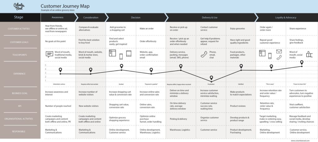
An example of a retail customer journey map.

a

Customer journey map example (Source: UXPressia)


Entrepreneurs’ compass: User experience survey

Eureka! One day you can be enlightened as Archimedes when bathing; you may think that you have found the perfect idea to solve people’s problems and meet their needs. In the next few steps, you may need to finalize your ideas and find an investor. For most entrepreneurs, this is how the process works. While some might find someone to invest in their idea as a result of much effort, others find an investor in the first three attempts. Then what? You turn your idea into a product or service, and you offer it to your users. We’ve come to the most exciting point! Will your users use your product or service?

Maybe you’ve never asked this question until this point. Depending on the experience of many entrepreneurs in different areas, many different predictions can be made on the answer to this question: Your users may love your product or service and be a part of your permanent audience.

Your users may love your product or service, but after a while, they might forget about it. If we come to one of the worst scenarios, your users can just look at your product or service and forget about it completely. Unfortunately, this is one of the most bitter truths for entrepreneurs. However, my goal is not to draw a pessimistic picture; on the contrary, to allow entrepreneurs to involve the user experience research to avoid confronting this painful reality and to reach a satisfactory result.

At this point, you might be thinking that you don’t have enough money and time for research and on top of that the investor would want to see something tangible. You might ask yourself “Where can we investigate? I would say that without any insight into your users, it will most likely cost you much more time and money than the user experience research methods I’ll share below.

Persona

The personas used in user experience research are tools that help you identify your target audience. Persona is a fictional presentation of a group of users based on data from real people. Demographic information (age, gender, educational status, occupation, marital status, etc.) matches the needs, motivations, and problems of your product or service. Making assumptions about who might be the target user for your product or service, and converting your assumptions into a concrete format helps clarify the big picture. For example; Let’s say that you are planning to develop a mobile application where people can share the second-hand items that they don’t use. Do you think that women or men would use this application the most? What would be the age range of users of this application? Does it cater to users with high socioeconomic status or the ones in lower statuses? You can create personas by directing these and similar questions to yourself and your team. The staff will create the needs of your users, their motivations, their habits and so on. Although it doesn’t help you with the details, it allows the team members to meet their assumptions in a single place. You can also create more than one persona to represent differentiated users. For example; for the application for the sale of second-hand goods, you suppose that university students and homemakers will be your users. So, you create an Ahmet (23) persona representing university students; Gülcan (34), who represents homemakers. After that, you can gather the characteristics of these two groups under these two personas. Thus, when you use one or more of the research methods which I share below, with very little effort you will be able to identify individuals who are your target customers.

Netnography

Netnography is a method to observe the behaviors of individuals on online platforms (such as Facebook groups, forums) and to collect qualitative data about these behaviors. This method, which can be utilized without getting on the field and meeting with the participants, is both a time and budget-friendly solution. At a time when we assume that people are having a problem and we’re about to develop solutions to this problem, this research method truly enables us to determine whether or not this problem is really happening. If we continue with the above example, it may be possible for you to determine the needs, issues, and motivations of the users that you want to reach by becoming a member of an existing group where the second-hand goods are exchanged, shared or sold, and by observing the users behavior within these groups. For example; a user wants to sell his television and has posted in a group. Under the ad, you notice that there are many people who like it and would like to purchase it, however, you also see comments that say that they can’t find a cheap shipping option for the TV. So you’ve discovered that people buying second-hand goods have a problem with the cost of shipping. In the next step, you can add a feature that will solve this problem for the product you are developing, and you end up completing one of the steps to create a product that would appeal to real users.

Survey

Surveying is a more familiar research method and does not take much time and easily reaches many users. Even though this method is not ideal when in-depth data collection is needed, it is a method that allows you to see if your assumptions are correct and it can be used as a mediator when a difference of opinion arise within your team. The questionnaire can consist of open and closed-ended questions. The closed-ended questions are ones that can be answered “yes” or “no”. Open-ended questions, on the other hand, allow participants to express themselves. You can create an online survey and make it available to many people. If you want to know how often people exchange second-hand goods, you can add options such as “once a week ”, “more than once a week”, and, “once a month.” If you would like to learn why they prefer to use second-hand goods, you can ask “What are the reasons for your preference in using second-hand goods?”. You can add possible answers such as “It is cheap” or “I am looking for something temporary.” When preparing questions and options, it is vital to act as impartial as possible and ask more general questions that do not manipulate participants.

One-on-One Interview

Unlike the survey method, in one-on-one interviews, open-ended questions are asked to the participants, and they are expected to tell stories specific to the topic. This method, which is effective for in-depth understanding, gives us insight into the attitudes of individuals rather than their behavior. Questions are prepared prior to the meeting. It is essential that the questions are as open-ended as possible and not manipulative. For example, instead of the question ”Do you like product A?” asking “Would you share your opinion of product A?” is a question that is more objective and does not guide the user. In the first question, the participant may leave the possibility of not liking the product. At the same time, the most frequently yet faulty question is “Would you use such a product?” and it should be avoided at all times. It is often not consistent when users are predicting their future behavior, and for this reason, it may be good to remember that they are living with the problem and not developing the product. In light of these facts, questions are prepared and a comfortable environment is created to help the participants focus. It is extremely critical that the interviewer by making eye contact and using body language effectively makes the participants feel that what they are sharing is being heard. One of the methods that can be used to analyze the data obtained after the interviews and to reach meaningful results is the correlation diagram. All the meaningful data obtained from the interviews are written to post-its. Team members associated with the project come together and group post-its according to their associations. In this way, by looking at your correlation diagram, you will be able to see in a single frame what different participants think about similar situations and what they experience.

Closed Observation

Closed observation is a method in which participants are observed in the context of research-related situations. It can be said that it is a method of collecting insights about individuals’ behavior. Participants are not aware of their observation. Therefore, it is a method that requires the observation to be conducted sensitively. Ethical rules which are taken as a basis in all research processes should be considered more carefully when performing a closed observation. Any behavior that may disturb the participants should be avoided and the data collected during the observation should be kept a secret when the data is shared with others. At the same time, recording a closed observation is not ethically correct. Here is an example of an observation process that you can conduct by adhering to these rules:

Suppose we want to understand the needs, motivations, and problems of individuals in the coffee-buying process and want to design an appropriate coffee-buying experience. You can observe this experience by allocating 2- 3 hours at each coffee shop. In this way, you will gain insights into what individuals pay attention to when buying coffee, what problems they face, and many other issues.

These methods, which I have briefly summarized, are some of the leading methods that can be conducted by reading up on them and getting a little support from people who are qualified in this field. I think it is necessary to emphasize this as I finish. By devoting time to these methods, the insights you have gained about your users will illuminate the way you are progressing and support you as you strive to be successful.

Reading Recommendations

What is confirmation bias and how does it affect our decisions?

Although it is difficult for some to accept, humans are biased creatures; it is nearly impossible for humans to be %100 rational because they have emotions. As an average human, you probably want to believe that your convictions and knowledge are the result of years of experience and objective analysis. The truth is that we are all under the influence of an insidious problem known as “confirmation bias.” We would like to think that our convictions are rational, logical and objective, but our convictions are in fact the result of us giving our attention to ideas that support them.

What is confirmation bias?

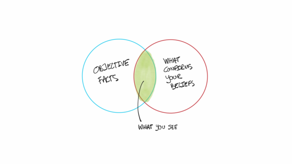
Confirmation bias (confirmation prejudice) is a tendency to seek out information that confirms one’s own desires, ideas, and convictions; and to ignore counter opinions, while investigating a subject, evaluating a situation, making decisions, or even remembering an event that happened in the past. Even if we take into account that every idea has positive and negative features, our mind unconsciously seeks information that confirms our belief. With this information, we want to defend and provide justification for the ideas that we believe in. It is often difficult to accept a different idea on the same subject. This is because we are prejudiced against change and do not easily want to change.

The Confirmation Bias

David McRaney explains how confirmation bias affects our awareness and the way we perceive our environment. When you think of buying a particular brand and model car, you suddenly start to see many similar cars in traffic. After a long-term relationship, every song you hear sounds like a love song. When you have a baby, you begin seeing babies everywhere. Confirmation bias sees the world through a filter that is shaped by your interests, wishes, and feelings, McRaney says.

This filter can momentarily change depending on your interest and mood, and confirmation bias – as it tends to support our changing convictions – also affects how we process existing neutral information.

What is an example of confirmation bias?

https://fs.blog/2017/05/confirmation-bias/

For example, when your relationship is happy, you do not see any mistakes in your partner and even ignore your partner’s negative personality traits. You perceive everything as perfect. Contrarily, when your relationship starts to go poorly, or when you are in a bad mood, all the mistakes and negative personality traits of your partner which you didn’t mind before begin to bother you. You are still with the same person, but the way you perceive what they do depends on how you feel.

How does confirmation bias affect our thinking?

Confirmation bias also affects your memory. You can interpret memories and events according to your own ideas and even alter them in extreme situations. A well-known, classic experiment conducted by Hastorf and Cantril explains this situation quite well. Princeton and Dartmouth students watched a football match between their two schools. At the end of the match, Princeton students remembered that the Dartmouth team made more fouls and Dartmouth students remembered that the Princeton team made more fouls. The two groups of students, both fanatically believed that their teams played better. The selective perception and memory of these two groups led them to construct different realities even though they were watching the same event. People who are members of a group usually obtain the perspective and filter of that group, and this frame and filter distort the way each group member perceive their environment. In the same way, people with prejudice tend not to recall the characteristics of stereotyped individuals outside of those stereotypes. People therefore take less notice of information that conflicts with their expectations. When we think of the same example, the students who watched the match did not consider or remember the good plays of the rival school’s team.

When it comes to personal passions and interests, confirmation bias – which is effective in moments of evaluation, judgment, and decision-making – can become more violent when confronted by an opposing view, as it exists because of an over-reliance on one’s own beliefs,  potentially leading to dire consequences. This phenomenon is frequently seen in the management and recruitment of positions of companies, in medicine and in politics. Especially in this realm, people do not think they have particular prejudices. Because most of the things that occur in the brain are not accessible to the brain itself, people are not capable of understanding the times when they are biased. While individuals realize that others act in deceptive and biased ways toward themselves, they forget that they, too, are human.

A Princeton University research team offered an extensive list of prejudices to a group of people and requested them to list the number of prejudices they possessed and the number the average person possessed. A majority of the test participants claimed that they were less biased than the average person. According to a similar study conducted in 2001, doctors think 84 percent of their colleagues will be affected by gifts coming from pharmaceutical companies when diagnosing and treating patients. But only 16 percent thought they would be affected in a similar way.

Individuals tend to overestimate or underestimate the impact of certain situations and decisions on themselves and other people. Therefore, in cases in which judging and decision-making duties are endowed on one particular person or in cases of external intervention into objective assessment, the decision-maker is often deceived by his or her prejudices and ends up making decisions that negatively affect those impacted by those decisions. On the other hand, people may also tend to exaggerate or underestimate the effects of their decisions. As a result, the decision-makers are more biased than they think, but we can safely say they are less biased than others suspect about them.

Wason’s work aims to show that even when new information is presented, people stick to their first instinct and do not take an approach that tests a hypothesis optimally. You can review a sample of this test in the video above. In this experiment, people were given a set of numbers with a rule. Participants were expected to first mention another set of numbers that conform to this rule, and then tell the rule set for this series. The person conducting the test explained whether the number indicated corresponded to the rule and whether the rule was correct or not. The number series for the test was indicated as 2, 4, 6. Many people suggested the series 6, 8, 10, or 8, 10, 12, and guessed that the rule was consecutive pairs. The series conformed to the rule, but the rule was not consecutive even numbers. The participants developed quick judgments about the patterns they had seen and established a quick hypothesis. However, despite the fact that the rule was pronounced false, they continued presenting other series that confirmed their hypothesis instead of rejecting the hypothesis. Few participants tried presenting a series of numbers that could reject their own hypothesis. This experiment shows why the scientific method is so critical. When a theory is created on a particular subject, we should try disproving that theory because only when the theory can no longer be disproven can we achieve genuine knowledge.

It is important to approach life with curiosity rather than judgment to prevent this bias. Whenever you try to prove that you are right in every argument, you are deceived by confirmation bias. Even worse, since you’re constantly trying to be right, it’s inevitable you have to avoid risky problems and are likely to pass responsibilities to someone else to focus on simpler things out of your fear of making mistakes. In this case, your life experience will be limited. If you approach the problem without fear of making mistakes and establish a proper relationship between the past and the future, you will achieve the right definition and open yourself to new insights. Trying to understand others’ alternative views and perspectives instead of insisting on your own ideas about what you are presenting or working on will help you to correct and reform your perspective on the subject. In fact, getting together with people who have different opinions, introduce you to different methods, make efficient contributions and, in some cases, play devil’s advocate is very helpful for escaping the confirmation bias. In other words, when you have an idea, try to disprove the idea and discover the features that remain out of the pattern in your mind. Only then will you reach the best objective without deceiving yourself and acquire more comprehensive information on the subject of your curiosity.

In terms of the broader society, those who have the authority of decision-making – such as doctors, judges and administrators – seek to acquire more genuine information than others think they do, but they overlook more things than they themselves acknowledge. Since the brain can’t see its self-deceit, the most effective way to avoid prejudice is to avoid the situations that cause it, and to minimize external influences that make the objective assessment difficult. For example, confirmation bias may be prevented if doctors do not accept gifts from pharmaceutical companies and if judges do not handle their relatives’ cases.

References and suggestions for further reading:

  • Wason Rule Discovery Test
  • Daniel Gilbert – I’m O.K., You’re Biased
  • Daniel Kahneman – Thinking, Fast and Slow
  • Bill Pratt – What is Confirmation Bias
  • Buster Benson – Cognitive Bias Cheat Sheet
  • Lakshmi Mani – Confirmation bias: Why you make terrible life choices
  • Catherine A. Sanderson – Social Psychology

Which one suits your project better: Use case or user story?

Do you know how many results you get when you search “UX” on Google? (In private/incognito mode) 234 million results appear. In the UX world, where there is so much content; it is normal to have mistakes and accidents. However, some of these accidents, if not careful and no action is taken, could increase the risk of casualties among team members. Let’s take a look at one of the most common areas of “accident” and answer one of the most fatal questions: Should we write Use Cases or User Stories in the UX documentation? (If you say both, don’t read the rest of the article at all; take a short walk, come back and give it another try.)

Since the “Agile” hurricane struck Turkey, the debate over writing Use Case and User Story has been flaring up among the enthusiasts. If the main concern of the Agile methodology could be interpreted as “Taking the simplest and the most effective steps first and delaying the rest of the concerns until the product creation phase” writing both the Use Case and the User Story in a UX project, creates an antithesis to this statement.

You ask why? Let’s answer why by examining in detail the key differences, the risks, and the approaches that emerge when using Use Case and User Story.

Use Case

Use Case is the name given to an end-to-end interaction sequence that takes place between an actor and the system, creating a value observable by the actor.

So you may be thinking “This is a wonderful definition, however, isn’t it like a quantum physics term definition? It says so much but means so little” then you are not alone. When you place the above definition and the stick figures together (just type Use Case on Google and you will know what I mean); then you would most likely end up with an unwanted documentation format which will never be used again.

I think it would be more practical to continue with an example:

The actor does something.
The system does something else.
The actor does something other than that.
The system does something totally different.
For those who say “Please, show me visually.” The following example for Use Case diagram is for you.

Here are a bunch of interactions. So, is this it? Is this the Use Case? No.

Finally, for these series of interactions to form an end-to-end flow (the main flow), we need “alternative flows” for the exceptional circumstances and alternative steps.

For someone else, such as a designer or a developer, to work efficiently after examining the User Case; the main and alternative flows about the activities framed by the User Case must be thought thoroughly. This thinking practice also requires you to have a good command of the rules that determine how the actor interacts with the system in the Use Case, which rights those rules give to the actor in exceptional circumstances, and how they direct the actor.

In other words, the BDUF – Big Design Up Front, which is opposed by Agile from the beginning, becomes mandatory. Rightfully, for the Use Case production “Let me think of everything, plan, detail and then start production.” becomes inevitable.

Weren’t we supposed to be Agile?

User Story

The key to writing a User Story is avoiding details in the beginning stages of the project; creating a working environment where details can be added to the project in a timely manner and as needed.

Unlike Use Case, User Story samples are created with much simpler reasoning:

As a <user>, I can <indicate folders not to backup> so that <my backup drive isn’t filled up with things I don’t need to be saved>.

In fact, as the key approach summarizes, the User Stories were born as a reaction to extreme elaboration. This is exactly why they are called anti-BDUF. When Kent Beck came up with the concept of eXtreme Programming (XP), he positioned the User Story as a point of support for this iterative and progressive production approach and pointed to the true Agile methodology.

Mike Cohn took the issue another step, wrote a book called “User Story Applied” and created a remarkably rich bibliography on the use of User Story in Agile projects.

Next, Jeff Patton introduced the Story Mapping technique to keep User Stories from drowning in the functional depth of a product. This effort became a method of positioning a User Story, which may be seen as very simple, in relation to the bigger story and showing how we can connect it to other (simple!) User Stories.

I would also like to share the following graph summarizing the position of User Story in Agile:

As can be seen from the examples, there are three prominent concepts in the User Story creation process:

We answer the question: What type of user are we writing this story about?
We identify the activity, seen as a need in the story.
We clearly demonstrate the user benefit that emerges as a result of this story so that we can review it in our prioritization work.

The position of the User Story within the value chain, in the axis of the business objectives of the product; depends on the clear manifestation of these 3 steps.

Although I would like to continue with the “Acceptance Criteria” that defines the acceptance status of the User Stories, Epics which is the next level above User Stories, and the “3C”s of Mike Cohn’s User Stories: Card, Conversation and Confirmation; I put an end to the User Story explanation and recommend you to have a look at the reading list at the end of my article.

The main difference between Use Case and User Story

The key difference between these two concepts is timing. The product design environment can constantly change because of  business objectives, product characteristics and the constraints of project time limits. If you are trying to develop a product in that environment at a time when response time is a sought after capability, you have two options. Trying to think of all details, making analysis from the start and then deciding if you will design or not, places User Story and Use Case on two opposite ends.

Use Case is the choice of “I define every detail from the start” people, and User Story on the other hand is the choice of “I only define the essential details needed at any given point” people.

User Story people tend to think  that they can whenever necessary further elaborate the User Story and create other User stories associated with it, and acknowledges that even this User Story may become unnecessary in the future, and they may have no objections to remove it. Use Case people think differently. Essentially they because of their fear to deviate from the detailed analysis, tend to clash with change.

Can I use the Use Case instead of User Story in an Agile Project?

In theory, there is nothing against it. However, choosing Use Case in an Agile project forces the resolution of a gigantic dilemma which is the imposition of “monolithic” and “absolute acceptance/rejection” philosophy. There are two factors that build a barrier between fragmented and iterative creation. The first one is that in the Use Case Creation, both cause/benefit definition is usually ignored and secondly, the lack of necessary relationship to be established between the business objectives and the Use Case. The effort spent trying to solve many small issues from the start will produce some results. However the loyalty to such results during the production period will put a barrier to the effective use of time and neglect “recent developments” that could provide added value.

Which one to use?

I am a part of the generation whose projects do not continue as they were planned/agreed upon.

I’m a veteran who admires the Japanese way of working. When my plans completely fall apart in the middle of a project, instead of whining about it, I happily take full responsibility to do my best to solve the issues. Most likely “the man who died while keeping the project going” will be engraved on my tombstone.

If you’re trying to do business in a market where discipline is of utter most importance similar to a football player on the German national team, and if your sole capital is time; I suggest you choose User Story and the iterative approaches that come with it.

“I like the subject. You said there was a reading list?”

If you are interested in the topic, you can start reading the following in order:

  • What is a user story?
  • What is a use case?
  • User Story writing techniques
  • 3 Common User Story Mistakes
  • A Day in the Life of a User Story
  • A framework for modern User Stories
  • Are User Stories and Use Cases at war?
  • User Stories, Tech Debt and Defects

Content writing or copywriting, that is the question

Although copywriting has been a part of our lives for a long time in the advertising context, with the rise of content marketing industry, a similar discipline, content writing (or production) has also become part of our lexicon. So here we are, with two terms which are often mistakenly used interchangeably.

What a copywriter does, and a content writer doesn’t do

Content is mostly taken for granted as textual production even though it has a broader and more comprehensive meaning; moreover, copywriting and content writing both include the act of writing. Therefore an ambiguity over the use of these terms is inevitable. It is true that the scope of this article will be a textual production mostly, but even without emphasizing the textual part, the content is correlated with writing.

Let’s start with a depiction of the scene from the marketer’s and creative writer’s point of view and make some basic definitions.  

Content production (text-based content in this article and content in any form in a broader sense) means the creation of qualified content for indirect marketing. Without any direct and specific action call, content marketing provides entertaining, useful and engaging content to users and makes them feel connected. This is the trust-building process. Considering textual content in this context helps us understand what it really is. In a nutshell, content within content marketing is not related to advertising. It does not make any action call for making money except that it is produced on behalf of a brand, institution or organization. This is the copywriter’s job.

The purposes of copywriting and content writing are substantially different. As a concept related to advertising, copywriting indicates production of any written material with the intent of particular customer actions. These actions can vary from purchasing a new product to invite a customer to contest, from product advice to election propaganda. There is an infinite number of call to action types for a copywriter.

Talking about the Beetle

A famous case can be helpful to illuminate the difference between these two terms. One of the most successful advertising campaigns of the last century was Helmut Krone, and Julian Koenig’s Volkswagen Beetle – Think Small ads. Let’s take a look at the visual and the copy.

Unlike the typical car advertisements (which were basically an ode to luxury), Think Small focused on the minimalistic simplicity and usability of the Beetle; the copy was created to highlight these properties. On the one hand, there are a product and an action; and on the other, a proper text to call for that action. This is what a copywriter does.

On the same product, this BBC Culture article can be given as an example of the “content” based material. The piece is not created for or by the brand (so, it is not content marketing either); it is informative and entertaining, and not aimed at sales or marketing.

The only resemblance between the textual content and the advertisement copy is at the structural level. Both contain components such as a title, subtitles, and descriptive spots. These components are advertisement elements of the text itself so to speak. They must be successful in creating sufficient texts since good content does not have any value by itself. It only makes sense when it reaches an audience. An actual and large audience determines the success and value of content.  At this juncture, unsurprisingly, copywriting turns into a great contributor to content marketing because it is aimed at creative actions.

On the contrary, if we prioritize content marketing and discover its impact, we can see that it goes beyond a temporary benefit with the useful material it offers. With the help of content marketing, the customers acquired with advertising become loyal and long-lasting.

“Content tells, copy sells”

To sum up, the relationship between content marketing and copywriting can function singularly, but to reach the ultimate success, they should assist each other mutually. Even though they can cooperate and overlap, they have distinctive forms and mediums. Content marketing mostly uses the forms below:

  • Blogs
  • Articles
  • Bulletins
  • News
  • Video essays
  • Product demos

Copywriting, on the other hand, can be used in any advertising medium. We have already mentioned that content marketing can make use of the tactical pieces copywriting offers.

In conclusion, we can refer to Elizabeth Campbell’s formula that is quoted in this article. Campbell summarizes the difference as: “Content tells, copy sells. It is as simple as that.” It might be easy to say. However, like any other subject on writing, it demands substantial effort, serious reading, studying and mastery on the subject.

Which one to prefer for a website: responsive or adaptive?

Due to the rapid increase in mobile internet traffic, recently one of the most frequently asked questions from project owners is if their website would be responsive. This is not a bad question; however, the question is incomplete, and also our responses are quite technical. At this point, we at SHERPA want to provide a solution without drowning everyone in terminology.

Go ahead. Read it, enjoy it, and even share your objections, but please do not ask if it should be responsive or adaptive.

As if he had heard us, Nick Davison, vice president of technology at Rhythm Agency, suggested a solution for this dilemma. (Yes, it’s possible to find an answer to almost every question on the internet.) The project Liquidapsive is just like the final answer to the discussion with four simple examples.

Let’s examine them one by one:

If you’d like a responsive website

Enter the liquidapsive.com and pick “responsive” from the drop-down on the top of the page. The user interface of the website will convert to responsive. Let’s continue for those who might be wondering what changed.

Responsive user interfaces have different layouts for different resolutions. As you drag your browser window narrower and wider, taller and shorter, you will understand how the interface responds to the changes in size. You can see that the transitions between different layouts are softer and fluid (liquid) during the change. The content and media elements within your page layout begin to vary depending on your browser’s display area. If you ask how it happened or are displeased by content not being as fluid as you would like, I can recommend a series of articles, however, be warned that if you are not a developer, they might give you a headache. In Hollywood-made horror films, remember what happens to the teenager who asks where that sound came from and still goes down to the basement all alone. Believe me, It’s better to trust the experts to design your product or service’s user experience.

If you’d like an adaptive website

Enter the liquidapsive.com and pick “adaptive” from the drop-down on the top of the page. The user interface of the website will become responsive. Let’s continue for those saying “So, what happened?”:

Adaptive user interfaces have different layouts for different resolutions. If you drag your browser window narrower and wider, taller and shorter, the page layout does not change. However, if the viewport reaches a resolution predefined by the development team, then the page layout adapts itself to the new resolution.

If you noticed, there are white columns on the right and left blocks of the screenshot above. It is because the viewport displayed on my browser is 1.440 pixels, and the upper limit for the adaptive option of liquidapsive.com is 1.366 pixels in width. In other words, the website does not adapt itself to viewports over 1.366. It is a decision which is made within the user experience design process. If your users prefer displaying your website on giant screens as much as next-generation TVs’, it would be a good idea to review your decision about 1.366 pixels for the upper limit and to consider adaptive solutions for wider resolutions such as 1.600, 1.920 and 2.500 pixels, and more.

If you’d like a fluid/liquid website getting into every form

Let’s first ask what the timing of the project is. Your answer to this question will set in motion a series of questions and answers from which there will be no turning back. Let’s assume that your answer is “Let’s first find out what is happening, then let’s see the budget, and timing is not an issue.” Enter the liquidapsive.com and pick “liquid” from the drop-down on the top of the page. The user interface of the website you are on is fluid/liquid now. So what? It’s actually almost the same as the responsive UI.

This is where our famous debate mentioned in the title (and also ego wars) begin. The comparison of responsive to fluid/liquid is not valid. Responsive is a type of development that performs responsive page layout decisions based on display areas. On the other hand, liquid is just one of the responsive page layout methods. And yes, an adaptive page layout can also be liquid. Therefore, the question if the best one is adaptive, responsive, or liquid is a futile discussion.

Content and media elements vary depending on the display areas of your browser when the page is designed as a liquid. If you try to display your website with resolutions other than the defined page layouts (that is smaller or larger than the defined metrics), you may see the page layout scattered. Here you can see an example of what happens when you display a page prepared as liquid, in 628 px as an undefined page layout. This interface is a dead-end of a project providing a user experience that ignores the widths below 1.024 px.

We know exactly what we want: Make it static

Then let’s ask: why static? Enter the liquidapsive.com and pick “static” from the drop-down on the top of the page. The user interface of the website you are on becomes static. Let’s keep for those who say “Is this all? Is it done?”:

The static page layouts, as can be seen from the name of the preference, are static, so they do not vary according to the condition. Whatever your screen resolution, they’re always static. Whether it is wanna-be-smart phones, laptops, tablets, it does not matter on which device you display your website, you always see the same page layout. Of course with a small difference: you see some different kinds of scroll bars to view the content outside the viewport. Here you can see an example and then decide how many times you have to scroll the bar to see the whole content.

If you read this blog post, I first want to thank you. From now on, you are one of us. Unless the speed of the development of mobile internet quite slows down, I am worried that this debate will be exacerbated and I considered to write this blog post as public debt. If you have any questions, please comment below.

Finally, I would like to emphasize that I avoid providing technical details in the article as I was trying to explain the matter in an understandable language. The necessity of the language of expression that I used to describe the issue plainly. My sole purpose in writing this article was not to make it easier for you to decide whether your site should be adaptive or responsive, but to help you get information first and so idea when conducting a discussion on the user experience.

But not finished yet…

Frequently asked questions

1. In the 2nd paragraph of your article, I got bored, and I jumped to the last section, and I did not understand anything. Well now, we have a mobile website. We would like to turn it into responsive. What do we need to do?

First of all, I assume that your mobile website runs on a subdomain such as m.yourfabulousdomain.com. If this is the case, I feel bad for saying this, but I cannot hide the truth. Google does not like you. If you wonder why that is the case, I recommend you check out this article. In case you don’t read the article, here is the summary: Google does not like URL redirection. If you would like to learn more, you can contact us via this form to get an SEO 101 education pack.

2. Do I have to know all this mumbo-jumbo? What does my agency do?

If your agency is free to make the user experience decisions which can affect the KPIs of your web assets, you don’t need to know all about this. If you’re not satisfied with your agency, we say “Oh! Look at the delegation discipline!” and we would be delighted to meet you. In other words, if you are the one who makes the user experience decisions of your web assets, you must know about it to answer the questions of your agency or other service providers. If not, you sometimes are tricked, generally, have wrong feelings and mostly make a false budget allocation, and you become pretty exasperated when you’re writing your year-end reports.

3. Nice. I got the point. But I am not sure about which resolutions should be responded by our website?

If you use any tool such as Google Analytics to measure the performance of your web assets, you can find out all the answers there. Analysis of these answers, more precisely the interpretation, will require technical knowledge. If your agency cannot support you in this case, you can contact us via this form to get a Web Analytics 101 education pack.

That’s all for now.

A hard decision on app development: Native app or hybrid app

With smart devices, apps have become one of the most essential parts of our daily lives. Today, no service provider can claim there are no mobile device users in their target audience. However, the world of apps is confusing as well as it’s exciting. If you ask, “What type of app should we develop?” it’s quite possible you would get many more questions than a clear answer. In this article, we will talk about perhaps the most important of these confusing questions, “Native application, or hybrid application?”

As mobile devices continue to evolve rapidly, all recent advancements lead to significant changes in the users’ lives. Especially as the IoT devices became real and entered into our lives; usage of mobile devices introduced us a completely different world. It started with reading emails, taking notes and playing games; now the apps are a part of our lives in almost every environment from car controls to the food in the oven. From the safety and the cleanliness of your home to your health checks. Perhaps this is why there are no services and/or products left without the target audience of mobile device users. At the same time, various new technologies and options have emerged in the app development industry and are having a tremendous impact.

Native apps

We definitely loved the apps that came into our lives with the rapid rise of smartphones; and by the third quarter of 2018, the number of apps stood at 2.1 million on the Android platform, and at 2 million on the iOS platform. Native applications, which were the pioneering format, to this day continue to be the first format that comes to mind in the mobile application world.

The “App Store” standards, which emerged with the iPhone, brought specific rules that must be followed by both developers and software infrastructures. By instituting restrictions such as not allowing the installation of apps from external sources, Apple made it compulsory to comply with these standards. Developers have begun developing apps per these standards using only the necessary software development infrastructures.

Various operating systems — such as the later Android — have continued the concept of App Store created by Apple, even though they didn’t have any restrictions on external app installation. They also started developing their own standards for app development. However, the difference between these software infrastructures and the operating-system standards began causing various problems — especially higher costs — for the app service providers. There are many differences between the user experience and how the devices which are designed  The differences between the user experience, as well as the device usage brought about by variation in design and software, has made it necessary to consider devices both in respect to its design and the user experience from various angles.

These limitations in native applications, in fact, provide significant advantages in terms of user experience and performance. These standards, based on the hardware features of the device, allows you to offer the most satisfactory experience for your application.

Advantages of native apps:

  • They provide users fast, reliable and consistent software.
  • They may access all the hardware and software functions of the devices.
  • Especially for continuously updated systems such as publishers; they allow using the device’s own notification system.
  • Users generally spend more time in native apps.
  • Native apps may be more easily adapted to newly developed technologies in devices.
  • Designers can use the device’s own design kits with native apps.

The primary disadvantage of native applications is that they can only work on the platform they are created for. Because of the differences between operating systems, the app created for a platform needs to be re-created with a completely different infrastructure and hardware to be able to work on another platform. As mentioned above, it may even be necessary to redesign the usage habits of the devices. A native application that is supported on multiple platforms cannot be created. However, if your budget is sufficient, designing a native app is an ideal solution for better user experience.

Web apps

Web apps are displayed on browsers just like mobile-compatible websites. No installation is needed for these apps. They can also be added as shortcuts to your device’s screens. You can even run them like an application view, by editing the manifest.json file to force the browser to go full-screen.

Web applications can be indexed by search engines. They can be shared as URLs and can be given links, and on top of that, they do not require updating.

Web apps can be designed in a native app appearance. Their creation is remarkably fast and easy. However, this simplicity is also the most significant drawback of web apps. Web applications are limited in their ability to feature development, and they often need an internet connection. They cannot connect to the hardware of the device. They have limited hardware access, such as microphone access provided by HTML5. Therefore, they cannot access any hardware in mobile devices, and they cannot use the notification systems. They are unable to be used when there is no internet connection available; also problems may occur at slow connection speeds.

Hybrid apps

Hybrid apps can be positioned between native apps and web apps. They are usually faster than native apps, but they work better than browser-based web apps. Hybrid apps are also designed with HTML, CSS, and JS, like web apps. To gain access to some functions in the devices, they can use almost all of their software and hardware features. This allows them to take full advantage of the native apps above. Thanks to the improvements in the hybrid app development frameworks, the gap between hybrid apps and native apps are closing.

They do not need different development software and hardware for different operating systems. The app can be published in the market. It can be converted into an app to be downloaded and installed by users.

There are many frameworks in the hybrid app development world. These frameworks accelerate the hybrid app development process. They also enable the apps to be strengthened at their weaker points compared to their native counterparts.

How should we choose?

Native apps are preferred in projects for which high frequency of use is expected. In such cases, performance and device usage habits become more important.

In the whole process, from the creation to the launch of web apps, considerable savings in terms of cost and time are possible. Projects for which low frequency of usage is expected, web apps are the way to go.

Hybrid apps are widely preferred because they can benefit from the advantages of both web apps and native apps at the same time. With the advancements in hybrid application development frameworks like ionic, hybrid apps are getting closer to the experience of native apps. In many apps, you may find it difficult to recognize the differences between the two. There are two operating systems at the top of the mobile world: Android and iOS. When you think you might have to give up 2 million users when you choose only one of them, the world of hybrid apps become more attractive. The critical factors in this choice are, being familiar with your target audience, their needs, the mobile devices, and the operating systems well. Also, of course, your budget is critical.


SHERPA is now on Clutch.co and The Manifest!

We are a renowned digital design studio focused on user experience. We are SHERPA.

As a talented user experience agency, we are perfectly suited to helping clients ensure that their businesses receive the most cutting-edge trends and information to push their websites ahead of the competition. Keeping on top of industry trends, we create designs that are smart, personalized, efficient, and utilize the latest technologies.

SHERPA, due to our commitment to serving clients and producing excellent designs, has been named among the leading UX designers in the UK on Clutch and the top UX design and digital design agencies on their sister site, The Manifest.

This acclaim comes from reviews of our internal operations and external performance. The Manifest and Clutch, as two widely-trusted business insight companies, scored our market presence, product performance, client feedback, industry experience, and customer satisfaction. This thorough review of our services and client satisfaction makes us proud that we have excelled on so many fronts in delivering for our clients.

If you ask our clients directly what they think of our experience and collaborative styles, they have as much as support for us as did the Clutch team. In reviews left by previous customers on our Clutch profile, our project management and ability to deliver have been lauded.

The COO of an insurance company told Clutch, “We’re one of SHERPA’s oldest clients, which shows how much we trust them. The site they created was functional within just a few weeks, and we’re the strongest performing online and e-commerce insurer in Turkey. We don’t have any competition that’s close to our level of UX, thanks to SHERPA.”

He continued, “They have a phenomenal ability to absorb information and create a solution that perfectly meets your needs. We had a successful launch, and they’ve even been able to apply their skills outside of the Turkish market. The company culture is friendly and honest, admitting to mistakes and fixing them without excuses. They all have great work ethic and aren’t afraid to challenge us to make the best product possible.”

Thank you to Clutch, our clients, and The Manifest for their acknowledgments and feature of SHERPA as a potential partner. We look forward to continuing our work, and we welcome you to reach out if you have questions about anything that we provide with our services, our approach, or past experience with former projects and clients. Our team can’t wait to start a new collaboration soon!