Transcending limits: the SHERPA way of problem-solving, remotely

Once thought impossible is the norm today. 

There were rooms in offices solely dedicated to servers. We used to get our cards stamped for our shifts. It was not even possible to collect feedback without presenting a hardcopy of a deliverable, being present in a meeting room. You see the point, right? All of that is past now. Everything is within our grasp, and we can literally work with anyone in any time zone. Such a leap forward in less than 30 years! 

Studios —more broadly service providers— were left with no choice but to redefine themselves more than a couple of times in those 30 years. The flattening world came with the demand for more agile teams and faster production expectations. At its climax, today, maybe fueled by one-day delivery reality, we are almost overwhelmed with a constant demand for more for less. 

A remote team as an extension

To accommodate today’s expectations, we’ve endlessly invested our time and effort in seeking better collaboration methods and honing our skillset. This endeavour also entailed a fully updated tool stack to answer the need for faster & better design solutions. 

The work speaks for itself, true, but without the tools needed to gather constructive feedback, it remains unfinished. In believing so, we fine-tuned each detail of our workflows to attain an audacious goal we set in the early days: Successfully completing a design project with a repeatable approach, without being physically present. 

We knew that two things are the keys when working remotely: Collaborating with low latency and collecting feedback swiftly.

So, we focused on these two from day one to stay on top of the expectations. From project management to production, we handpicked a set of tools and directed our resources to simply make communication and collaboration spotless. 

Along with following meticulously crafted workflows, we also rely on a couple of fundamental principles to enable us to work with no restrictions. 

  • We take “transparency” to heart and make each and every step we take in a project traceable by simply granting access to our production environment. On top of that, we share monthly timesheets showing the breakdown of spent efforts, minute by minute. 
  • Inclusion. We make one thing clear: We can create good design. But, for the best results, we need to collaborate. Instead of working in shadows, we put the idea of collaboration to the frontline and invite product teams to the table constantly.

Once we establish the ground rules for the play, we simply follow the manual. For each step in our design methodology, there is a working formula to carry out the things remotely.

Mind mapping tools for brainstorming and collaborating on abstract notions

We fancy collaborating in the earlier stages of a design project. It helps us understand the constraints and perspective. Each comment or feedback left on canvas is a step forward to create something remarkable. Miro is our go-to address for such projects, especially in working on information architecture and user flows.

Miro is our go-to address for such projects, especially in working on information architecture and user flows.

Research tools to conduct user interviews and collect qualitative data

Depending on a requirement, we select the right assistant to gain insights from users. The need to touch base with different user groups becomes more vital if a product is global. Hotjar, Usabilla, Flurry and many more are in our arsenal to conduct research activities seamlessly.

Product design platforms to present our deliverables and create prototypes 

Designed, discussed, redesigned, and delivered digitally. Our aim is to ship a product like this. Time-wise, it’s efficient and working. Starting from Sketch to Zeplin, we build each deliverable with the help of project owners, allowing product teams from different time zones to weigh in and contribute. 

Project management tools for running sprints, together

In review, ongoing or done. For us and for project owners, it’s always visible. Sprints are finished together even though everyone runs individually. We work with IATA from Spain and Hippo form South Africa, without sharing a room, for almost two years. Instead of spending our most valuable resource —time— on the road, our unwavering focus is entirely utilized on designing better products.

Video communication tools for delivering our presentations

A good narrative makes it perfect. Whether we explain ourselves or present a wireframe, we always need to make eye contact. But, having presented and hosted numerous online sessions, it’s obvious to us: Presenting online does the trick, too. We successfully validated this hypothesis after presenting almost any artefact that we produce. From user stories to content maps, with the right tone and degree of moderation, you can by-pass the necessity of being somewhere physically.

So, in short, here are the ingredients to remotely design global products:

  • Obsessively perfected workflows. 
  • A robust business model. 
  • An ambitious goal. 

Maybe, it’s a bit oversimplifying to put years of iteration under three bullets. But, for us, this is the formula to become borderless in what we do.

User flows: Veins of experience design

Have you ever wondered how many decisions we make on a typical day? It may come as a shock to you but according to a study at Cornell University, it is estimated that the average person makes around 35,000 choices a day. It is mind-blowing to think that every single decision we make triggers a variety of outcomes which in turn affect the experiences we might or not have. Only if we could see all the possibilities laid out in front of us, right? Though —sadly— we don’t have a tool for that, we, as UX practitioners, do have a very powerful mapping method to explore all the different paths that a user might take for any given decision in a digital product or service: User flows.  

Let’s explore this vital user experience design method that we incorporate into our services in SHERPA and see how it helps us craft better products.

What is a “User Flow”?

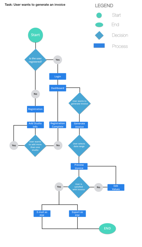
A user flow is a user experience design artefact that maps out all the actions users can take to achieve a goal in your product or service. We can create a user flow diagram to:

  • Describe the decisions of users in a system
  • Demonstrate the logic flow of a whole product/service
  • Simplify complicated processes and workflows
  • Create a shared language among designers, developers, and project owners
  • Speed up the experience design process by building as a base for other steps such as information architecture or user interface design
User flow diagram example

It is an essential ingredient that puts users right in the centre of an experience design process and helps us create well-articulated products. What’s more, regardless of how complicated the design is going to be, only a few basic components are enough. Let’s have a quick look at them:

How do you create a user flow?

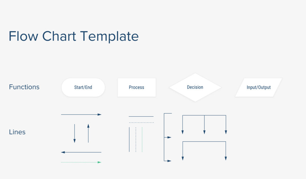
User flow components are created by basic shapes and elements like boxes, squares or arrows. When you understand what each component represents, it is a very simple process:

  • Decision node: Represented by a diamond shape, decision nodes are used to represent conditional situations
  • User action: Represented by a square, a user action describes a basic task, action or a process that users can take
  • Arrows: Connector lines that indicate directional flow 
  • Input/Output: Represented by a parallelogram, these nodes function as user input or system output
User flow diagram components

A wide range of possibilities 

Using such basic components, you can create user flows all the way from simple processes like setting an alarm clock on your mobile phone to more complicated actions like conducting a search on an e-commerce website. To give you an idea, let’s simply write down the steps a user takes when she wants to read an article online in a logical way. The user

  1. Enters the website
  2. Scrolls through the feed
  3. Searches for an article
  4. Clicks on & reads an article
  5. Highlights important sentences
  6. Likes and saves the article
  7. And exits the page

If this sounds too simple for your business, we’ll kindly urge you to think about a scenario where a user wants to purchase flight tickets for her family. Imagine that you have to create a user flow for this specific case: There will be 4 adults, 2 children, and an infant traveling; one of them is a light traveler who likes to travel with a backpack whereas another one has 2 luggage weighing above 40 kgs. One family member will need special assistance. One of them happens to be on the outgoing flight, but not on the return flight. One of them is vegetarian, another one has gluten intolerance while one is allergic to peanuts. On top of that, throw in an aviation restriction that prevents passengers from selecting seats near the exit doors…

This is actually a real-life example —one of the many, many cases— we have currently been working on for the redesign of an airline company’s digital product. It is just a sample of the tremendous amounts of possibilities we consider when designing experiences. (Yes, we are perfectionists and we take our jobs very seriously.) When things get complicated at a very high level, the value of user flows becomes more and more apparent. If you do not take the time to simplify and visualize such complex systems, it is almost inevitable to make costly, structural mistakes. In this manner, user flows’ importance is not a subject of debate for us.

Benefits of creating a user flow diagram

Besides the obvious advantages such as its simplicity and flexibility, there are very solid reasons why we love creating a user flow diagram so much and strive for utilizing it at the early stages of product development. 

One of the greatest benefits of user flows is allowing teams to work on a project simultaneously. After agreeing upon the user flow diagram with our project owners, both parties start working on their areas of expertise. While we start to build content architecture onto the flows, developer teams can start building the code structure. This way, developers start working on the project way before they even see the wireframes. In this manner, providing a shared structure to work on together reduces the time to finish the project significantly. 

Having a user flow diagram also keeps the channels of dialogue open, enabling two different teams to work as one unit. This is an incredibly valuable aspect when you think about how much information tends to get lost in translation between project teams. In one of their articles Nielsen Norman Group points out:

“In addition to being a useful form of communication with project stakeholders and developers, flows also work well as a tool for collaboration between team members. Especially in Agile environments, being able to collaborate and communicate well among a cross-functional team is critical.” 

When we have open communication, clear understanding and alignment between parties, we can oversee the prospective flaws and interfere quickly before a small problem turns into a big avalanche in the next steps of the development cycle.

As a digital experience design studio, our job is to make sure that the product or service offers an exceptional experience to users for every path that they might take. And we do our best work when we are aligned with our clients’ business goals, understand the users thoroughly, and visualize how they might navigate through a digital product. Creating a user flow is one of the best possible UX methods to do just that.

UX in e-commerce: Horizontally bound vertical blocks

Here is the root cause of the friction in digital transformation projects: For over 100 years, we’ve created siloed companies with defined task forces, namely departments, to conduct their operations with autonomy. We’ve directed all our effort on departmentalisation and hierarchy, and as a result, we got pyramid-shaped organisational charts with lots of layers. But, upon shifting our mindset and channelling our energy towards what users and customers actually need, we concluded that digital transformation is only possible if we carry out horizontal work, encompassing all the layers. And that’s when the problem started, and we tried to transform the vertically-structured companies horizontally. 

Connected divisions

Likewise, it makes sense to view digital e-commerce products with a similar modular perspective. Essentially, there are four principal blocks in each product: 

  • Homepage
  • Listing page
  • Product page
  • Check-out funnel

The idea is to treat them as compartments and, if possible, assign a product team to each one of them. By doing that vertically, all teams can run towards a single goal while having the autonomy to experiment and optimise their “products”. But, it is also notable that the navigation, the consistency between the blocks and the overall UX Strategy must persist throughout the product; otherwise, it’s likely to have unification issues where users could not figure out the logic in the system. Thus, the same vertical approach is legitimate to compartmentalise e-commerce products, but learning from the past hurdles, we have to employ complex ways in which we can maintain the connection in terms of user experience between the blocks.

From a UX perspective, there are three points that need to be highlighted in order to optimize the performance of each block:

  • It’s easier to think of each block as a separate product. This way, the focus can be amplified, and besides the ultimate goal, each team can own and spend time on the metric that matters for their product. If the product is a homepage, the team can direct more users to product pages. Or, if a listing page is the case, then the team can solely focus on filter usage or add-to-cart shortcut on the product cards.
  • Rules and connections defined in information architecture should be kept in mind since it is easy to lose track when assigning teams to each block. You need an eye out for consistency, acting as a spectator during the optimisation process.
  • While going after a north star metric or any vital indicators for a product, turning a blind eye to what users need is something we often see once we start auditing digital products. Once you lose your users in this vertical, it quickly becomes a costly operation to retain them. Competition in the e-commerce landscape is fierce and incessant, therefore each mistake is almost irreversible if you become business-oriented. 

An idea or a product

If you’re on the verge of creating a new e-commerce product, that’s fine. It would be best to start with the things that may fundamentally affect the whole system, which should be taken care of horizontally at the ideation stage.

  • What is your promise? 
  • How do your online and offline services talk to each other? 
  • What are your competitive advantages?
  • How are they embodied in your digital product? 

Principles and building tenets of your strategy basically are the first things to be sorted out. Because only this way you can see and sort out the things that will help you grow your business while keeping your users happy. 

You can only envision a holistic service that is engineered over your strategy at each level unless you map out these details on day one. These details will be the horizontal reflections that are engraved in your navigation functionality, content, the overall interaction approach you choose to embrace. 

The characteristics that identify a brand, according to their interaction with the customers, greatly influence personas. When we focus on a new product, we start off by matching essential personas with analytics data to first answer high-level questions.

If there is an ongoing process to improve your product, then the rules change a bit, and the tactics to be employed depends on a few factors. 

  • Do you follow a UX strategy? 
  • Do you have a UI library to render consistency? 
  • Is there any change in your roadmap that may affect your relationship with your users? 

All these questions aim to achieve one thing before generating hypotheses to optimize a product. 

  • How far can a team go? 

Drawing from experience, we’ve had projects that belong to one of those two categories, new & established products. We created brand-new e-commerce products from scratch, and the first question we fired was what is (y)our goal? Do we want to show as many products as possible? Or is our goal to take users to a payment page with the quickest route? It all goes back to day one, where you conceptualised your business. Who you are as a business, and where is your strength comes from. 

At the other end of the spectrum, we nose-dived into projects with a fully functioning product that needs to be optimised. At those encounters, we first elicited the main KPIs, created a backlog and moved along with a product team to develop solutions aligned with the overall strategy. Simply acting vertically as we welcomed the business reality, thinking horizontally. 

Consensus on strategy

Apart from the tactics, the key thing is always keeping both external and internal teams on the same page regarding the overall strategy. As consultants, we are the ones that broadcast warnings over consistency issues. Given that the vertical structure of teams is an invitation to rapid testing, it’s also relatively easy for each team to get way too focused on the piece of the puzzle in their hand. An external eye is needed there to oversee the integrity of the whole picture and to intercept when a piece seems like it doesn’t fit. Besides, someone is also required to organise a plan to take users’ opinions into account and ensure their voice is heard. After all, a horizontal approach to solving UX issues and engineering improvements in core features turns into a necessity to consolidate every vertical block’s understanding of the business. 

In conclusion, creating and working on vertical blocks of your e-commerce product will facilitate the experimentation process. Yet, each team must be in unison when it comes to the horizontal connectedness of the product. A butterfly may flap its wings, and all of a sudden, you see your users flocking into your competitor’s products unless you keep your horizontal factors in sight.

Feedback or didn’t happen: How we use VoC solutions?

It’s just like drinking-2-litres-of-water-per-day case all over again. Everyone seems to agree about it, but the majority does not care much to follow it in their daily life. Similarly, if you are a product person, you’ll be harshly lashed out if you say anything against collecting feedback from end-users, even though you have no interest in giving your users a voice.

Let’s stop here for a moment and take a look at the logic behind it. Why is it so critical to gather user opinion?

Despite the numerous benefits of having daily harvested feedback from your users, feedback collection comes into the picture with two essential questions:

  1. How to collect feedback?
  2. How to use feedback?

First one is relatively easy to answer. You either create a team & department with a growth mindset or consult someone to learn the intricacies of collecting opinions. In our case, we’re the ones who can teach you the intricacies.

It’s quite rare to come across a project owner who needs help with implementing VoC tools or analyzing the collated data. It’s more like there is a project to be completed and we are the crusaders to bring the idea of gathering user feedback to the table.

There is a stark difference between those who understand the importance of what users think and those who try to trim any UX research resources assigned to a specific project. To be honest, it’s utterly unspeakable to bring forward such an idea, cutting of UX research from a project plan, which could be also framed as I-do-not-care-what-my-users-think-or-feel. But, we see it and we circumvent it at any cost.

You still may ask how to collect it. Let us explain: It’s easy.

We use well-known tools like Hotjar or Usabilla to seamlessly integrate the UX research phase of our design methodology into projects. We configure polls, surveys and keep the pulse of user behaviour directly and consistently to develop stories, features and eventually products built upon user needs. Regardless of the context, the steps are as follows:

  • Find a problem or question to investigate
  • Determine who is your audience 
  • Employ the right tool & logic
  • Build a feedback loop
  • Decipher the results
  • Turn them into actionable backlog items

If it is all done, then we can move onto the second question. How to use feedback? 

Even though it’s an undeniable fact that you need feedback in each and every step of your product lifecycle, using feedback in a meaningful way requires planning and structure. You first need to frame your effort with a purpose: Why do you need feedback?

→ Feedback for product development

Great, then you need to specifically target pre-defined segments or cohorts and a set of features to choose your collection method. You should be methodical about sifting through collected answers with a prioritization framework. And, you need to configure a way to knit your ideas and user requests together to build a product that creates value while helping you reach your business goals.

→ Feedback for anomaly detection

Understandable. It’s never easy to concurrently design a product and launch something bug freely. Plus, the more the merrier in Quality Assurrance, right. Then, roll your sleeves up and help your users understand that their contribution is highly valued and making their product bulletproof. You may think of a way to reward them too. Just remember that your developers have also life and the collected feedback does not necessarily mean anything. Therefore, craft a way to pop your questions at the right time with the right tool. If you need help to kickstart, do not hesitate to get in touch with experts.

→ Feedback for customer relations

How can you separate B2C products from B2B products? Simple, take a look at the average support time spent on a user account.

If you’re operating a B2B product, you must definitely give your users an open channel, because their loss would shake things up depending on their share in your financial charts. You need to value them by simply asking for their opinions and feelings regularly, also you probably should create customized solutions based on their ideas. In the meantime, the crucial thing for you is not to be entangled with the size of the feedback you collect and to stay on track when it comes following your roadmap. While keeping your users happy by giving ear to their opinions, you must act to ward off any gibberish that reaches to you. That means you need an intricate, more complex feedback mechanism that might have logical jumps and in-depth functionality to automatically assess the quality of given feedback. To create such a practice, you need someone who knows your product top to bottom and the questions that have been asked frequently.


As for the conclusion, one thing became very clear: You need feedback to outcompete the competition. I reckon there are many more noble purposes to collect feedback, but this is what we do fairly regularly to help our project owners with giving their users a voice.

If you think it would help you listen to your users, for any reason at all, then let’s have a talk about how you can do it.

The Last IA Master: Ben Terrett

There are some websites with heavy content and complex navigation structures. Before you visit them, you feel anxious about whether you’ll find what you’re looking at a glance. But once you start browsing, you experience a seamless information architecture intelligently designed and executed. My suggestion best case for those kinds of websites is gov.uk: UK Government’s Public Sector Information Website.

When I started investigating about the story of a single domain including 25 ministerial departments, 407 other agencies, and public bodies’ content, I found out that behind the scenes of this impressive digital transformation story lays down the initiative taken by the a.k.a “Digital Champion” Martha Lane Fox’s famous report named “Directgov 2010 and beyond: revolution, not evolution” targeting directly the UK Cabinet, emphasizing the need for a radical change in the way the UK Government digitally communicates. This report and the marginal economic gains proposed to the Cabinet were so clear and impactful that no one could stay still, and showing that one simple fact, well-told was enough to direct the rider, to motivate the elephant. Shaping the path was the next step. Government asked for feasibility on a huge project from GDS (Governmental Digital Services) with two simple but hard to achieve goals:

  1. To test, in public, a prototype of a new, single UK Government website.
  2. To design & build a UK Government website using open, agile, multi-disciplinary product development techniques and technologies, shaped by an obsession with meeting user needs.

With a bit of luck and the help of my dear friends (in this case, Kerem Alper) I had the chance to meet the man, the captain leading the team at the hardest times of this massive project: Ben Terrett, Head of Design @GDS 2011-2015. The story he shared with me was so inspiring and interesting that together we decided to publish it in Turkish at SHERPA’s Blog and in English at SHERPA website.  

If you don’t know Ben yet, I’ll guarantee that you’ll be more than glad to know him. If you do know him already, you’ll find the chance to read about the behind-the-scenes of Gov.uk’s digital transformation, as well as actionable insights from Ben on design and product & team culture. So everyone will find something useful in this interview.


Not only being the one leading this transformation from 2011 to 2015 as the Head of Design @GDS, but Ben also has a really impressive professional background. Now he is the CEO of a Digital Transformation Agency, Public Digital, operating globally, where they help other world governments digitally transform. 

Once we met, my first question was:

“You led a multi-disciplinary design team working across government on GOV.UK, and furthermore you joined the Cabinet Office when GDS was set up to deliver the recommendations in Martha Lane Fox’s “Digital by Default” report. How did you manage to put all of these into your basket? What is your secret sauce?” 

Ben replied: 

“Very kind, thank you. No secret sauce. I’m a designer and I do my hobby for a living which is a privilege. If I had to offer any advice it would be to always do things that interest you, to say yes more than no and to not be afraid of new opportunities. Take some risks. And always remember to focus on the quality of the work. If that’s good everything else will fall into place..” 

Right after that answer, knowing how hard is to gain the RDI, Royal Designers for Industry title (he holds) as a designer, I asked him to enlighten me about the application procedure, requirements, and evaluation policies. He stated:

“It’s a real honor. I feel incredibly humbled as the other Royal Designers are incredible. I’ve since found out that everyone thinks that, even the most famous of the RDIs. There are only ever 200 RDIs at once and every year they get together and vote for new designers to receive the honor and join the group. Generally, they are looking for years of sustained excellence, design work that has improved the lives of others and a commitment to something like design education. Having now sat through a nomination and voting meeting I know how hard it is to meet that criteria. You don’t apply you get nominated, so it really is an honor.”

I confess that if someone had asked me to lead the design team whose responsibility would have been “the digital transformation of the UK’s public sector information” I’d be terrified at first. So I wondered how Ben felt when he was asked to lead this massive project. He replied: 

“Simply to keep focused on the user need. To use design in a very functional way and not let traditional graphic design or marketing get in the way. To strip everything back and focus on getting tasks done online. I knew we would need a very strong typographic style and that a visual identity would come from being strict with simplicity. This blog post is a good example of that approach https://gds.blog.gov.uk/2013/06/18/retiring-our-icons/

I also wanted it to feel British with any nationalistic overtones. The New Transport typeface used on the UK road signs allowed us to achieve that. The designers Margaret Calvert and Kenneth Grange were very early inspirations for the project. Design-wise, it has a very modernist philosophy.”

https://gds.blog.gov.uk/wp-content/uploads/sites/60/2012/01/new2.png

Taking strength from Ben’s (to be respected) modesty, I could not restrain my curiosity and asked the question that its answer is probably the anticipated:

“To overcome the ever-growing requirements, never-ending scope changes, exhausting design feedback cycles and time pressure, what kind of design methodology you used to?” 

The answer was shorter and clearer than I expected: 

“The design process will be familiar to anyone who works in an agile, digital product environment. I wrote about it here.” https://gds.blog.gov.uk/2014/07/18/whats-the-design-process-at-gds/

I knew that gov.uk launched in beta form in 2012 and replaced hundreds of public sector sites. It has wrapped in ministerial departments including the Foreign Office and the Ministry of Defence and organizations such as the Driving Standards Agency and HM Revenue and Customs. Since its implementation, gov.uk has become a one-stop-shop for Government services in the UK, letting people register for a birth certificate, apply for UK citizenship or find out when the next Bank Holiday is, all in one place. Gov.uk has been hailed for its design – in 2013 it won a Black Pencil at the D&AD Awards and was named Design of the Year by the Design Museum. That is quite a success. 

However, I didn’t know the answer for, the “success criteria” of Ben. Did he succeed? He satisfied my curiosity: 

“I didn’t really have a personal criterion. At GDS we had a very strong team culture and we were really focused on building a single domain that meets user needs. I wanted the design to help and be a part of that. I also felt that we should have a world-class design team and a world-class design output. We were funded by public money so we owe it to citizens to do work of the highest quality. I think we achieved that but although the awards were great, it was never a factor in my thinking or ambition.”

It was clear the gov.uk project had a sophisticated audience while working on government digital assets since there are lots of different personae. There should have been massive user research process to conduct, loads of insights to collect. Right after smiling meaningfully he stated:

“That’s a whole other interview :)” 

And leaving the impression that user research was one of the hardest parts of the whole project deserving another stand-alone interview. 

He gave a strict “No” answer for my “Did you work on a more challenging project than Gov.uk in your professional design life?” question, and an inspiring another respond to my last “Which one you prefer: Being the hands-on designer or the one who manages the designers?” question: 

“I like making good design happen and I believe if you want to do that at scale you have to lead a team of designers. So I think the question answers itself. If you only ever do hands-on work you are limiting yourself and the impact your work can have.”

After listening to what Ben has achieved in the field of information architecture, I think that defining him as the “last information architecture master” can be a small but memorable indicator of my respect for his craft.

I’m really happy to meet you Ben.

Our path to good design: SHERPATH

Have you designed how you design?

We know it sounds like a nursery rhyme, but this is a question worth thinking about. If you are looking for a digital studio to support you in your design processes, ask the candidates’ representatives this question first. Let us tell you why.

The concept of design is so prevalent in today’s business world that it can not be defined only by adjectives such as creative, aesthetic and beautiful. This phenomenon is a result of the fame that design thinking has gained worldwide. 

When we look back, we see that design used to come after engineering and production in a hierarchical sense and it was perceived as the last step before the launch to make the product more aesthetic. We know that this has resulted in many innovations failing to meet customers’ actual needs. Only after companies began to move the design phase to the beginning of the production process, designers’ impact increased significantly and human-centred solutions started to come to the table. 

Of course, for this approach to be accepted and used across large companies, it had to fit into a certain model or framework. This is how design thinking, the framework leveraging creative design process for solving business problems, has earned its much deserved popularity.

Design Thinking Diagram

The diagram was designed by Nielsen Norman Group. 

This is what the cycle you see above tells in a nutshell: First, empathize with the audience and identify their needs/problems correctly. Next, come up with ideas that would meet these needs and test the validity of the solution you are leaning towards. Once the implementation is done, go back to the first step and start again.

What makes this approach -and therefore the concept of design- so valuable is that it is not limited to the business context alone. You can also use this methodology when you have an important decision to make in your personal life.

SHERPATH

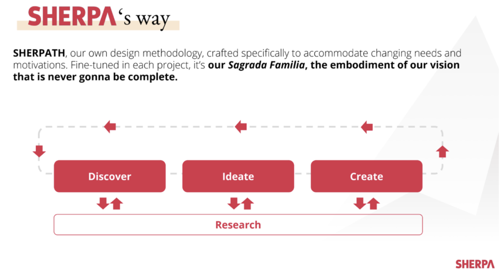
This methodology inspired us to embrace the motto “Everything is design” here at SHERPA. Unlike those who dream of an alluring visual interface when design is mentioned, we think of systems and methodologies. Although our final output as a digital design studio is often a Photoshop or Sketch file, we are aware that what we call design is a process and that we cannot ensure the quality and sustainability of our work unless we have an accurate design methodology in place. This is why we came up with SHERPATH.

We applied this lean approach, inspired by globally accepted principles and models, in more than a hundred projects and made several iterations to increase its efficiency. 

The logic of our methodology is in line with design thinking. Regardless of project scope, we begin with the Discovery phase and ask three basic questions: 

  • What goals do we want to achieve? 
  • What are our constraints?
  • What can we further improve?

 We don’t continue the process without agreeing on the answers with the project owner.

We begin the Discovery phase by analysing research reports that our project owner shares with us so that we can take advantage of the existing insights and not dig for the answers that are readily available. Next, we conduct qualitative/quantitative data analysis and deepen our insight pool by analyzing data from measurement tools are set up on digital products and by interviewing stakeholders/users.

After the Discovery phase, we start the conceptual process of design we call Ideation. By asking questions like:

  • How do we define our personas?
  • What should their ideal journey look like?

We define the right design solution. Let’s highlight that we still don’t have design deliverable (in the classic sense) at this point.

In the third stage, Creation, we are interested in answering the question “how do we design it right?”. We work on the wireframe and UI designs in this direction and reveal the visible part of the iceberg.

Finally, as you can see in the diagram, activities in the research phase can come into the picture any point in the cycle. While research conducted in the Discovery phase aims to bring new insights on users to the table, a usability test following wireframe design might allow us to validate or debunk our design logic.

Digital transformation with SHERPATH

Let us tell you about one of the success stories we have created with SHERPATH.

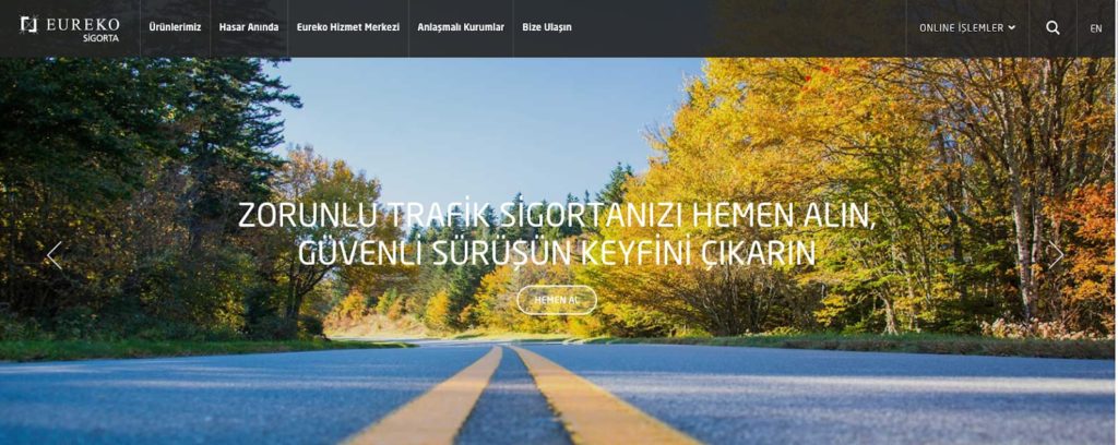
In 2018, we partnered with Eureko Insurance, a subsidiary of globally known insurance group Achmea, for redesigning the user experience of their corporate website and online branch.

Ethnographic research conducted recently and workshops we run during Discovery phase with target personae and the project owner revealed that users had a hard time while browsing and buying insurance policies online, and the main reason for that they find the insurance ecosystem in Turkey very complicated, far from creating a perception of trust. 

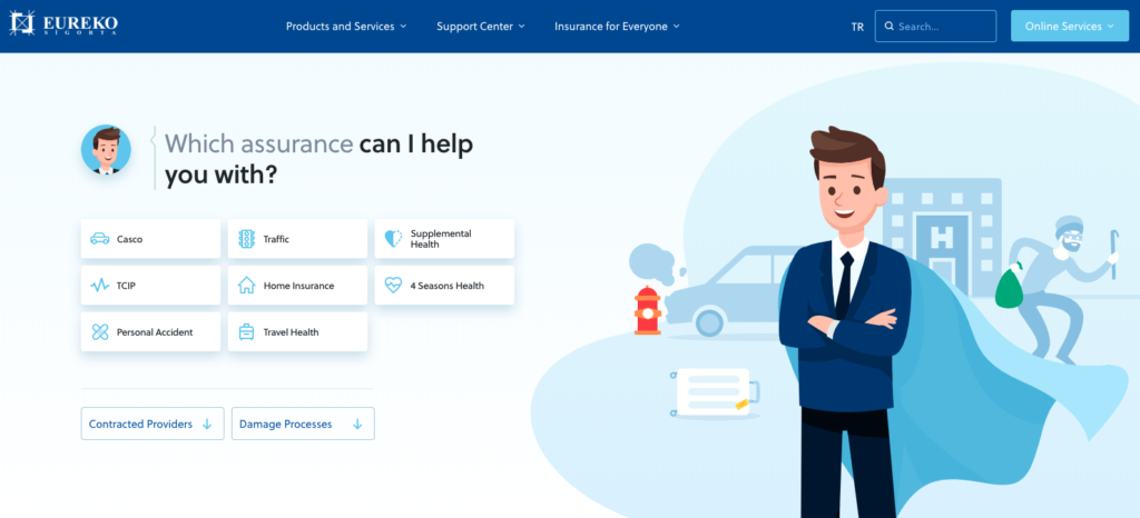
Building on this insight, we worked on several approaches to address this problem during Ideation and we decided to position Eureko as a “hero brand” guiding users during every step of the journey by accurately describing the benefits of buying an insurance policy and the nuances among various products rather than focusing on hastily closing a sale. 

In the Creation phase, we worked on a design solution that would communicate this approach clearly to the users and designed the information architecture that would allow them to find what they need easily.

We prototyped and tested alternative interaction scenarios with users and decided to move on with “conversational UI” approach that felt very familiar to users who communicate through digital devices on a daily basis. Most participants validated the idea that buying insurance by chatting with a virtual assistant would feel more natural and hassle-free compared to filling out conventional forms.

To sum up, defining user needs through quantitative and qualitative research and validating alternative solutions with potential users, we were able to manage Eureko’s transformation with a user-centric approach.

Last but not least, as SHERPATH highlights, it is crucial to revisit the Discovery phase after the new experience has put in place. Restarting the design cycle and measuring the new experience’s performance based on users’ digital footprints is what makes UX optimization possible.  

To conclude, digital products/services that are designed with “we know best” mentality and ready-made solutions are highly likely to stay behind the competition. A design partner equipped with a design system of global standards  -whether its name is as cool as SHERPATH or not- would be much more likely to create solutions that would make you and your users happy.

Applying design thinking is imperative for standardizing creative processes and enabling sustainability in terms of design quality. This is why our best advice would be to ask your potential design partner this question: “Have you designed how you design?”

Can digital products achieve human-like communication?

Think about the digital products and services you love. They all have one thing in common: Humanlike communication skills that make you smile from time to time. This is an indication of two things: How passionate the designers of the product were and how the products that aim to make us feel good, can easily stand out from their competitors.

In the field of information technology, the reality is no secret: The primary element that determines the quality of the user experience is the communication that a product or service establishes with its users. In the case of digital products and services, UI copy is the focus of this approach, which points to a completely different type of communication from brand or marketing communication. This subject has been frequently mentioned in recent years as the concept of microcopy, which has become prominent thanks to investments from Google, Dropbox, Slack, Uber, Facebook, and many other global companies.

What is Microcopy?

Short, clear, guiding, and occasionally humorous interface texts. It is one of the main components of user experience design, content design, or UX writing as it is known in the US. Microcopies enable users to interact with a product or service.

Kinneret Yifrah, the founder of the Israeli-based microcopy studio Nemala and author of the book titles Microcopy: The Complete Guide, simply identifies microcopy as follows: 

“Microcopy is the words or phrases in the user interface that are directly related to the actions a user takes. It may be content that the user encounters before, during, and after taking action on a digital interface. For example; onboarding content, button texts, content in registration and login forms, error messages and error prompts, messages directed to sign up for email, user tips, confirmation messages, and much more.”

When you open a new document on Dropbox Paper, it welcomes you with humorous microcopy examples that allow you to connect emotionally with the product.

Why is it essential for a digital product to communicate with users?

The microcopy, which plays a role in every aspect of user experience, is one of the key elements which ensure the user experiences a seamless flow. What makes it so important is that new technologies that enter the market have increased the expectations for interfaces that almost everyone can intuitively use. Therefore, microcopy, which has the potential to cause frustration or confusion in users, also has the power to make your product indispensable. Through a well-designed microcopy, a product can communicate with users in a more humanlike, understandable, and motivating to take action.

Why is it vital for a digital product to interact with its users in a humanlike manner?

The answer to this question is given by Professor Clifford Nass of Stanford University in his book: The Man Who Lied to His Laptop – a collection of more than 100 experiments that explored the relationship between people and computers. According to one of the striking findings of the research, as users, we expect digital interfaces to act according to human social norms. So much so that we are surprisingly disappointed when this expectation does not materialize. It can even break our hearts. What’s more, we can be very angry with the digital interfaces that communicate with us in a technical language specific to machines. After all, until a few years ago when we saw an error message, we would try to solve it by hitting the computer tower. So how does microcopy prevent these heartbreaks?

Digital products and services with personality

According to the archetype theory developed by Carl Gustav Jung, the founder of analytical psychology; the archetypes, which define the personality structure of human beings, are universal themes that exist in our subconscious, independent of language and culture. Each of us makes contact with other people through these themes that determine our personality and behavior. Brand personality studies based on this theory simply tell us the same thing: People relate to the products you offer to them through the archetypes that determine your brand and therefore, the personality of your product. As a result, what allows users to embrace your product is the personality of the product before its features. So how does a product have a personality?

Whether the content is text, voice, visual, or all of them; each interface content needs a personality. This is when microcopy (and the UX Writer as it is) comes in handy. Let’s return to our question: How can a product have a personality? Up to this point, what is clear is that product to have a personality is possible through a humanlike communication with users. And what is human communication?

Spoken vs. Written English

Not until a few years ago, there was an apparent distinction between the language we used in written communication and the language we used in oral communication. As we all know, the written language is much more formal: We often build longer and more complex sentences, which are usually composed of words that we do not use in face to face communication. The language we use in speaking is much more dynamic: we prefer short sentences of common words that people can easily understand. In other words, speaking is much more concise, simple, and more fluid.

The internet, which has changed many things in our lives, has blurred the sharp distinction between these two languages. Because the words we express in writing on the internet are often part of a dialogue. Digital products and services that evolve with internet technologies actually establish a dialogue with their users. They ask users some questions, and as users, we either fill up a form or click on a button. It is a written dialogue rather than written communication. Erika Hall, the author of the book Conversational Design, summarizes it this way: “The traditional categorization between the language of writing and the spoken language has collapsed, and a third option has emerged; conversational writing.”

Relationship of conversational writing and microcopy

Conversational writing is a written communication form, primarily mimics a conversation. Of course, this is not a real dialogue, but a product with this approach naturally speaks directly to the user. As with talking face to face, it establishes a short, concise, and sometimes humorous communication. It uses everyday words that make speech fluent.

Let’s explain this with an example: If you like a song on Spotify and then undo it, the following message appears: “Let’s pretend that never happened.”

This example may bring up the question of whether conversational writing is suitable for more complex systems. Complex systems mean; products and services such as ERP, CRM, function-oriented interfaces, or digital interfaces of banks and insurance companies that communicate in a more professional tone.

Let’s continue with another example: SAP, a well-established company that has built many complex systems so far, in recent years, has begun to write in conversational writing and as a result, began to communicate with its users as humans rather than machines.

What used to be “the new backend service has been written into the application settings and requires manual activation.” has become “You have switched to a new backend service. Go to app settings and tap Activate.” and thanks to this change, it has become easier to understand and follow. We can see that the basic approach of SAP has evolved into a language that speaks directly to the user by using you/us instead of a passive structure. The technical expression “(it) requires manual activation” becomes brief and straightforward “tap Activate“.

Professional system users need the guidance that facilitates the lives of digital interfaces, which they interact with, just like any other user, without having to communicate with a more complex language than they already are. In other words, in all circumstances, you should help users better understand your product more easily. And this is possible through humanitarian, understandable, motivating and sometimes humorous communication.

What does a better microcopy add to your business?

A better microcopy gives the users very few reasons to leave your product and gives more reasons to take action. This implies a scenario where fewer users stop using your product, and more and more of them continue to use your product. In other words, it means more customers, more successful transactions, higher conversion rates, and naturally more revenue. Not to mention the fact that your users trust your brand more.

Conclusion

Ten years ago, smartphones were hardly ever in our lives. Today, chatbots and IoT devices are a natural part of our daily lives. As these technologies become widespread, the need for a product or service to communicate with its users is going to become more prominent. It is a priority for all of us (especially product and service designers) to better understand and implement the microcopy’s place in the user experience design processes.

SHERPA named top creative and design agency in Turkey by Clutch

A masterful digital presence is key to any successful business venture. Perhaps you’re in the real-estate sector and need a resourceful website for all of your listings.  Or maybe, you’re in the nonprofit space and need a powerful cloud-based CRM to manage all of your donations. Either way, making the technical component of your business as seamless as possible for your external stakeholders is vital for the longevity of your company.

SHERPA is a state-of-the-art digital experience studio with seasoned problem-solvers, client-focused personnel, and knowledgeable designers come together to provide the best experience possible.

Clutch

We specialize in UX analytics, UX research, UX strategy, and UI/UX design, among several other capabilities.

In light of our success, we’ve been named one of the best design services in Turkey by Clutch! We’d like to take this opportunity to thank our wonderful clients for participating in one-on-one interviews on our behalf! In reflection of that feedback, we’ve scored an amazing 4.9 out of 5 stars!

Once again thank you to our clients and to Clutch for making this award possible. Please drop us a line if you’d like help bringing your design dreams to life! 

Biomimicry: A sustainable world already exists

“If I could reveal anything that is hidden from us, at least in modern cultures, it would be to reveal something that we’ve forgotten, that we used to know as well as we knew our names. And that is that we live in a competent universe, that we are part of a brilliant planet, and that we are surrounded by genius.”

This 2009 TED talk opening statement belongs to the biologist, author, innovation consultant and self-titled “nature nerd” Janine Benyus, who gave this talk titled “Biomimicry in Action” and has done significant work in the field of biomimicry. As Benyus has stated, biomimicry reminds us of the fact that we all know naturally, yet many of us are not aware of today.

Nowadays, there are a lot of discussions about product and service design, architecture, and new designs that are sustainable and functional. The question of what should be a reference for designs that can adapt to severe changes, create awareness, and create a robust framework is still on the table. What is clear is that such designs require excellent inspiration and modified facts. The main question is why are we going in all different directions despite the fact that mother nature is there to inspire us?

Biomimicry, a nature-inspired design approach

Man, a creature with intellect, even if it is unintentional, has created significant sustainability problems for future generations – not too far from today. However, thankfully, specific solutions to each of these global challenges are all around us. If we are willing and ready to see, biomimicry, which comes from such a lean and staggering movement, is an approach that seeks sustainable solutions to human-made challenges by imitating the patterns and strategies of nature that have been tested in time. Its purpose is to create products – processes and policies – new ways of life – that are well adapted to life on earth in the long term.

In short, the basis of biomimicry, which is a nature-inspired design approach, lies in the idea that nature has already solved many of the problems we are facing today. Through scientific research, we have come to know that animals, plants, and microbes are excellent engineers. So, after billions of years of research and development failures became fossils, how can we deny the fact that what surrounds us today is ‘the secret to survival’?

“I think the biggest innovations of the 21st century will be at the intersection of biology and technology. A new era is beginning”.

Steve Jobs

Two basic missions of biomimicry

  • Experience: The concept of inspiration from nature as a whole comes with the experience of “evolution over a million years.” Various forces of nature have tested solutions developed for multiple processes of nature. By adding our research to this experience, we can achieve a perfect design solution.
  • Sustainability: Design based on biomimicry inspires solutions that are adaptable, visually compatible, and energy-efficient. Eventually, nature has also redesigned its processes for the same problem. Its reference is that this process, which is imitated over time, is effectively present. Nature has also optimized resource consumption in its natural processes. Thus, sustainability is ingrained in the development of designs from nature.

“Biomimicry is the conscious emulation on nature’s genius.” 

Janine Benyus

Four brilliant examples of biomimicry

Let’s embody the subject with four examples designed with biomimicry and converted into a product:

1. Velcro

Scott Camazine; Custom Medical Stock Photo

In 1941, after returning from his hunting trip in the Alps, the Swiss engineer George de Mestral noticed that his dog was covered with burdock burrs. Mestral examined one of these burrs with a microscope to discover that it had a simple hook design which made it easily lock on to furs and socks. After working on it for many years, he finally invented the velcro (or velcro tape), and in September 1955 he patented his invention. According to Benyus, this product is probably the most famous and commercially successful example of biomimicry.

2. Dew collection bottle

Michael & Patricia Fogden/Minden Pictures

The Namibian beetle which lives in the desert collects drinking water from fog, which hit his raised shell and flows into its mouth. Designed by Pak Kitae from Seoul National University of Technology, the “Dew Bank Bottle” mimics the Namibian insects’ water gathering system. The product condenses the dew in the morning and stores it in its chamber.

3. The mind of the hive manages the honeycomb

Temmuz Cam Arsiray; Krisztian Bocsi/Bloomberg

The bees are hardworking and quite agile animals. Despite limited brainpower, individuals can sense what the colony needs, and instinctively get to work. On the other hand, the problem with complicated human-made systems such as electricity grid is that separate divisions are unable to communicate and interact with each other.

Continue reading “Biomimicry: A sustainable world already exists”

Not versus, but together: Redefining collaboration with in-house UX teams

TL;DR: It’s even better when our clients have an in-house UX team. Yes, that’s right, because we know that the more the merrier. We know that diversity creates value. And we know that resource allocation requires flexibility. 

Building a diverse team 

The secret to building digital products is simple, having strong product teams. Culturally diverse, cross-functional teams are leading the hottest startups today. It’s a fact, and that’s for a reason. 

We all try to get feedback from external reviewers, even in our daily struggles. What do you think about this dress? Do you think I crossed a line? We intrinsically are inclined to gather feedback to move forward before making a decision, and applying the same logic into product development totally makes sense. Who would stand against the value of getting direct feedback or guidance from experts? After all, that’s why mentorship is so valuable, and that’s why astrology never loses its touch. 

In our case, as a team of UX experts, we strive to bring our unique experience to the table while collaborating with in-house product teams. In a sense, our collective memory is a repository for those who seek to find a relevant solution-set regarding their project. Being consultants, we work on multiple projects across several industries, which eventually unlocks a great opportunity; rapid testing of our solutions and fine-tuning every aspect of our work in a relatively short amount of time compared to an in-house team. Therefore, as practitioners, who “have been there before”,  we are able to catalyze a reaction fairly quickly than a product-specific team.  

On-demand talent

There is a universal constraint affecting all of our jobs. Limited resources vs. unlimited wants. To deal with the dilemma, we all make a decision about resolution. We either work on a large number of tasks while foregoing some level of details or spend time on a small number of tasks by simply disregarding the rest of the workload. So, as a result, we have trouble managing this trade-off and end up feeling that we’re not functioning properly. 

The same conundrum is also valid for a product team as well. The volume of items in a backlog can quickly reach alarming levels, requiring an expansion of the talent to deal with it. Yet, it might not be feasible growing headcount to handle work, because bringing talent without thoroughly considering the consequences might paralyze a team for a couple of reasons. 

  • First, it’s not easy to find the talent, period. Without spending an enormous amount of effort on talent acquisition, you’re not going to be able to form a team, coming from a relevant background to take care of your problems. You need someone who “has been there before.”
  • Second, you probably need a temporary solution to carry the work forward. You do not want to set anything on a stone if you do want to get financially tied up. That’s why interim teams come in handy to alleviate the pain stemming from an overfilled backlog. 

In other words, we shorten the time needed to find talent and soften the blow on your talent acquisition activities for a simple fact: we’re talented, we are relevant, and we’re only there as long as you need us. 

The vast spectrum of UX skills

From initial launch to late maturity stages, each milestone in a product’s lifecycle demands a different set of skills in order to meet user needs while growing the business. In fact, this the same reasoning behind the low ratio of founder CEOs we come across today. Creating a vision and defining a product strategy leaves its place to being profitable and cutting costs in the later stages of a business. As a natural outcome of this process, a need for new skillset gradually emerges. Similarly, the UX expertise you need changes in time while working on an idea. Instead of having high turnover rates to fill out gaps in skills, elite teams could come in to play to give a hand.

We are on a mission to understand users and find intricate ways to solve their problems, and the methods we utilize to do so are largely diversified. It would not be rational to expect all the necessary skills from a candidate or an embedded team. To cope with a skill deficiency or basically extend the level of UX maturity in a product team, external teams with flexible business models like DaaS can provide unique value as temporary remedies. 

In reality?

How about in reality? We’re more than happy to state that: it all checks out!

We’re working with Hepsiburada and their UX team over a year now. We’re iterating, testing and optimizing together to find the “right” solutions for “our” users. 

We’re a long-term partner of Arçelik, pioneering the future of home appliances for more than three years. And we’re doing it not only being an extension of the team but also working as an individual unit with autonomy thanks to DaaS and the vision brought forward by Arçelik.

There are also countless case studies and examples in the past that show how we were able to create value together working with in-house teams, joining our forces to understand users. 

It’s not in-house teams vs. digital studios any more. If you ask us, it was never the case in fact.  Let’s keep continue building diverse, cross-functional teams to give “our” users a voice and find the solutions that no one single-handedly would be able to do otherwise.