SHERPA & RST announces partnership!

The first step in solving a problem is to define it, right? We thought so, and that’s why we recently shipped a new productized service, UX Audit, for those who need UX experts to evaluate their digital products from a usability perspective.

As we mentioned before, we could not help but keep thinking about the next step ever since we first ideated on the UX Audit. We always wanted to expand the footprint of our analysis by integrating an array of different skills to help product owners even further. And today, we’re happy to announce that we’re one step closer to that goal. 

Drumroll please, meet our new service: Digital Check-up —brought to you by SHERPA and RST Software Masters!

We recently joined our forces with RST Software Masters to create the “ultimate audit” for digital products. Upon taking the initial steps towards building a long term partnership, we quickly realized that our perspective on creating better products aligns perfectly. Following this major breakthrough, we held a couple of ideation sessions with them on how we can ship a new service that would seal this partnership and let us work together collaboratively. 

After several meetings, we agreed upon the direction we must channel our efforts. Long story short, encapsulating the whole ideation process with RST Software Masters, If you can’t measure it, you can’t improve it. emerged as the main theme, heavily reflecting both teams’ understanding of creating sustainable and scalable solutions. Once we acknowledged that “click”, we rolled our sleeves together with RST to build a comprehensive service, covering all the bases from usability issues to code review and scalability performance.

So, what is it?

The short answer: We devised an audit service where you can get your hands on a report filled with findings from UX and development experts in 15 working days. 

The long answer: Please follow the link and learn more about this exciting service: https://rst.software/digital-checkup/

For those who haven’t had the chance to meet with RST Software Masters, we’d like to make a brief introduction while you are here.

RST Software Masters is a reliable software house from Poland with a team comprising of top experts. For over 20 years, they have been building, deploying, and developing advanced, highly scalable systems with agile methodologies.

They strive for excellence in programming to create the best products that deliver value to system users. They have more than 150 software engineers on board who work in a unique atmosphere to produce a system tailored to the customer’s needs.

In final words, our aim with this new service is to thoroughly evaluate a digital product to list all usability and performance issues in chase of better ROI of design & development investment. And we believe that it will make product owners and users happy.

How to conduct user interviews

A user interview is a semi-structured interview method generally used in the exploration stage of a project. Understanding potential users, their daily lives, and most importantly the context of goals and motivations of potential users are essential discovery areas for the researcher. 

What should I prepare for a user interview?

First, you can start by writing down what you’re trying to understand with the research, and the specific points you should understand deeply. 

Let’s say you’re conducting research to enhance the user experience of a call center intranet, and you have to understand the main purpose of using the call center interfaces, but can’t directly ask the participant this question. Instead, you can prepare your questions by providing a context.

  • “How do you start your conversation with the clients, and which screens are you using while you talk with them?” 
  • “Can you show me the process of mentioning critical parts and why they are so critical for you?”
  • “Now conversely, please think of, and tell me about a particular time when you used the tool, and it made you ineffective in your work.”
  • “Can you show me the process that made your call ineffective?”  

These questions are more appropriate for user interviews because they provide a context and ask participants a process they regularly do and think about.

Review your prepared questions before the interview process. Make sure to conduct a pilot interview with one of your teammates and test the questions. 

Why is a user interview important?

We need to understand our users, and the first thing to understand people is to empathize with them. Interviews provide a context to understand and evaluate the problems of the users. We can learn about the problems and challenges they’re facing directly from them. Therefore, we need to ask the right open-ended questions and listen to them.       

Moreover, user interviews are a rich source of information to feed personas and further research that is going to be carried out after the discovery phase. For example, in usability testing, we ask follow-up questions to the user to understand the motivation behind their actions or to understand the dominant emotion in the experience. We select the participants from different personas for usability testing, and the user interviews that we conducted in the discovery phase become very beneficial at this point.

How long should qualitative interviews last?

A user interview generally takes 30 minutes to 1 hour. As we can understand from the name, we don’t have a strict time limit to finish the interview. As long as the interview is fruitful, the researcher can extend the time according to the daily schedule.

How many user interviews should you do?

What are you researching, and which context are you researching for? Some researches should have a wider sampling size due to having a larger number of user profiles. According to the NN group, you should make at least 5 user interviews. One of the leading resources the NN group states that after 5 interviews the findings start to repeat itself. So we can safely assume that if there is nothing “extraordinary”, 5 interviews are enough to analyze the patterns of the users’ behavior. As a researcher, if you can’t find any patterns that are repeating itself, maybe you can add new interviews to your schedule.

As much as you practice research your empathy skills and also interview skills will improve. User interviews are the fastest way to learn about users’ motivations and pain points. You can also learn about the potential users and the contexts they seek. It’s important to inform the participants about the research you do and prepare the right questions to provide accurate and reliable data.

As the VP of NN Group says;

UX without users isn’t UX.

Hoa Loranger

5 Google Analytics tips to improve user experience

Time is one of our most valuable resources. And these user insights are not just about user experience. It provides indispensable data for startups, business owners, and marketers about user intent and how to optimize their digital products by addressing the most critical user pain points.

Based on practical ways; we will explain how to optimize your product for your users, share how to utilize Google Analytics to understand your users, and how to improve your product’s user experience with the following recommendations.

Ready?

Let’s start!

1. Site search insights

The “Site Search” section in Google Analytics can recognize significant areas of opportunity. The tool records that users composed into their own site searches. 

People who search for content or items on your site are more likely to consume that content or buy a product if they can find it on the first page of search results.

So these keywords from the behavior section in Google Analytics are telling you exactly what your users are looking for.

It means this is the GOLD.

In this section, we first need to recognize the following these:

  • Search Term: These are the words that users type into the search field on your website.
  • Start Page: These are the pages that your users start searching for.

This action lets you see a list of the search terms from your users that visited your website.

When you click the Ecommerce explorer option, you can see the words through which users made purchases.

And here are the start pages users searched for in this view: 

To get search trends, select “Search Terms” in the “Site Search” section and see all the actual words that are searched via your search field on your website.

Now here are the two things that I like to do in this step:

1. Select the “start page” as a secondary dimension. Now you can see the page visitors started searching.

2. Select “Exit Page” as a secondary dimension.

I know that if users leave the search results page, they cannot find what they actually need.

Gotcha!

There are two search terms that you can see who searched for something but just couldn’t find it. 🤔

Bonus action: 

  • Please try this on your own search bar on your website first.
  • If it’s a product or a category based keyword, then you can redirect this query directly to the relevant page. It’s a good start hah? 🙂
  • Decrease your interaction cost, suggest related searches, or auto-complete search queries to get better results.
  • Since you know that the data as your users’ pain point here is important for your users, you can use it both in your campaigns and in your SEO operations.

2. Product performance

You’ve achieved the dirty work of improved e-commerce up and running in Google Analytics. Now it’s time to take some action.

Whether you’re driving visitors to product pages via buying campaigns, retargeting, or some promotions on site, one of the most critical metrics is the percentage of add to cart actions. We call it “Cart-to-Detail Rate”.

Here is the quick way to see it in Google Analytics:
Conversions > Product Performance > and then click on the Shopping Behavior explorer option.

Bonus action: It will be useful to look at the products that fall below the average.
In the example above, although it is the eighth product with the highest revenue, we can see that the related product has a 0.48% Cart-to-Detail Rate.

OK. What should I do from here?

  1. Do you still have this product in stock? It may be helpful to check.
  2. Are there any major pricing issues, missing pictures, or description details?
  3. Bad reviews or minimal content around the product?
  4. When you check the page, what do you think could cause this result?

If you aren’t certain then on the minimal you may think to pause your campaign budget for this web page till you can develop a hypothesis around “why” that is appearing so poorly.

3. Email time of day performance

This insight will show you how to visualize sessions and transactions out of your emails.

Now please go to, In Google Analytics > Customization > Custom Reports > Create New Custom Report with the following settings:

You will see the report saved as below.

Also, you need to add sessions and transactions into your explorer tab shown in red:

The data shown over the 24 hour span of on a daily basis rolled up for the complete date range period. And you might have the table breakdown below the graph.

Insight action: How can you use this insight to your business?

  1. What is your average amount of time between send and opened mails? If a large percentage is opened within the first hour, you can try optimizing your emails for that time plan.
  2. What is your average amount of time between send and opened mails?
    If a large percentage is opened within the first hour, you can try optimizing your emails for that time plan.

4. Top converting content to improve internal linking 

Following the last few steps will help you identify the most popular way people are arriving at your site and navigating through. Executing these steps will help you capitalize on getting more visitors. 

The next logical insight is to effectively funnel this traffic into your primary goals or objectives to move your business metrics. 
And thank God, there’s a simple report buried deep that can help you connect these dots: 

  1. Go to your Goals > Reverse Goal Path section which is under the Conversions.
  2. Select the primary goal you’d like to view or analyze in this view.

Abra Kadabra: Now you’ll be able to see the previous pages people used before accomplishing your goal in your website. These show the pages your users were on before your goal converted.

Insight Action: You should lead the rest of your visitors from your popular pages to the pages that you’ve discovered which have the highest conversion numbers based on the primary action that you see.

5. Behavior flow

Behavior flow is a good resource to show your visitors’ moves on the website and where they went next. The report visualization is helpful for landing page optimization and to verify that your audience is viewing the best possible content.

And here’s what I like to do:

  1. On the top left corner of the Behavior Flow Reports, you can “Select a view type” and see the user flow according to content grouping, automatically grouped pages, events, or according to both pages & events.
  2. Let’s find out what each of the view types tells us.

Content grouping is a feature of Google Analytics that helps you to arrange your pages into specific segments so you can evaluate metrics aggregated under each group.

To see your content groups in your flow you need to first create your content grouping in your GA account.

Here is the quick way: admin >> view >> content grouping.

When you select “content grouping” in view type, the Behavior Flow Reports will show you a flow user navigates according to the content group you selected.

Conclusion

UX analytics is the first part of design-driven development. Sorry but it’s true, this is the first way to get more users to understand your users’ problems before running your ad campaigns. For this, you should first assign a meaning to your data and organize the things you see missing. Because raw data is meaningless. However, with this blog post —which you can access in 10 minutes— you can understand your users’ problems and create a more comfortable conversion path for them.

In our experience at SHERPA, many organizations do not have the ability to interpret the information they see in Google Analytics. Hope this content helps you develop insights based on your users’ footprints.

And best of all, all these insights are data-driven.

Accessibility in user experience design

Designing a seamless user experience for a product or service entails a thorough understanding of the people who will use it. This sometimes means conducting user research, creating personas, going through a quantitative user dataset, and so on. But there is a huge segment of people that designers may disregard when crafting an experience. Let’s briefly explore this usually overlooked concept called “Accessibility”, and see how we could use it in user experience design.

What is accessibility?

People with disabilities form one of the largest user groups in the world. According to a fact-sheet released by World Health Organization (WHO), there are over 1 billion —about 15% of the world’s population— have some form of disability. Accessibility is about designing products and services that people with disabilities can use with ease and joy. When we say we think about “disabilities” or “accessibility” when designing, people may think of visual impairment problems like color blindness, but disabilities actually vary quite a lot. According to the Centers for Disease Control and Prevention (CDC), which is the leading national public health institute of the United States, a person with a disability may have difficulty with the following:

  • Vision
  • Movement 
  • Thinking 
  • Remembering 
  • Learning 
  • Communicating 
  • Hearing 
  • Mental health 
  • Social relationships

How to design for accessibility?

As designers, we have the responsibility to encompass a wide range of people when it comes to building human-centered solutions. Here are a few things to keep in mind while designing products to be more user-friendly and inclusive:

Check contrast

According to WCAG (Web Content Accessibility Guidelines); for “normal” sized text or images of text, we should use the minimum contrast ratio of 4:5:1, and for “large” text (or images of large text), the minimum contrast ratio should be 3:1. We can easily check whether the typographic colors we use in our designs have enough contrast by online contrast checker tools for accessibility.

Have a persona with disabilities

We all love to create detailed user personas including their behavior, personality, goals, and motivations, favorite brands, activities, etc. but as Interaction Design Foundation also suggests, you can try to include a persona with a disability. This way, you could empathize with your users more, and understand the difficulties they may have to go through in their daily lives. 

Consider motor disabilities, too

According to nngroup, many users have difficulty using a mouse, touchpad, and keyboard when they require complex movements such as holding down multiple keys simultaneously:

Most of these issues should be taken care of by improved browser design and should not concern content designers except for the advice not to design imagemaps that require extremely precise mouse positioning. Client-side imagemaps will work even for users who cannot use a mouse at all: the browser should be able to move through the links under keyboard control.

Nielsen Norman Group

Ask yourself when designing for accessibility;

  • Have you included the extremes?
  • Can all customers see and understand the difference between your color preferences?
  • Can your users understand video content if there was no sound?
  • Have you provided image descriptions for the visually impaired?
  • Can users perceive the content? *
  • Can users use UI components and navigate the content? *
  • Can users understand the content? *
  • Can the content be consumed by a wide variety of browsers?

It is our responsibility to acknowledge and bear in mind that a diverse range of users will use the products and services we design. We should work towards developing the reflex to make the digital environment user friendly to all people regardless of their abilities.

4 misinterpretations about UX strategy

*This is a review article and most of the information is provided by Jamie Levy’s UX Strategy book. 

Long term value of UX development is crystal-clear but where does the UX Strategy fit in the big UX umbrella, and why do we need it?

UX strategy fits in between business strategy and UX Design; they are not directly interconnected, but they benefit from each other.

The term “UX strategy” first appeared on Indi Young’s Mental Models book (Levy, 2015). There are a lot of theoretical concepts for what UX strategy intends to do and why it matters but first we should understand what UX strategy is not. Understanding the misinterpretations provide a context to eliminate idle concepts about the subject and create a contrast.

UX strategy is not setting a north star

The north star is “fixed” in the sky when you look above at night. It’s not the brightest star in the galaxy and not in the Milkyway either. The north star analogy in the digital age can be a fixed goal that traditional large companies set for themselves. That goal is planned to accomplish in the long term, usually with a slow-paced team. However, what if your goal is to create a digital product in a market full of uncertainties? At this point, you need an agile methodology to develop that product which means you need to create the prototype, feedback loops, and iterate. According to this, you don’t need a north star, you need a flexible point that you can follow every time your product positioning changes.

UX strategy is not “a perfect way” to perform UX design

UX design and UX strategy are different things. When you create an experience, centered around the users’ needs, you create something for the real world. When you are building strategy, you are creating a context for the game that is going to be played. means that you are providing a roadmap where and how the design fits. UX strategy is a “product” for “user experience”. The first thing that UX strategists do is to assist stakeholders, conduct competitor and potential customer research for the product, and distill the results to produce a solid strategy. They also think about the product costs, pricing strategy, and how it is going to be differentiated for different customer segments.

UX strategy is not just a product strategy

We talked about the UX strategist role and how they make business decisions about the product and how they create a roadmap for the future requirements according to the context. According to this information, product strategy and UX strategy may look similar to you, however, they are as different as creating a real-world shopping experience and online shopping experience. The people who design the two different contexts encounter different issues to solve.

UX strategy goes beyond a single digital product or service. It is about uniting the whole online experience. There are dozens of services, platforms and products, and UX strategists interconnect all the digital interface ecosystems.

For example, if we think about Apple products; they carefully consider how the iMac, iPod, the physical Mac Store, iTunes, iCloud connect, and communicate with each other.

UX strategy is not the brand strategy 

Brand strategy decides who you reach and how you reach them with your brand message. UX strategy and brand strategy help each other become more reliable. A poor brand message may not decrease the value of UX, but a poor user experience can definitely decrease the brand value. A product needs good UX no matter what.

So what is the UX strategy? It is a process that should be prioritized before any creation (ex: design, development). It is a vision of a solution that needs to be validated with the real users to test what is needed and wanted in the market. It is a high-level plan for the product experience. This plan strategizes how you should go to the desired point by considering the current position. Therefore, a good strategy is mindful of weaknesses as well as strengths.

There are templates of Jeff Gothelf’s Lean UX Canvas and the UX Strategy Blueprint by Jim Kalbach. You can implement your strategy with these templates by recognizing risks, possibilities and problems.  They can also help to create a solid decision-making process for everyone in the team. 

As SHERPA, we build UX Strategy before we start our projects. We use our user-centered design canvas and UX strategy blueprint to create a roadmap and identify significant points for the project and also stakeholders.

UX Strategy Guide

References

What is a “Persona Workshop” and how do we use it at SHERPA?

When we talk with our project owners, stakeholders, or prospects; any professional related to customer relations or not, has a certain idea about who their product/service’s users are. Especially in bigger companies, they are very well aware of the various user segments in relation to their diverse range of products. 

However, these user segments are not sometimes boiled down to representative personas in order to empathize with their fears, motivations, pain points, or needs. There should be a twist in perspective that a website or an app of a company is one of its products and should be treated as so, rather than an eclectic unity of its all users of all products. 

Fortunately, we acknowledge that and help our clients to collaboratively uncover their “Personas” by focusing on their business goals and the UX vision we provide. We call it “Persona Workshop” and it consists of two quick stages. Let’s pore over how we carry it out at SHERPA.

Before the Persona Workshop: Qualitative research

As underlined above, user segments as tools are not solely enough to create personas, however, constitute a very good starting point. A quick wrap up is that defining user groups or market segments differs from creating a persona in terms of purpose and scope. Within the scope of market research, large user masses are categorized into user segments according to their qualities and their share in the market. This method is mostly used to detect the demand in the market during product development. Generally, the data provided by quantitative data collection methods are processed and statistical evaluations are made.

In contrast, a persona refers to a single user derived from qualitative insights to highlight certain details and important features of a group of users. The aim is to list the user’s habits, likes, needs, and pain points in such a way as to empathize with the single user in a way that the user experience designer as well as stakeholders can internalize it. The properties that are aimed to be met in the design process are determined accordingly.

We take these user segments into consideration to define representatives in terms of their age, gender, socio-economic or cultural status, location, or any other specific data. Before being able to render personas, we conduct one-on-one user interviews with representative users which we acquire from our User Database. Moreover, we gather all other data obtained from other channels such as Analytics, past reports, etc.

During the Persona Workshop: Collaborative production

After a qualitative analysis of user interviews and all kinds of data collected we provide a rich insights pool to analyze and synthesize in order to create personas for the product at hand. Three to four-person groups are formed to evaluate and build up personas by filling in the Persona Card provided by our team. In this collaborative exercise, our team members also participate and help in uncovering the actual needs, motivations, and pain points of the user and in manifesting these as a Persona. We support groups to produce personas as many as the insights at hand allow. At the end of the group sessions, a collective evaluation of the personas produced by all teams is taken and accordingly vital personas are set with a prioritization exercise. 

What to do next

When making strategic design decisions, feature optimizations, and prioritization of these features are taken into consideration according to the personas of the product/service at hand. Knowing about their personas, companies can determine their UX Strategy, work on User Journey Maps including different digital channels, or shape a tone of voice as a brand.

Usability test sample size

“How many users should we include in the usability test?” might be the question many of us have asked at least once; it is such a question that requires consideration of expertise and effort. On one hand, deciding on a way to approach the matter is dependent on one’s capability to handle the ways to do it; on the other, project limitations such as budget and time have to be taken into account as most of us do not have unlimited access to either of these. 

A simple answer to the question is, in fact, based on the statistical significance of a test which is the ability to explain the likelihood of an event not happening randomly. So if you set a significance level of 90%, it means that you are 90% confident that the results of the test you conducted can be explained by your hypothesis.

What affects the significance level is the test sample size, confidence level, and hypothesis type as the methods you will need to apply are based on these. When your hypothesis is built on your ability to find pain points of the users during a test, you can find how many users you need to test by deciding on how confident you want to be in the results. This is just a simple explanation of how a sample size can be found before a test is conducted at the most basic level. Since it is a prediction, as you might have noticed, we can refer to the whole process as inferring based on possibilities. Therefore it is to be noted that there are different methods for calculating the sample size depending on the distribution of the probability. Luckily, there are already analyses with actual data on the matter that let us not delve deep into the matter here but explore what kind of approaches are available to us.

Quantitative Usability Tests

An analysis on the matter sets a minimum of 20 users as a requirement for the test sample size if you want to conduct a quantitative study. There are strict conditions, however, regarding how the process of the test should be planned which results in a trade-off between statistical accuracy and cost in terms of effort and money. If you want to take this approach, make sure that you have the expertise and resources to see the test through.

Qualitative Usability Tests

Another analysis suggests that only 5 users are needed for a usability test by conducting a qualitative study. By doing so, the analyst argues that the benefit provided as opposed to the cost would be much higher since:

You don’t have to measure usability to improve it.

If you see your users, for example, struggling with navigating back to the page where they sign-up or place an order due to a design element, the matter of how much they have a hard time, loses its importance in terms of ability to capture pain points. If a sample size of 5 users has the probability of detecting the signals, you can allocate the remaining budget conducting more tests.

Do you really need a redesign?

As an experience design studio, we practice improving the user experience and creating design systems for a wide range of digital assets. We work with industry leaders using not-so-up-to-date intranet systems, affecting hundreds of their workers, which in turn results in the loss of huge sums of revenue. We see big travel companies with flawed booking flows that lose thousands in a single day, every day. We come across confusing information architectures that users cannot even know where exactly they are on a website, yet navigate through it. The reasons for the betterment of user experience or a complete redesign of the user interfaces are endless. But before allocating valuable resources for such big projects, do you really know what you need? Let’s start by defining some common yet mixed-up terms such as user experience design (UX design) and user interface design (UI design).

User experience design vs User interface design

Though the terms “user experience design” and “user interface design” are often used interchangeably, it can be said that they are some kind of umbrella terms for a wide variety of methodologies. As Interaction Design Foundation states;

“User experience (UX) design is the process design teams use to create products that provide meaningful and relevant experiences to users. This involves the design of the entire process of acquiring and integrating the product, including aspects of branding, design, usability, and function.”

It is the process of enhancing user satisfaction by improving usability and accessibility by putting the users at the center of every design decision. (see: human-centered design). If done well, human-centered design opens the doors for better digital products in which users can reach their goals easily, sometimes with joy—ultimately resulting in engagement and growth. 

While user experience design focuses on easing the life of the users, user interface design is more focused on how “it” looks:

User interface (UI) design is the process designers use to build interfaces in software or computerized devices, focusing on looks or style. Designers aim to create interfaces that users find easy to use and pleasurable. UI design refers to graphical user interfaces and other forms—e.g., voice-controlled interfaces.”

It is the visual component of the process, including grids, layouts, colour palettes, typography, and branding. It’s a good analogy to use the metaphor of a movie vs making a movie to understand the difference thoroughly: A movie is an end product you interact with, and it is designed in a way to make you feel in a certain way with moving pictures, music and dialogue. Whereas making a movie involves so many components such as art-direction, CGI effects, storyboards, casting, cinematography, etc. all these things collectively contribute and form the end product in a long time. It may take more than a year to produce just a 1-2 hour-long piece. 

Just like that, user experience (UX) design describes a collection of activities and methodologies in order to create experiences for the target audience. Everything from user research, user stories, system flows, content architecture, information architecture, wireframing, and prototyping falls under the umbrella of user experience (UX) design.

Most common reasons for a design project

In light of these definitions, let’s name a few common reasons why companies invest in user experience (UX) design and/or user interface design:

  • Websites that are tough to navigate 
  • Difficult-to-use applications
  • Repeating pages or actions in a flow resulting in frustration
  • Asking users too much and unnecessary information
  • Not giving clear directives
  • Old-fashioned or untrustworthy looks
  • Websites only designed for desktop
  • Poorly written content 
  • High bounce rates
  • Low sales and market share
  • Readability and accessibility issues 

First off, keep in mind that 88% of online consumers are less likely to return to a site after a bad experience. So, if you ask “OK, but where do I start?”, whatever your reason is, every meaningful design endeavour starts with the same: Listening and empathizing with your audience. Without gathering feedback from your audience, you should not define the nature of your project, whether it’s a redesign or optimization.

First, conduct your research and know your audience. Start by running user interviews, sending out online surveys, or at least tracking down your users’ clicks and taps to understand their intentions to see how big the issues are you need to deal with. In parallel, collect benchmark data and invest in marketing research. Understand how your competitors are moving in the market.

Components of a successful user experience design

Despite its importance, understanding the users is just the first step of this process, because influencing and affecting people’s emotions through design is no easy task. That is why we use below methodologies (and many more) in our process for a carefully thought out, well-crafted experiences:

  • User stories
    • The key to writing a User Story is avoiding details in the beginning stages of the project; creating a working environment where details can be added to the project in a timely manner and as needed.
  • User flows
    • A UX artefact that maps out all the actions users can take to achieve a goal in your product or service.
  • Content production
    • Text-based content or content in any form in a broader sense means the creation of qualified content for indirect marketing.
  • Information architecture
    • “Information architecture is about helping people understand their surroundings and find what they’re looking for, in the real world as well as online.”

“Site redesigns often require a tremendous amount of coordination and resources. Sometimes, a redesign project can be a purely visual reskinning of the entire site, with new styles, layouts, and treatments. Other times, serious taxonomy, information architecture, content, or usability issues are being addressed. Either way, make sure that your redesign project is based on user data and has clear goals and measures of success.”

NN Group (nngroup.com)

Redesigning the user experience of your digital assets involves thorough user research of the needs, challenges, and goals of your target audience. If you think there are problems to be addressed in the domain of user experience in this manner; the more you wait, the more customers you’re gonna lose and it’ll be harder to reach business goals. But if it’s done right, and early the return on investment can be tremendous. Also, bear in mind that you may not need a complete overhaul of your product. Tweaking a few features and toiling over the macro conversion journey might get you back on track. And save you a lot.

7 simple ways to optimize the mobile conversion rate of your e-commerce website

“Welcome to the new normal.”

We hear that often these days, right?

In a similar vein, here is another thing that is always in circulation.

“Future is mobile.”

Eagerly catapulted, yet both statements lack arguments to create actionable game plans. Personally, I don’t agree with the latter anymore. Cause, mobile is actually happening now. More disruptive than ever. Similarly, the things that have been labeled as “new” today, had been there, affecting our way of doing things substantially for quite some time.

So, here we’ll take a look at what mobile means, today, and how one should take any action not to miss the boat?

First, let’s start with a simple explanation. What does “mobile” mean?

Here, Chris Goward explains it:

Mobile differs in many ways, primarily the context. By definition, mobile implies the user is “out and about,” which means they have a greater distraction, less attention available, and different location-based needs.”

Especially in this time, most sellers need new and proven mobile conversion optimization strategies when the low touch economy makes itself felt day by day and the consumption of digital media is increasing. So, we are right here to make that moment of “Aha!”.

In this article, you’ll learn 7 simple and effective ways to increase mobile conversion rates of your website.

1. Optimize your mobile page speed

Painfully slow loading speeds of websites can frustrate any user, it’s obvious. A study shows that 40% of people abandon sites that take more than 3 seconds to load. However, the same study also found the 3 out of 4 mobile sites have load times of over 10 seconds.

So, first of all, try free tools brought by Google to understand how you can optimize your mobile page speed. If not convinced, learn more about how your page speed affects your revenue first, and then delve into optimization.

2. Focus on action buttons

Mobile users don’t surf the web on their phones as they do on desktop devices.

When people are on their mobile devices, they rarely have the time or need to view the entire content. They’re usually “busy”. In other words, they have no time like desktop users, so to speak. Therefore, you should think about this before making adjustments to optimize your mobile conversion rate.

If mobile users are directly visiting your product page: it’s an indication that they might have specific intentions.  In an optimal scenario, they first take a look at your page and then scroll down to learn more about your product via comments or other details.

At this point, one thing to do is not distract them with all the details of your product. Users are fond of progressive disclosure, even though they are not familiar with the definition. You need to show sufficient information at the right time, each time. That’s progressive disclosure, and you need to design your detail pages while keeping this method in mind.

Following a well-written product description, users generally spend time on reading reviews if there are any. And finally, if they’re convinced, they will add your product to their cart. Right?

But wait? Is your button at the right place to take advantage of intent-rich moments?

If you don’t make your action buttons easily accessible for mobile users, you may simply lose revenue. Thus, as a rule of thumb, make your buttons visible throughout your product pages and let users add or remove products from carts with ease.

Once you have buttons in place, do not forget to polish the labels to spur actions. Use action and power words to drive conversion.

3. Use behavior analytics tools to understand the “Why?”

Here is a fact: Mobile users don’t have a lot of time. 

So, in order to increase the add-to-cart rate of any product page, you should put all the information on a product to its page. And, in order to create well-written product page content, you just need to uncover what your users are after while they’re shopping.

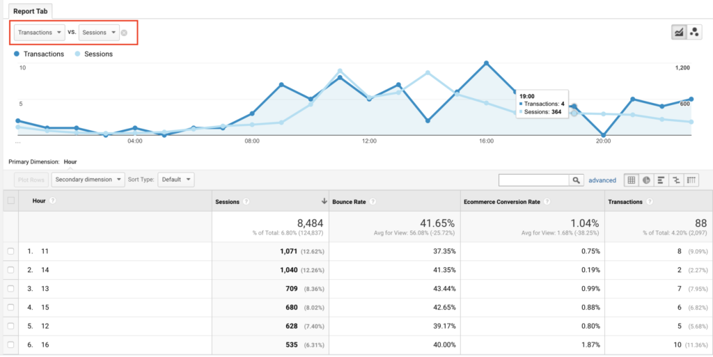
The best way to uncover user expectations is to use qualitative and quantitative data sets together to make sense of your users’ needs and wants. Any analytics tools, including Google Analytics with a combination of behavior analytics tools, such as Hotjar or Fullstory, could come in handy following your users and what sort of clues they are leaving after once they check out your products.

Heatmaps, session recordings, and on-web page polls are great tools to look at how your visitors interact with web page elements and browse through your website or product pages in particular.  It’s also good to ask for direct feedback from your visitors on how they feel about the overall experience to get a sense of their perception of your products.

Thanks to the responses obtained through polls or surveys you can set up on any page, you can easily detect any problems or usability issues that your users are having a hard time before finalizing their purchases.

These sorts of analytic tools are the best for e-commerce stores for increasing mobile conversion rates of both versions of a website, desktop, and mobile.

4. Let your users type less with autocomplete

Yes, AI is already here. In the context of usability, it’s been here for a long time.

Simply put, if you can understand what your users want, then they’re much more likely to convert.

So, one useful approach is to use autocomplete features as a part of onsite search functionality, just like how Google works. As users type, they see likely alternatives and might quickly pick out one, reducing the time it takes to locate objects.

This is one of my favorite user experience actions that I come across regularly on e-commerce sites that are at the top of their class. Also, it’s a relatively quick hack for mobile conversion rate, considering how it shortens the path to find a product.

5. Do your best on product pages

You’ll find yourself optimizing your product pages a lot. I mean a lot.

When your mobile visitors come to your website to buy your products, then the mission is simple, right? You just need to make an excellent case for convincing them to buy an item from you and no longer from a competitor.

So, here are some hints for building high converting product pages to increase mobile conversion rates of e-commerce websites. 

  • Show your excellence in the product title
  • Add images to galleries from different aspects of the use
  • Put your security badges and other trust signals that you own
  • Include a detailed product description
  • Add shipping and product return processes information
  • Include different ways to pay

6. Improve your navigation

If your mobile website isn’t always smooth navigable, it could negatively affect your mobile conversion rates, period. You need to show all the options and exits to your users in any funnels to make them comfortable while searching for their needs. 

Mobile users have no time to explore your flows. And sorry, but, lack of options directly affects their enjoyment and would motivate them to leave your website in the blink of an eye.

However, if you can provide a better navigation flow and overall user experience design, it results in much higher mobile conversion rates for mobile devices.

Here’s an instance from Beauty Bridge, a beauty brand. 

You can see how smooth their navigation menu looks on the mobile web site and gives a clear message to users about where they are and what their options look like.

7. Test, test, test!

Statistics and theories can help you formulate the future changes to make on your website, however, only proper testing will let you inform if those changes are valid or not.

Running optimization tests to decide whether or not any changes you make results in measurable impact is the only way to improve your conversion performance. A/B tests allow you to see if your target market approves any decision you made on a design or when any upgrades should be rolled back.

Every detail you change must be tested before implemented. You can easily and freely utilize some of A/B testing tools in the market in order to run tests and make informed decisions. 

One of my favorite case studies is already here if you’d like to check out how we managed to increase the mobile conversion rates of a retail website with a simple change. See our story of success as the first Turkish partner of Optimizely in UX design in Zingat.com project.


To conclude, improving the mobile conversion rate is the key point for many e-commerce websites in today’s digital world. With these smart actions, you can return to the game more powerful. And don’t forget the use your data to know your customers better.

Intentful actions: How clicks and taps lead UX optimization

With the ongoing digitalization of services, we have come to depend on the internet to the point of living two somewhat merged lives: online and offline.

It is at a level that, which I’m sure, many of us have already been scolded by our elders at least once or twice that we do not socialize in a healthy way. Whether it is the new norm or simply just a matter of deterioration of communication, not up to me to decide, we now express our feelings by sharing memes, using emojis and such. We just want to leave a like on that picture of our best friend’s wedding and maybe share a few good moments of our last holiday on social media; this is now our way of communicating with each other. Yet there is a stark difference between real life and online, where our communication is limited in a sense, the limit being the fact that we are bound to our devices’ capabilities and the services offered by the online platforms.

Relatively “New” Normal

In order to adapt to the new era, many organizations today use a wide range of online channels to communicate with their customers and prospective users where these channels live on different platforms varying from websites to mobile applications. As the level of communication is primarily dependent on the platform unlike physical stores where the main factor is human to human interaction, organizations have been trying to improve their platforms to provide optimal human to system interaction. Many companies, for example, now enable users to share feedback and rate their experience on their websites and mobile apps. Such data gathered is then processed to improve upon the system. Yet there is a catch; not all users, especially the ones that were not happy with the service provided, leave a like, rate after purchase or get into contact with customer success teams to leave comments. Instead, they do provide something that can be used to improve the user experience: lots and lots of clicks and taps.

In daily life, the human to human interaction has several elements to communicate the necessary information: words, hand gestures, facial expressions, tone of voice and posture. On the other hand, none of these necessary elements is present in average online human to system interaction without the consent of the user. Thus, clicks and taps come in here to fill the gap; along with the pages and screens which can be considered as context, these interactions could be considered as users’ way of communicating with your system latently. So it is necessary to observe where users specifically click or tap on digital platforms and collect interaction data* to detect where the gaps in communication exist.

*The data collected, however, shouldn’t include any personal information on users; with the recent implementation of GDPR, any data collected should be anonymous and the users should be informed about the practices.

Crumbles left: Clicks & Taps

A common practice to observe clicks and taps is the use of heatmap tools. Heatmaps are visual tools that are generated upon interaction data gathered and turned into a map where the most clicked, tapped areas of the pages and screens are coloured in bright red while least interacted areas are in cold blue colour. With these tools, it is possible to easily see which part of your digital product, the system communicates the most with your users. Usually, the area around navigation links, action buttons of main features and modules appear in reddish colours since these areas are the focal points of your design. In contrast, the text area of an article might not have anything to play with, resulting in a blue or non-coloured area in a heatmap. Even so, you could observe inconsistencies regarding the previous statements. Sometimes, despite not featuring a clickable element, an area will be coloured reddish whereas an “add to cart” button appears in blue. In actuality, these inconsistencies are the key findings in filling the communication gap. 

As we expect a human to human communication to work flawlessly as long as its elements are used in a proper way to convey a message, systems are expected to work in a similar manner. Since the algorithms of both are mathematically correct, they should work, shouldn’t they? As the main actors of both are humans, the answer is no. Just like when you sometimes observe people do something entirely different other than what you told them to do despite explaining everything in detail, how you expect your users interacting with your system will be different than what happens in reality. The idea is not just conveying a message but also receiving it through the difference between what functionality the users expect a particular area of your digital products to present. If you see a red area around a price tag of a product, which to your knowledge serves no purpose other than the element highlighting the text content within, your users might be recognizing it as a button or link, a clickable element. Then you might need to reconsider your design choice of the element.

Following our design methodology, we regularly visit quantitative datasets, which are extracted from measurement tools to analytically decide that our designs work as intended or not. Heatmaps and click events that can be configured in such tools sometimes might be the panacea for usability issues otherwise go unnoticed. We build experimentation backlogs through feeding on both qualitative & quantitative analyses in which users lead us to detect any problematic areas by clicking or not clicking specific areas. As the number of clues increases, you’re more likely to come up with solutions to maximize the value of your design effort.