James J. Gibson, a prominent perceptual psychologist, coined the term ‘affordance’ when referring to the feasible properties between the environment and an actor (the user). The word thus recognizes the human instinct to look at their surroundings to achieve their objectives. In his book The Ecological Approach to Visual Perception, Gibson first used the term “affordance” and later built on this definition, describing affordances as all “action possibilities” implicit in the system, focuses on observable and independent of the capacity of the person to recognize them, but always about actors and, thus, dependent on their capabilities, abilities and cognitive pathways. For example, the pencil would not afford writing if the actor is a newborn because a newborn would not know how to write.
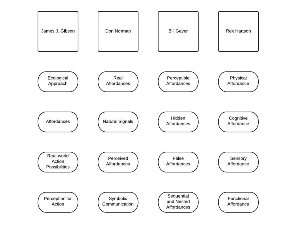
Image by Interaction Design Foundation
The relationship between affordances and human-computer interaction was born with Don Norman’s use of the word in The Design of Everyday Things (1988). Interaction designers have appropriated the concept almost as a design philosophy, illustrating the need for clear and definite signals to explain to the consumer what they should do with a computer or inside a system. Interactive components such as scrollbars, command keys, connections and icons inside a user interface, for example, must be configured to give the user enough indications about what they can do with these interactive elements and how they can communicate with them (e.g. moving up and down, clicking, and pressing). We can criticise a design for lack of immediately perceptible affordances or confusing users with false affordances. Therefore, designers need to understand what we mean by affordance and how to apply it to strengthen old and new designs.
Motivation is another key factor for affordances. We are likely to miss or forget to think about them without the drive to check out the potential uses we may have for an artefact. For instance, when you want to write something on a rough surface, you immediately search for an object that provides you with a suitable surface. In that situation, you search for an object that affords you to write easily. We are not searching or thinking about a flat ground that provides easy writing, eating, or working experience in our daily lives if we don’t need it. Still, we are alerted by our goal and encouragement to consider the unique affordance of all items available to us.
Perceived Affordances in Graphical User Interfaces Image by Interaction Design Foundation
Real & Perceived Affordances
As Don Norman states, the word affordance applies to the perceived and real characteristics of the object, precisely those fundamental characteristics that decide how the thing might actually be used. Thus, we say the actual properties of objects by real affordances, rather than the properties recognized by an actor/agent/user as belonging to objects. For example, gripping and pulling are provided by a door handle, which are the user activities needed to open a door. Graphical user interfaces (GUI), on the other hand, can be stated to have perceived affordances when the user perceives that their activity would have a significant effect within the system/software/website, based on experienced correlations between perceptible elements and the result(s) of communicating with them. For example, touching the control screen to use a graphical user interface is perceived affordance, and a touch screen successfully affords it. Perceived affordances in the graphical user interface depend on the system feedback for the user to understand that they produce or do something meaningful, not trying to understand the meaningfulness of their actions from their perceptible properties of the display alone.
Norman’s other concept is symbolic communication. Apparently, artefacts, names, instructions, and other supplementary ‘clues’ in graphical user interfaces are necessary for situations where the actionable properties of physical artefacts require an agent who does not have sufficient knowledge to identify the intended means of interaction. As semiotically clear objects, images, and vocabulary are used to express the affordances and intended interaction methods to accomplish these purposes. Providing additional knowledge is referred to as symbolic communication. Nevertheless, as mentioned by Don Norman, “The design has failed when simple things need images, labels, or instructions.”
Perceptible, Hidden, and False Affordances
Gaver outlined the relations between experience and behaviour in Technology Affordances (1991) and stressed the crucial role that perceptual knowledge (including visual, auditory, tactile/haptic, and, to a lesser degree, taste and scent information) helps us evaluate the affordances of an item. In HCI, Gaver (1991) distinguished three kinds of affordability: perceptible, hidden and false affordances.
In order to access the content of this interface feature, one of the first connections we experience in HCI (human-computer interaction) is between a desktop icon and the affordability to double-click. The notion of perceived affordances described by Norman is equivalent to the notion of perceptible affordances by Gaver, but the latter definition includes all affordances that can be calculated from sensory data, which may also include real affordances. Despite this distinction, the significance of explicit and essential perceptual knowledge in design is highlighted by both definitions. Merely catching users’ interest is not sufficient; the details must be connected to the affordance in order to form an essential and easy-to-understand relationship between the presentation and the planned action.
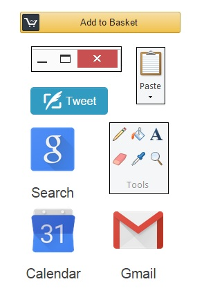
Other examples of perceived affordances in HCI are the computer sounds, button colours and design metaphors (pages, documents, scissor, turning the page in a tablet). According to Gaver, when the interaction between an object and its affordance is correctly described by perceptual knowledge, the subject can immediately recognize what they can do with an object and communicate accurately.
Hidden affordances are where there is no sufficient perceptual knowledge to enable the consumer to assess the probability of action. For instance, certain affordances are hidden in the design of the graphical user interface, and the user must rely on the expertise or trial-and-error activities to recognize a clear probability of action. For the novice or new users, perceptual knowledge is extremely relevant, but users need less perceptual signals over time since they can depend on familiarity to better direct their behavior. Hidden affordances can be used as a way to minimize confusion when communicating with advanced consumers, but typically there should always be signs accessible to the consumer to allow them to decide how to access the hidden affordances.
The user is prone to make mistakes if the visual signs are available, but the corresponding affordance does not occur. Designers must ensure that the perceptual knowledge used to signal an affordance’s presence correctly reflects the possibilities of intervention accessible.
Physical, Sensory, and Functional Affordances
Rex Hartson developed and built on the concept of perceived affordances by Don Norman. He used the term cognitive affordances to highlight the effect of product features on our thinking processes and ability to determine what we can do with or in an interface and particular features of graphical user interfaces. Cognitive affordances, to paraphrase Hartson, are the design characteristics that assist, aid, support, facilitate, or allow thinking and/or realizing about something. Cognitive affordances are also the design characteristics that lead to our ability to decide whom we can engage with, anticipate the effects of our behavior, and therefore improve the general usefulness of a product or graphical user interface.
The physical affordance principle of Hartson reflects on the actionable components of screen-based interfaces, such as command keys, and how these affordance attributes enable us to decide the actions we can execute and the outcome(s) of these connections. Although the actual affordance definition of Hartson is relevant to the real world, it differs from the real affordance principle of Don Norman, as Norman sees visual features in graphical user interfaces as symbols of abstract communication, such as images representing such actions, or perceived affordances, which are properties that we interpret as afforded.
Sensory data refers to the ‘top’ aspects of items that help us interpret stimuli in our world. Sensory affordance is a notion present in all affordance schemes, but Rex Hartson is the first to treat it as a different affordance from other affordance categories. In all cases of evaluating the cognitive and physical actions we may execute, sensory input processing is the first step. The lack of sensory affordance can curtail our capacity to perceive cognitive and physical affordances since it plays an important and supportive role in all these phases. Sensory affordability examples include scale, colour, perceived loudness, and sensation. In addition, sensory affordance plays a critical role in the successful user experience correlated with a design within the GUI.
Hartson can approach as distinct terms the four modes of affordance identified and segregated, but they are interrelated, and allow us to determine the functions we will play within a show, how and when we can do so. For example, sensory affordances involve text size and readability that allow us to read instructions (cognitive affordance) and identify what happens when we engage with an active component (physical affordance), and subsequent interface upgrades help us establish functional affordability, such as adding a product to our online shopping basket.
Conclusion
Since Don Norman presented the design world to James J. Gibson’s theory, there has been intense discussion about the definition, forms, and potential use of the word affordance in human-computer interaction. The above topics and arguments made by the other researchers only point to the main parts involved in this discourse, but the other relevant topics allow everyone to see how vital the mechanism of communicating, exchanging ideas, and proposing new methods is for a coherent and accepted collection of models and frameworks.