User flows: Veins of experience design

Have you ever wondered how many decisions we make on a typical day? It may come as a shock to you but according to a study at Cornell University, it is estimated that the average person makes around 35,000 choices a day. It is mind-blowing to think that every single decision we make triggers a variety of outcomes which in turn affect the experiences we might or not have. Only if we could see all the possibilities laid out in front of us, right? Though —sadly— we don’t have a tool for that, we, as UX practitioners, do have a very powerful mapping method to explore all the different paths that a user might take for any given decision in a digital product or service: User flows.  

Let’s explore this vital user experience design method that we incorporate into our services in SHERPA and see how it helps us craft better products.

What is a “User Flow”?

A user flow is a user experience design artefact that maps out all the actions users can take to achieve a goal in your product or service. We can create a user flow diagram to:

  • Describe the decisions of users in a system
  • Demonstrate the logic flow of a whole product/service
  • Simplify complicated processes and workflows
  • Create a shared language among designers, developers, and project owners
  • Speed up the experience design process by building as a base for other steps such as information architecture or user interface design
User flow diagram example

It is an essential ingredient that puts users right in the centre of an experience design process and helps us create well-articulated products. What’s more, regardless of how complicated the design is going to be, only a few basic components are enough. Let’s have a quick look at them:

How do you create a user flow?

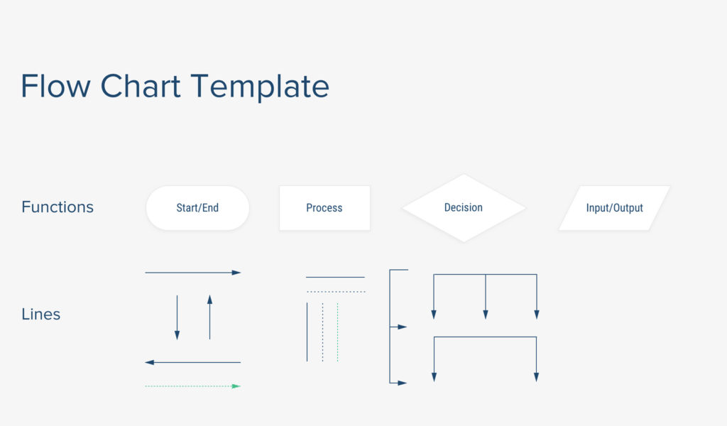
User flow components are created by basic shapes and elements like boxes, squares or arrows. When you understand what each component represents, it is a very simple process:

  • Decision node: Represented by a diamond shape, decision nodes are used to represent conditional situations
  • User action: Represented by a square, a user action describes a basic task, action or a process that users can take
  • Arrows: Connector lines that indicate directional flow 
  • Input/Output: Represented by a parallelogram, these nodes function as user input or system output
User flow diagram components

A wide range of possibilities 

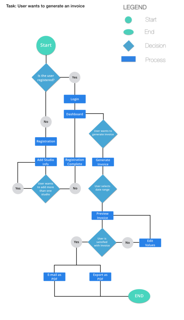
Using such basic components, you can create user flows all the way from simple processes like setting an alarm clock on your mobile phone to more complicated actions like conducting a search on an e-commerce website. To give you an idea, let’s simply write down the steps a user takes when she wants to read an article online in a logical way. The user

  1. Enters the website
  2. Scrolls through the feed
  3. Searches for an article
  4. Clicks on & reads an article
  5. Highlights important sentences
  6. Likes and saves the article
  7. And exits the page

If this sounds too simple for your business, we’ll kindly urge you to think about a scenario where a user wants to purchase flight tickets for her family. Imagine that you have to create a user flow for this specific case: There will be 4 adults, 2 children, and an infant traveling; one of them is a light traveler who likes to travel with a backpack whereas another one has 2 luggage weighing above 40 kgs. One family member will need special assistance. One of them happens to be on the outgoing flight, but not on the return flight. One of them is vegetarian, another one has gluten intolerance while one is allergic to peanuts. On top of that, throw in an aviation restriction that prevents passengers from selecting seats near the exit doors…

This is actually a real-life example —one of the many, many cases— we have currently been working on for the redesign of an airline company’s digital product. It is just a sample of the tremendous amounts of possibilities we consider when designing experiences. (Yes, we are perfectionists and we take our jobs very seriously.) When things get complicated at a very high level, the value of user flows becomes more and more apparent. If you do not take the time to simplify and visualize such complex systems, it is almost inevitable to make costly, structural mistakes. In this manner, user flows’ importance is not a subject of debate for us.

Benefits of creating a user flow diagram

Besides the obvious advantages such as its simplicity and flexibility, there are very solid reasons why we love creating a user flow diagram so much and strive for utilizing it at the early stages of product development. 

One of the greatest benefits of user flows is allowing teams to work on a project simultaneously. After agreeing upon the user flow diagram with our project owners, both parties start working on their areas of expertise. While we start to build content architecture onto the flows, developer teams can start building the code structure. This way, developers start working on the project way before they even see the wireframes. In this manner, providing a shared structure to work on together reduces the time to finish the project significantly. 

Having a user flow diagram also keeps the channels of dialogue open, enabling two different teams to work as one unit. This is an incredibly valuable aspect when you think about how much information tends to get lost in translation between project teams. In one of their articles Nielsen Norman Group points out:

“In addition to being a useful form of communication with project stakeholders and developers, flows also work well as a tool for collaboration between team members. Especially in Agile environments, being able to collaborate and communicate well among a cross-functional team is critical.” 

When we have open communication, clear understanding and alignment between parties, we can oversee the prospective flaws and interfere quickly before a small problem turns into a big avalanche in the next steps of the development cycle.

As a digital experience design studio, our job is to make sure that the product or service offers an exceptional experience to users for every path that they might take. And we do our best work when we are aligned with our clients’ business goals, understand the users thoroughly, and visualize how they might navigate through a digital product. Creating a user flow is one of the best possible UX methods to do just that.

UX in e-commerce: Horizontally bound vertical blocks

Here is the root cause of the friction in digital transformation projects: For over 100 years, we’ve created siloed companies with defined task forces, namely departments, to conduct their operations with autonomy. We’ve directed all our effort on departmentalisation and hierarchy, and as a result, we got pyramid-shaped organisational charts with lots of layers. But, upon shifting our mindset and channelling our energy towards what users and customers actually need, we concluded that digital transformation is only possible if we carry out horizontal work, encompassing all the layers. And that’s when the problem started, and we tried to transform the vertically-structured companies horizontally. 

Connected divisions

Likewise, it makes sense to view digital e-commerce products with a similar modular perspective. Essentially, there are four principal blocks in each product: 

  • Homepage
  • Listing page
  • Product page
  • Check-out funnel

The idea is to treat them as compartments and, if possible, assign a product team to each one of them. By doing that vertically, all teams can run towards a single goal while having the autonomy to experiment and optimise their “products”. But, it is also notable that the navigation, the consistency between the blocks and the overall UX Strategy must persist throughout the product; otherwise, it’s likely to have unification issues where users could not figure out the logic in the system. Thus, the same vertical approach is legitimate to compartmentalise e-commerce products, but learning from the past hurdles, we have to employ complex ways in which we can maintain the connection in terms of user experience between the blocks.

From a UX perspective, there are three points that need to be highlighted in order to optimize the performance of each block:

  • It’s easier to think of each block as a separate product. This way, the focus can be amplified, and besides the ultimate goal, each team can own and spend time on the metric that matters for their product. If the product is a homepage, the team can direct more users to product pages. Or, if a listing page is the case, then the team can solely focus on filter usage or add-to-cart shortcut on the product cards.
  • Rules and connections defined in information architecture should be kept in mind since it is easy to lose track when assigning teams to each block. You need an eye out for consistency, acting as a spectator during the optimisation process.
  • While going after a north star metric or any vital indicators for a product, turning a blind eye to what users need is something we often see once we start auditing digital products. Once you lose your users in this vertical, it quickly becomes a costly operation to retain them. Competition in the e-commerce landscape is fierce and incessant, therefore each mistake is almost irreversible if you become business-oriented. 

An idea or a product

If you’re on the verge of creating a new e-commerce product, that’s fine. It would be best to start with the things that may fundamentally affect the whole system, which should be taken care of horizontally at the ideation stage.

  • What is your promise? 
  • How do your online and offline services talk to each other? 
  • What are your competitive advantages?
  • How are they embodied in your digital product? 

Principles and building tenets of your strategy basically are the first things to be sorted out. Because only this way you can see and sort out the things that will help you grow your business while keeping your users happy. 

You can only envision a holistic service that is engineered over your strategy at each level unless you map out these details on day one. These details will be the horizontal reflections that are engraved in your navigation functionality, content, the overall interaction approach you choose to embrace. 

The characteristics that identify a brand, according to their interaction with the customers, greatly influence personas. When we focus on a new product, we start off by matching essential personas with analytics data to first answer high-level questions.

If there is an ongoing process to improve your product, then the rules change a bit, and the tactics to be employed depends on a few factors. 

  • Do you follow a UX strategy? 
  • Do you have a UI library to render consistency? 
  • Is there any change in your roadmap that may affect your relationship with your users? 

All these questions aim to achieve one thing before generating hypotheses to optimize a product. 

  • How far can a team go? 

Drawing from experience, we’ve had projects that belong to one of those two categories, new & established products. We created brand-new e-commerce products from scratch, and the first question we fired was what is (y)our goal? Do we want to show as many products as possible? Or is our goal to take users to a payment page with the quickest route? It all goes back to day one, where you conceptualised your business. Who you are as a business, and where is your strength comes from. 

At the other end of the spectrum, we nose-dived into projects with a fully functioning product that needs to be optimised. At those encounters, we first elicited the main KPIs, created a backlog and moved along with a product team to develop solutions aligned with the overall strategy. Simply acting vertically as we welcomed the business reality, thinking horizontally. 

Consensus on strategy

Apart from the tactics, the key thing is always keeping both external and internal teams on the same page regarding the overall strategy. As consultants, we are the ones that broadcast warnings over consistency issues. Given that the vertical structure of teams is an invitation to rapid testing, it’s also relatively easy for each team to get way too focused on the piece of the puzzle in their hand. An external eye is needed there to oversee the integrity of the whole picture and to intercept when a piece seems like it doesn’t fit. Besides, someone is also required to organise a plan to take users’ opinions into account and ensure their voice is heard. After all, a horizontal approach to solving UX issues and engineering improvements in core features turns into a necessity to consolidate every vertical block’s understanding of the business. 

In conclusion, creating and working on vertical blocks of your e-commerce product will facilitate the experimentation process. Yet, each team must be in unison when it comes to the horizontal connectedness of the product. A butterfly may flap its wings, and all of a sudden, you see your users flocking into your competitor’s products unless you keep your horizontal factors in sight.