The Last IA Master: Ben Terrett

There are some websites with heavy content and complex navigation structures. Before you visit them, you feel anxious about whether you’ll find what you’re looking at a glance. But once you start browsing, you experience a seamless information architecture intelligently designed and executed. My suggestion best case for those kinds of websites is gov.uk: UK Government’s Public Sector Information Website.

When I started investigating about the story of a single domain including 25 ministerial departments, 407 other agencies, and public bodies’ content, I found out that behind the scenes of this impressive digital transformation story lays down the initiative taken by the a.k.a “Digital Champion” Martha Lane Fox’s famous report named “Directgov 2010 and beyond: revolution, not evolution” targeting directly the UK Cabinet, emphasizing the need for a radical change in the way the UK Government digitally communicates. This report and the marginal economic gains proposed to the Cabinet were so clear and impactful that no one could stay still, and showing that one simple fact, well-told was enough to direct the rider, to motivate the elephant. Shaping the path was the next step. Government asked for feasibility on a huge project from GDS (Governmental Digital Services) with two simple but hard to achieve goals:

  1. To test, in public, a prototype of a new, single UK Government website.
  2. To design & build a UK Government website using open, agile, multi-disciplinary product development techniques and technologies, shaped by an obsession with meeting user needs.

With a bit of luck and the help of my dear friends (in this case, Kerem Alper) I had the chance to meet the man, the captain leading the team at the hardest times of this massive project: Ben Terrett, Head of Design @GDS 2011-2015. The story he shared with me was so inspiring and interesting that together we decided to publish it in Turkish at SHERPA’s Blog and in English at SHERPA website.  

If you don’t know Ben yet, I’ll guarantee that you’ll be more than glad to know him. If you do know him already, you’ll find the chance to read about the behind-the-scenes of Gov.uk’s digital transformation, as well as actionable insights from Ben on design and product & team culture. So everyone will find something useful in this interview.


Not only being the one leading this transformation from 2011 to 2015 as the Head of Design @GDS, but Ben also has a really impressive professional background. Now he is the CEO of a Digital Transformation Agency, Public Digital, operating globally, where they help other world governments digitally transform. 

Once we met, my first question was:

“You led a multi-disciplinary design team working across government on GOV.UK, and furthermore you joined the Cabinet Office when GDS was set up to deliver the recommendations in Martha Lane Fox’s “Digital by Default” report. How did you manage to put all of these into your basket? What is your secret sauce?” 

Ben replied: 

“Very kind, thank you. No secret sauce. I’m a designer and I do my hobby for a living which is a privilege. If I had to offer any advice it would be to always do things that interest you, to say yes more than no and to not be afraid of new opportunities. Take some risks. And always remember to focus on the quality of the work. If that’s good everything else will fall into place..” 

Right after that answer, knowing how hard is to gain the RDI, Royal Designers for Industry title (he holds) as a designer, I asked him to enlighten me about the application procedure, requirements, and evaluation policies. He stated:

“It’s a real honor. I feel incredibly humbled as the other Royal Designers are incredible. I’ve since found out that everyone thinks that, even the most famous of the RDIs. There are only ever 200 RDIs at once and every year they get together and vote for new designers to receive the honor and join the group. Generally, they are looking for years of sustained excellence, design work that has improved the lives of others and a commitment to something like design education. Having now sat through a nomination and voting meeting I know how hard it is to meet that criteria. You don’t apply you get nominated, so it really is an honor.”

I confess that if someone had asked me to lead the design team whose responsibility would have been “the digital transformation of the UK’s public sector information” I’d be terrified at first. So I wondered how Ben felt when he was asked to lead this massive project. He replied: 

“Simply to keep focused on the user need. To use design in a very functional way and not let traditional graphic design or marketing get in the way. To strip everything back and focus on getting tasks done online. I knew we would need a very strong typographic style and that a visual identity would come from being strict with simplicity. This blog post is a good example of that approach https://gds.blog.gov.uk/2013/06/18/retiring-our-icons/

I also wanted it to feel British with any nationalistic overtones. The New Transport typeface used on the UK road signs allowed us to achieve that. The designers Margaret Calvert and Kenneth Grange were very early inspirations for the project. Design-wise, it has a very modernist philosophy.”

https://gds.blog.gov.uk/wp-content/uploads/sites/60/2012/01/new2.png

Taking strength from Ben’s (to be respected) modesty, I could not restrain my curiosity and asked the question that its answer is probably the anticipated:

“To overcome the ever-growing requirements, never-ending scope changes, exhausting design feedback cycles and time pressure, what kind of design methodology you used to?” 

The answer was shorter and clearer than I expected: 

“The design process will be familiar to anyone who works in an agile, digital product environment. I wrote about it here.” https://gds.blog.gov.uk/2014/07/18/whats-the-design-process-at-gds/

I knew that gov.uk launched in beta form in 2012 and replaced hundreds of public sector sites. It has wrapped in ministerial departments including the Foreign Office and the Ministry of Defence and organizations such as the Driving Standards Agency and HM Revenue and Customs. Since its implementation, gov.uk has become a one-stop-shop for Government services in the UK, letting people register for a birth certificate, apply for UK citizenship or find out when the next Bank Holiday is, all in one place. Gov.uk has been hailed for its design – in 2013 it won a Black Pencil at the D&AD Awards and was named Design of the Year by the Design Museum. That is quite a success. 

However, I didn’t know the answer for, the “success criteria” of Ben. Did he succeed? He satisfied my curiosity: 

“I didn’t really have a personal criterion. At GDS we had a very strong team culture and we were really focused on building a single domain that meets user needs. I wanted the design to help and be a part of that. I also felt that we should have a world-class design team and a world-class design output. We were funded by public money so we owe it to citizens to do work of the highest quality. I think we achieved that but although the awards were great, it was never a factor in my thinking or ambition.”

It was clear the gov.uk project had a sophisticated audience while working on government digital assets since there are lots of different personae. There should have been massive user research process to conduct, loads of insights to collect. Right after smiling meaningfully he stated:

“That’s a whole other interview :)” 

And leaving the impression that user research was one of the hardest parts of the whole project deserving another stand-alone interview. 

He gave a strict “No” answer for my “Did you work on a more challenging project than Gov.uk in your professional design life?” question, and an inspiring another respond to my last “Which one you prefer: Being the hands-on designer or the one who manages the designers?” question: 

“I like making good design happen and I believe if you want to do that at scale you have to lead a team of designers. So I think the question answers itself. If you only ever do hands-on work you are limiting yourself and the impact your work can have.”

After listening to what Ben has achieved in the field of information architecture, I think that defining him as the “last information architecture master” can be a small but memorable indicator of my respect for his craft.

I’m really happy to meet you Ben.

Our path to good design: SHERPATH

Have you designed how you design?

We know it sounds like a nursery rhyme, but this is a question worth thinking about. If you are looking for a digital studio to support you in your design processes, ask the candidates’ representatives this question first. Let us tell you why.

The concept of design is so prevalent in today’s business world that it can not be defined only by adjectives such as creative, aesthetic and beautiful. This phenomenon is a result of the fame that design thinking has gained worldwide. 

When we look back, we see that design used to come after engineering and production in a hierarchical sense and it was perceived as the last step before the launch to make the product more aesthetic. We know that this has resulted in many innovations failing to meet customers’ actual needs. Only after companies began to move the design phase to the beginning of the production process, designers’ impact increased significantly and human-centred solutions started to come to the table. 

Of course, for this approach to be accepted and used across large companies, it had to fit into a certain model or framework. This is how design thinking, the framework leveraging creative design process for solving business problems, has earned its much deserved popularity.

Design Thinking Diagram

The diagram was designed by Nielsen Norman Group. 

This is what the cycle you see above tells in a nutshell: First, empathize with the audience and identify their needs/problems correctly. Next, come up with ideas that would meet these needs and test the validity of the solution you are leaning towards. Once the implementation is done, go back to the first step and start again.

What makes this approach -and therefore the concept of design- so valuable is that it is not limited to the business context alone. You can also use this methodology when you have an important decision to make in your personal life.

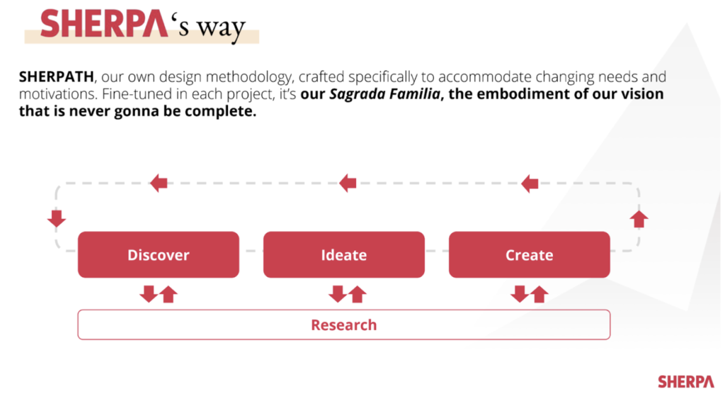
SHERPATH

This methodology inspired us to embrace the motto “Everything is design” here at SHERPA. Unlike those who dream of an alluring visual interface when design is mentioned, we think of systems and methodologies. Although our final output as a digital design studio is often a Photoshop or Sketch file, we are aware that what we call design is a process and that we cannot ensure the quality and sustainability of our work unless we have an accurate design methodology in place. This is why we came up with SHERPATH.

We applied this lean approach, inspired by globally accepted principles and models, in more than a hundred projects and made several iterations to increase its efficiency. 

The logic of our methodology is in line with design thinking. Regardless of project scope, we begin with the Discovery phase and ask three basic questions: 

  • What goals do we want to achieve? 
  • What are our constraints?
  • What can we further improve?

 We don’t continue the process without agreeing on the answers with the project owner.

We begin the Discovery phase by analysing research reports that our project owner shares with us so that we can take advantage of the existing insights and not dig for the answers that are readily available. Next, we conduct qualitative/quantitative data analysis and deepen our insight pool by analyzing data from measurement tools are set up on digital products and by interviewing stakeholders/users.

After the Discovery phase, we start the conceptual process of design we call Ideation. By asking questions like:

  • How do we define our personas?
  • What should their ideal journey look like?

We define the right design solution. Let’s highlight that we still don’t have design deliverable (in the classic sense) at this point.

In the third stage, Creation, we are interested in answering the question “how do we design it right?”. We work on the wireframe and UI designs in this direction and reveal the visible part of the iceberg.

Finally, as you can see in the diagram, activities in the research phase can come into the picture any point in the cycle. While research conducted in the Discovery phase aims to bring new insights on users to the table, a usability test following wireframe design might allow us to validate or debunk our design logic.

Digital transformation with SHERPATH

Let us tell you about one of the success stories we have created with SHERPATH.

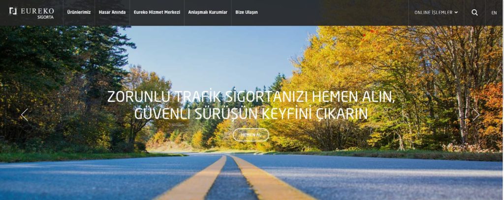
In 2018, we partnered with Eureko Insurance, a subsidiary of globally known insurance group Achmea, for redesigning the user experience of their corporate website and online branch.

Ethnographic research conducted recently and workshops we run during Discovery phase with target personae and the project owner revealed that users had a hard time while browsing and buying insurance policies online, and the main reason for that they find the insurance ecosystem in Turkey very complicated, far from creating a perception of trust. 

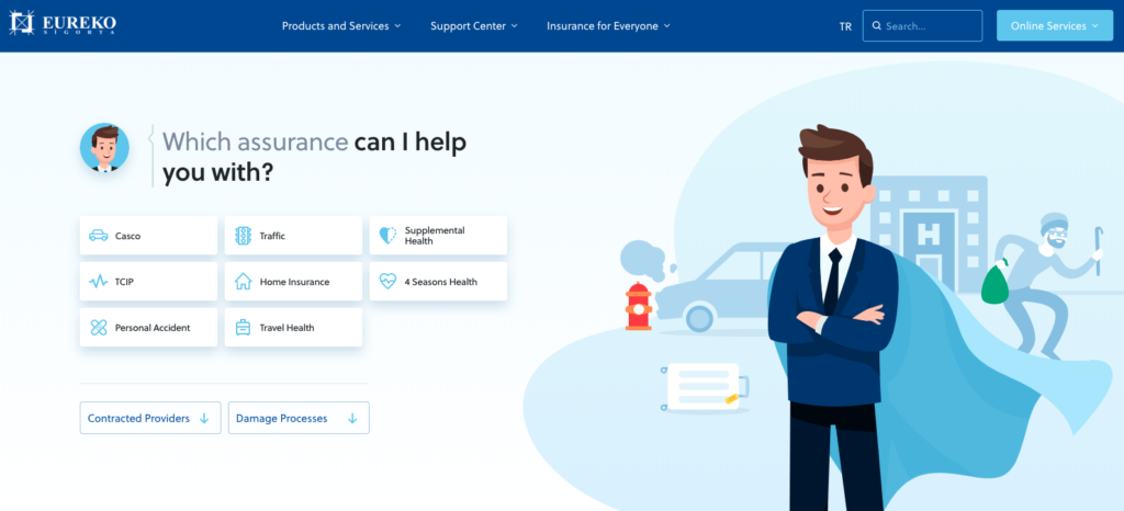
Building on this insight, we worked on several approaches to address this problem during Ideation and we decided to position Eureko as a “hero brand” guiding users during every step of the journey by accurately describing the benefits of buying an insurance policy and the nuances among various products rather than focusing on hastily closing a sale. 

In the Creation phase, we worked on a design solution that would communicate this approach clearly to the users and designed the information architecture that would allow them to find what they need easily.

We prototyped and tested alternative interaction scenarios with users and decided to move on with “conversational UI” approach that felt very familiar to users who communicate through digital devices on a daily basis. Most participants validated the idea that buying insurance by chatting with a virtual assistant would feel more natural and hassle-free compared to filling out conventional forms.

To sum up, defining user needs through quantitative and qualitative research and validating alternative solutions with potential users, we were able to manage Eureko’s transformation with a user-centric approach.

Last but not least, as SHERPATH highlights, it is crucial to revisit the Discovery phase after the new experience has put in place. Restarting the design cycle and measuring the new experience’s performance based on users’ digital footprints is what makes UX optimization possible.  

To conclude, digital products/services that are designed with “we know best” mentality and ready-made solutions are highly likely to stay behind the competition. A design partner equipped with a design system of global standards  -whether its name is as cool as SHERPATH or not- would be much more likely to create solutions that would make you and your users happy.

Applying design thinking is imperative for standardizing creative processes and enabling sustainability in terms of design quality. This is why our best advice would be to ask your potential design partner this question: “Have you designed how you design?”

Can digital products achieve human-like communication?

Think about the digital products and services you love. They all have one thing in common: Humanlike communication skills that make you smile from time to time. This is an indication of two things: How passionate the designers of the product were and how the products that aim to make us feel good, can easily stand out from their competitors.

In the field of information technology, the reality is no secret: The primary element that determines the quality of the user experience is the communication that a product or service establishes with its users. In the case of digital products and services, UI copy is the focus of this approach, which points to a completely different type of communication from brand or marketing communication. This subject has been frequently mentioned in recent years as the concept of microcopy, which has become prominent thanks to investments from Google, Dropbox, Slack, Uber, Facebook, and many other global companies.

What is Microcopy?

Short, clear, guiding, and occasionally humorous interface texts. It is one of the main components of user experience design, content design, or UX writing as it is known in the US. Microcopies enable users to interact with a product or service.

Kinneret Yifrah, the founder of the Israeli-based microcopy studio Nemala and author of the book titles Microcopy: The Complete Guide, simply identifies microcopy as follows: 

“Microcopy is the words or phrases in the user interface that are directly related to the actions a user takes. It may be content that the user encounters before, during, and after taking action on a digital interface. For example; onboarding content, button texts, content in registration and login forms, error messages and error prompts, messages directed to sign up for email, user tips, confirmation messages, and much more.”

When you open a new document on Dropbox Paper, it welcomes you with humorous microcopy examples that allow you to connect emotionally with the product.

Why is it essential for a digital product to communicate with users?

The microcopy, which plays a role in every aspect of user experience, is one of the key elements which ensure the user experiences a seamless flow. What makes it so important is that new technologies that enter the market have increased the expectations for interfaces that almost everyone can intuitively use. Therefore, microcopy, which has the potential to cause frustration or confusion in users, also has the power to make your product indispensable. Through a well-designed microcopy, a product can communicate with users in a more humanlike, understandable, and motivating to take action.

Why is it vital for a digital product to interact with its users in a humanlike manner?

The answer to this question is given by Professor Clifford Nass of Stanford University in his book: The Man Who Lied to His Laptop – a collection of more than 100 experiments that explored the relationship between people and computers. According to one of the striking findings of the research, as users, we expect digital interfaces to act according to human social norms. So much so that we are surprisingly disappointed when this expectation does not materialize. It can even break our hearts. What’s more, we can be very angry with the digital interfaces that communicate with us in a technical language specific to machines. After all, until a few years ago when we saw an error message, we would try to solve it by hitting the computer tower. So how does microcopy prevent these heartbreaks?

Digital products and services with personality

According to the archetype theory developed by Carl Gustav Jung, the founder of analytical psychology; the archetypes, which define the personality structure of human beings, are universal themes that exist in our subconscious, independent of language and culture. Each of us makes contact with other people through these themes that determine our personality and behavior. Brand personality studies based on this theory simply tell us the same thing: People relate to the products you offer to them through the archetypes that determine your brand and therefore, the personality of your product. As a result, what allows users to embrace your product is the personality of the product before its features. So how does a product have a personality?

Whether the content is text, voice, visual, or all of them; each interface content needs a personality. This is when microcopy (and the UX Writer as it is) comes in handy. Let’s return to our question: How can a product have a personality? Up to this point, what is clear is that product to have a personality is possible through a humanlike communication with users. And what is human communication?

Spoken vs. Written English

Not until a few years ago, there was an apparent distinction between the language we used in written communication and the language we used in oral communication. As we all know, the written language is much more formal: We often build longer and more complex sentences, which are usually composed of words that we do not use in face to face communication. The language we use in speaking is much more dynamic: we prefer short sentences of common words that people can easily understand. In other words, speaking is much more concise, simple, and more fluid.

The internet, which has changed many things in our lives, has blurred the sharp distinction between these two languages. Because the words we express in writing on the internet are often part of a dialogue. Digital products and services that evolve with internet technologies actually establish a dialogue with their users. They ask users some questions, and as users, we either fill up a form or click on a button. It is a written dialogue rather than written communication. Erika Hall, the author of the book Conversational Design, summarizes it this way: “The traditional categorization between the language of writing and the spoken language has collapsed, and a third option has emerged; conversational writing.”

Relationship of conversational writing and microcopy

Conversational writing is a written communication form, primarily mimics a conversation. Of course, this is not a real dialogue, but a product with this approach naturally speaks directly to the user. As with talking face to face, it establishes a short, concise, and sometimes humorous communication. It uses everyday words that make speech fluent.

Let’s explain this with an example: If you like a song on Spotify and then undo it, the following message appears: “Let’s pretend that never happened.”

This example may bring up the question of whether conversational writing is suitable for more complex systems. Complex systems mean; products and services such as ERP, CRM, function-oriented interfaces, or digital interfaces of banks and insurance companies that communicate in a more professional tone.

Let’s continue with another example: SAP, a well-established company that has built many complex systems so far, in recent years, has begun to write in conversational writing and as a result, began to communicate with its users as humans rather than machines.

What used to be “the new backend service has been written into the application settings and requires manual activation.” has become “You have switched to a new backend service. Go to app settings and tap Activate.” and thanks to this change, it has become easier to understand and follow. We can see that the basic approach of SAP has evolved into a language that speaks directly to the user by using you/us instead of a passive structure. The technical expression “(it) requires manual activation” becomes brief and straightforward “tap Activate“.

Professional system users need the guidance that facilitates the lives of digital interfaces, which they interact with, just like any other user, without having to communicate with a more complex language than they already are. In other words, in all circumstances, you should help users better understand your product more easily. And this is possible through humanitarian, understandable, motivating and sometimes humorous communication.

What does a better microcopy add to your business?

A better microcopy gives the users very few reasons to leave your product and gives more reasons to take action. This implies a scenario where fewer users stop using your product, and more and more of them continue to use your product. In other words, it means more customers, more successful transactions, higher conversion rates, and naturally more revenue. Not to mention the fact that your users trust your brand more.

Conclusion

Ten years ago, smartphones were hardly ever in our lives. Today, chatbots and IoT devices are a natural part of our daily lives. As these technologies become widespread, the need for a product or service to communicate with its users is going to become more prominent. It is a priority for all of us (especially product and service designers) to better understand and implement the microcopy’s place in the user experience design processes.

SHERPA named top creative and design agency in Turkey by Clutch

A masterful digital presence is key to any successful business venture. Perhaps you’re in the real-estate sector and need a resourceful website for all of your listings.  Or maybe, you’re in the nonprofit space and need a powerful cloud-based CRM to manage all of your donations. Either way, making the technical component of your business as seamless as possible for your external stakeholders is vital for the longevity of your company.

SHERPA is a state-of-the-art digital experience studio with seasoned problem-solvers, client-focused personnel, and knowledgeable designers come together to provide the best experience possible.

Clutch

We specialize in UX analytics, UX research, UX strategy, and UI/UX design, among several other capabilities.

In light of our success, we’ve been named one of the best design services in Turkey by Clutch! We’d like to take this opportunity to thank our wonderful clients for participating in one-on-one interviews on our behalf! In reflection of that feedback, we’ve scored an amazing 4.9 out of 5 stars!

Once again thank you to our clients and to Clutch for making this award possible. Please drop us a line if you’d like help bringing your design dreams to life!