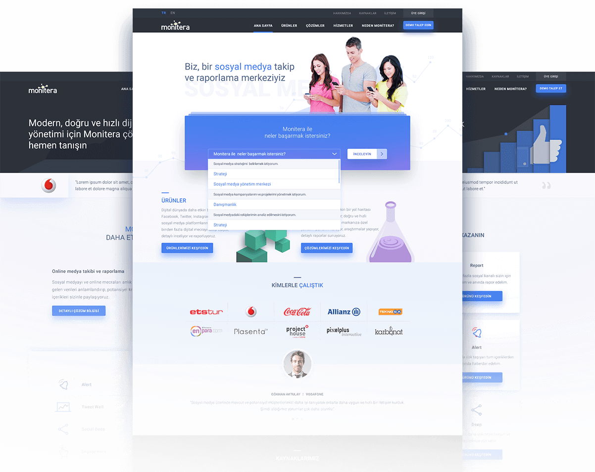
About the project
Redesigning a website from scratch isn’t an easy task. It’s even harder when you are simultaneously renewing your brand and services. What we did for Monitera was more than just redesigning their website. We not only designed a new web experience, but we also designed a newer digital storytelling approach.
Our services
- Content Strategy
- UX Design
- UI Design
- UX Engineering
Wait a minute?
Why are we redesigning?
From time to time, you can’t only content with solving the problems but reveal the what the original problems are. When Monitera asked us to redesign their website, we asked them why they needed this and tried to define the requirements.
Monitera was unhappy about not being able to reflect the brand to the users correctly due to the outdated content on their website. Also, the old Monitera.com had been designed and published years ago, therefore it couldn’t provide a proper mobile experience. In addition to that, the visitors of Monitera website didn’t have a chance to get in touch with the team. We soon understood that it wasn’t only about redesigning their website. Monitera’s biggest problem was to tell their story and create sales potential by providing information about their services and their years of expertise in the sector.
Briefly; what they asked from SHERPA was not only redesigning their web experience but also renewing their brand’s positioning from scratch.
What to improve and how?
SHERPA fellows know well that we believe that design is problem solving and to solve a problem you need to define them. In order to fulfill Monitera’s request, we needed answers from both the Monitera team and Monitera customers. The answers would help us reveal the correct approach and define solid objectives. The rest was relatively easier: We need to tell their story including who they are, what their brand promise is and how they realize their brand attributes. We had to do this by welcoming new customers with a modern and usable web interface in order to get them closer to their business objectives.
Solid grounds and
solid structures
We needed to define the source of the problem and find answers to some questions. What do their users expect from their website? What type of content are they interested in? Most importantly, how much does this website serve their business objectives? We got answers to a few of these questions from Monitera, but we should ask the rest to the users.

Starring UXAAR!
In order to make data driven decisions we analyzed their website. We not only analyzed their Google Analytics data and published a survey on their website, but we also recorded videos of user sessions to understand who their users were and what they were looking for.
So, could our users found the answers they were looking for? To answer this question, we did a competitive analysis of Monitera.com and the websites of their local and global competitors. We defined the positive and negative issues and created a clearer path to success.
Information architecture first
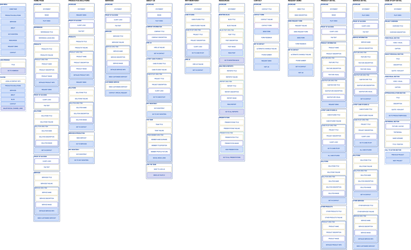
To provide a better experience, we started to work on the content. “Better content” was not enough; we had to provide this content within a better information architecture. We first created a content map. We mapped every content element to be provided on the new website by grouping these elements along with a user flow. We finalized these steps by collaborating with the Monitera team.
Content later.
Monitera was not only renewing their website. They were also renewing their services. We dived into working with Monitera team to tell who Monitera was, what types of products or services they were providing and what a customer should expect by working with Monitera. At the end of this process, we were exactly sure about Monitera as a whole. Our next task was to visualize this information to be consumed in the easiest way possible.
The right visual hierarchy and a clean interface
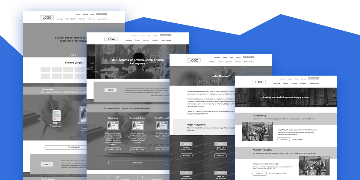
We went on with designing the interface and the interactions for both desktop and mobile devices. The wireframes we created helped us provide a solid visual hierarchy. Therefore we could be able to let users find the information quickly and easily through a usable web interface.
We didn’t forget the potential Monitera customers. We provided a “Get a quote” form for the users who were looking to get service from Monitera and a contact form for the ones who only needed to get in contact.
While designing the user interfaces, our objective was to reflect the brand essence of Monitera with high readability. The content we created in the beginning made it easier.

Metin Kahraman
Partner / Monitera
A really professional team with their approach and their planning skills. Besides the value they added to the project with their knowledge and expertise, they have a vision of always designing and executing the best for your brand.
The new Monitera.com website
is now live.
 TR
TR
