About the project
Banking is one of the fastest digitally transforming industries in the world. With its innovative philosophy also the convenience and advantages in the online banking operations, CEPTETEB, the next generation digital bank, is a pioneer of digital transformation in Turkey. Together with the CEPTETEB team, which aim to increase conversion rates by providing a better digital banking experience to its users, we successfully finalized the optimization process of the application flows by focusing on analytics data, with a great increase in conversion rates.
Our services
CONVERSION OPTIMIZATION
- UXAAR! - UX Analytics Audit Report
- Identification of Key Performance Indicators
- Custom Measurement Systems Installation & Optimization
- Target Performance Reports
- Conversion Oriented Hypothesis Development
- A/B Tests
- Conversion Oriented Hypothesis Reports
3 steps to success:
Analysis, hypothesis, test
In order to optimize all application processes, especially the New Customer Application, we first started by identifying the current and potential pain points of users with the support of analytics data.
We have developed hypotheses to optimize the pain-points leading users to exit from the application process. Within the scope of these hypotheses, we started working on conversion optimization practices and made small-scale changes in the user flows to accomplish our goals.
Then in order to observe the effects of these changes, we set up A/B test scenarios with testing tools such as Google Optimize. We conducted tests built upon these scenarios and reported the results in detail. We also conducted periodic analyses by bi-weekly reports through Google Analytics. Our goal was to quantitatively spot usability issues and engineer hypothesis in the pursuit of having a better conversion performance overall.
We actively used Google Tag Manager in every phase of the project. Simultaneously, by updating the tags in CEPTETEB domain regularly; we managed to optimize the conversion and acquisition performance.
Action focused architecture
After detecting the high traffic at the action focused architecture rates page, we thought that an approach emphasizing the advantages of the CEPTETEB foreign currency account would increase the conversion rates and we developed a hypothesis:
In the exchange rates page, moving the new customer application form CTA button to the top and adding an information text about the product benefits will increase the number of users who take the first step of the application.
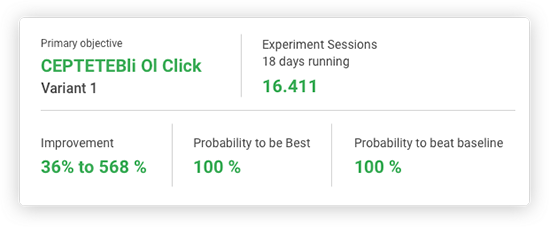
We designed a new module corresponding to our hypothesis and integrated into the existing page and conducted an A/B test for two weeks starting from 21 September 2018 in 16.411 sessions.
Conversion Performance

Design for needs
As we know that the applicants' journey at CEPTETEB are not over and the experience is end-to-end, we cared to continue analyzing the needs and expectations of the users who filled out the application form, throughout the project.
We observed the low conversion rate of mobile users who want to learn their application status quickly and developed a solution-oriented hypothesis:
Prioritizing the "Where's My Application" link in the mobile menu will increase the application tracking conversion rate and reduce the number of application status queries at the call center.
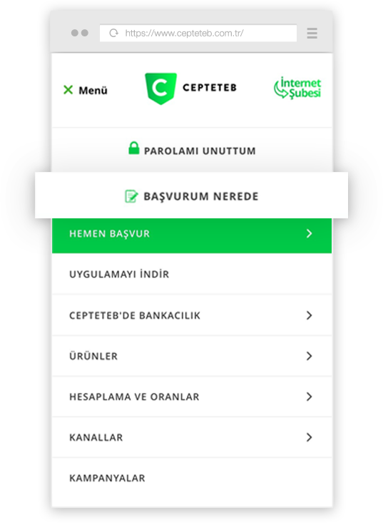
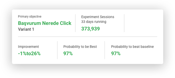
In order to test our hypothesis, we added an item to the mobile menu that directs the application follow-up form and we launched our test on January 25, 2019. A total of 373.939 sessions participated in the test, which was online for about a month.
At the end of the month, we checked the test results and we found that the conversion of mobile device users in the test variant was much higher and improved by almost 15%.
Conversion Performance

A warm welcome
In order to reduce the exit rates at the first step of the new customer application process; we have developed a hypothesis focused on giving users a friendly welcome and providing brief information about the whole process:
Adding introduction text to the first step of the customer Application form will reduce the first step exit rate and increase the completion rate.
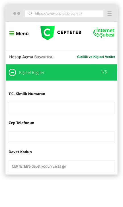
To test our hypothesis, we placed a welcome and information copy at the start of the form. We released this version on December 27, 2018 and tested it in 57467 sessions for 16 days.
Mobile - Original Variant
Mobile - Test Variant
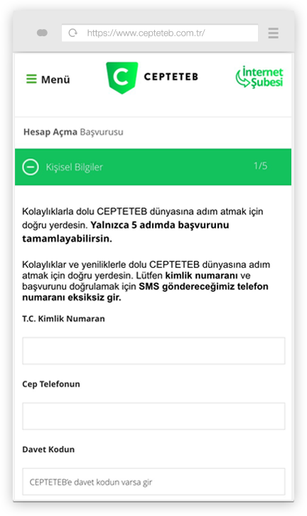
When we look at the results; we found that the test variant achieved a 5% higher conversion rate than the original version, and the test variant also performed 5% higher in the goal of advancing from the first step to the next step.
The inevitable rise of conversion

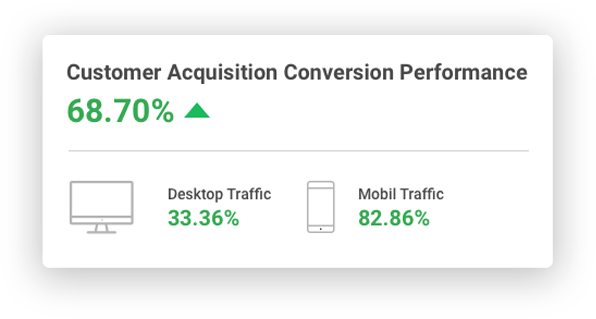
As we have seen in the data gathered from the A/B test results, we have successfully verified some of the hypotheses we have created.
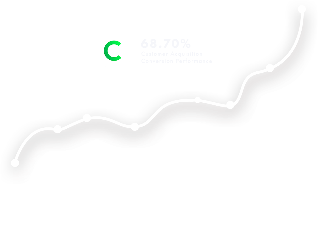
From April 1st to December 31st 2018, we achieved a 69% increase in New Customer Application conversion rate compared to the previous period. This increase was 33% for desktop and 83% for mobile.
In this project, together with the CEPTETEB team, we have carried out many micro processes in line with the hypotheses we have created in a continuous and coordinated manner. As a result, we have seen, once again, the unique contribution of good teamwork, data-based optimization and usability tests, successfully lead to improvements in conversion rates.

Serkan Fergan
TEB Digital Banking Group Director
With SHERPA, our longtime companion, we carried out an efficient project on optimizing our product and new customer application processes’ conversion rates. SHERPA quickly adapted their unique project management systems to our changing needs. The knowhow and the expertise of the SHERPA experience design team, as well as their high energy has contributed greatly to our side. SHERPA members supported us like teammates also as consultants. We worked as a single team and together and we achieved a satisfactory rise in conversion rates. Hope to work together on new projects in the future...
 TR
TR
