About the project
Since April 2015, Can Yayınları has been publishing Socrates Magazine monthly. In addition to the printed magazine, Socrates Team produces various content on digital media platforms such as Youtube, Spotify and Soundcloud regularly. Socrates Team worked with SHERPA for 8 months to redesign the user experience and interfaces of the Socrates Magazine website. Our aim with the new website was to combine video, podcast, and printed magazine content under one roof, to make the contents easily accessible to users, and also to provide a personalized experience.
Business objectives and problems
At the beginning of the project, Socrates team clearly outlined their business objectives and problems they wanted to tackle in the system. The main business objective was to design a platform that houses all the different content types, which spread across social media platforms such as Youtube and Spotify, and enable users to access the content seamlessly. In addition to that, our other high-priority objectives were to customize the user experience depending on content type and to improve existing subscription flows. The main problems of the current experience were listed as follows:
- The current website doesn't reflect Socrates's content diversity
- There are some roadblocks and open ends in the current membership and subscription flow
- Social media and websites have two different user groups and neither interacts with the content of the other
- The digital version of the printed magazine is not user-friendly on mobile devices
Through the new website, we aimed to set up a scalable system that provides an end-to-end user experience that reflects the content diversity of the Socrates ecosystem.
Designing the content
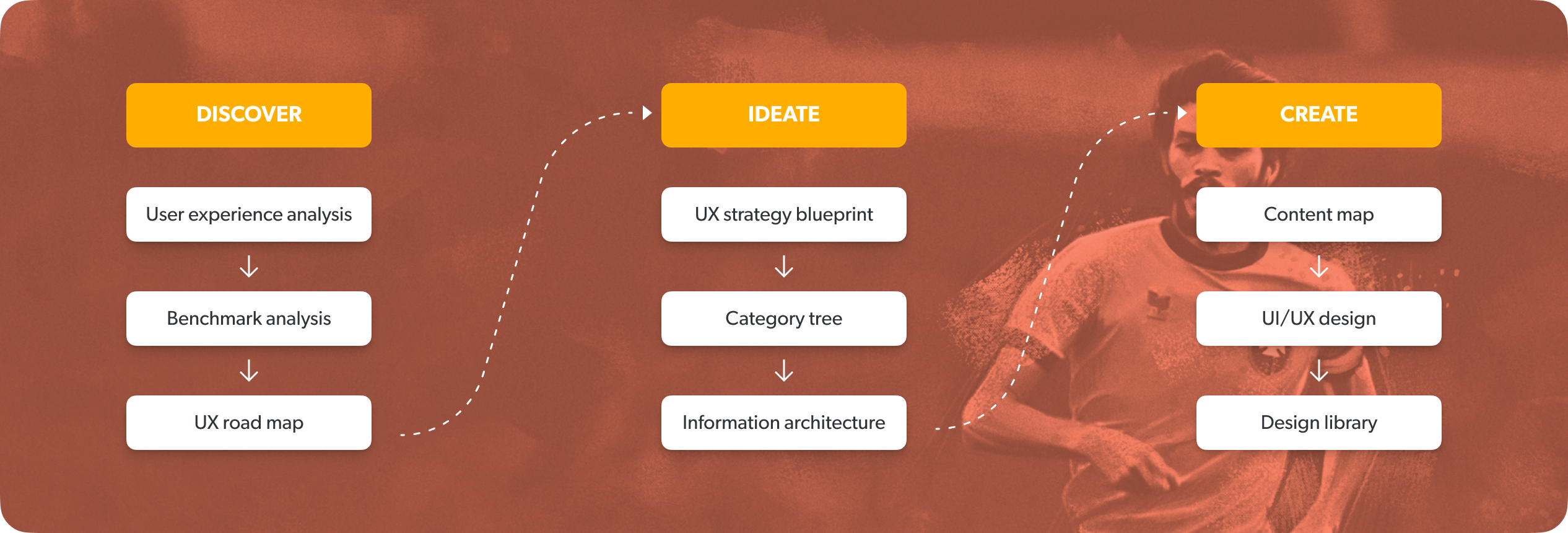
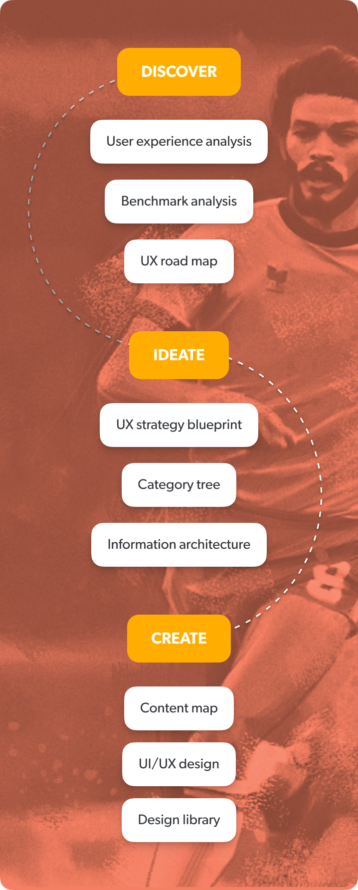
In user story creation, which is the first step of the ideation phase, we worked on “how” the main actions in our strategy would be reflected in the system. While creating the stories, we took into account the range of features offered by the existing structures of the system, the business objectives, the research outputs in the discovery phase, the strategy we prepared and the habits of target users. We identified 3 different user types - visitor, member and subscriber- and aimed to create a holistic experience which puts each user in the center at every step of the flow. We completed our project planning by prioritizing the user stories we created together with the project owner and the software team.
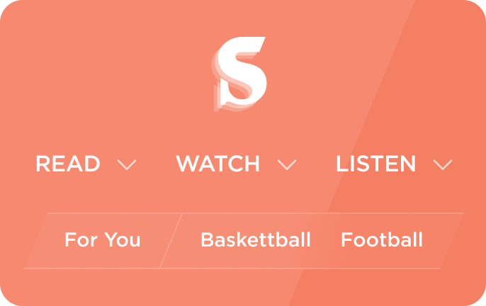
After the creation of user stories, we started working on the category tree and the navigation which were the corner pieces of the desired solution. We created the category tree and navigation with the primary goal of enabling users to reach and discover the content that interests them effortlessly. While creating the category tree, we grouped all the contents in the Socrates ecosystem and classified them to fit the mental models of users. One of our key decisions for navigation was to offer the user a two-tier structure based on content type and topic. The navigation layout reflects this decision in the positioning of main content types like “read”, “watch” and “listen”, as well as subject topics like basketball, football, and bicycle.

We started to create the information architecture based on the category tree and navigation scheme. During the creation process our main focus was to increase content engagement by simplifying the discovery process. Within the framework of the information architecture we have decided how and in what order the content would be presented to the users on a given page. We have designed a simple and effective structure that would enable users to easily meet with the subject, program and content producer they are interested in, without the need for complex algorithms.
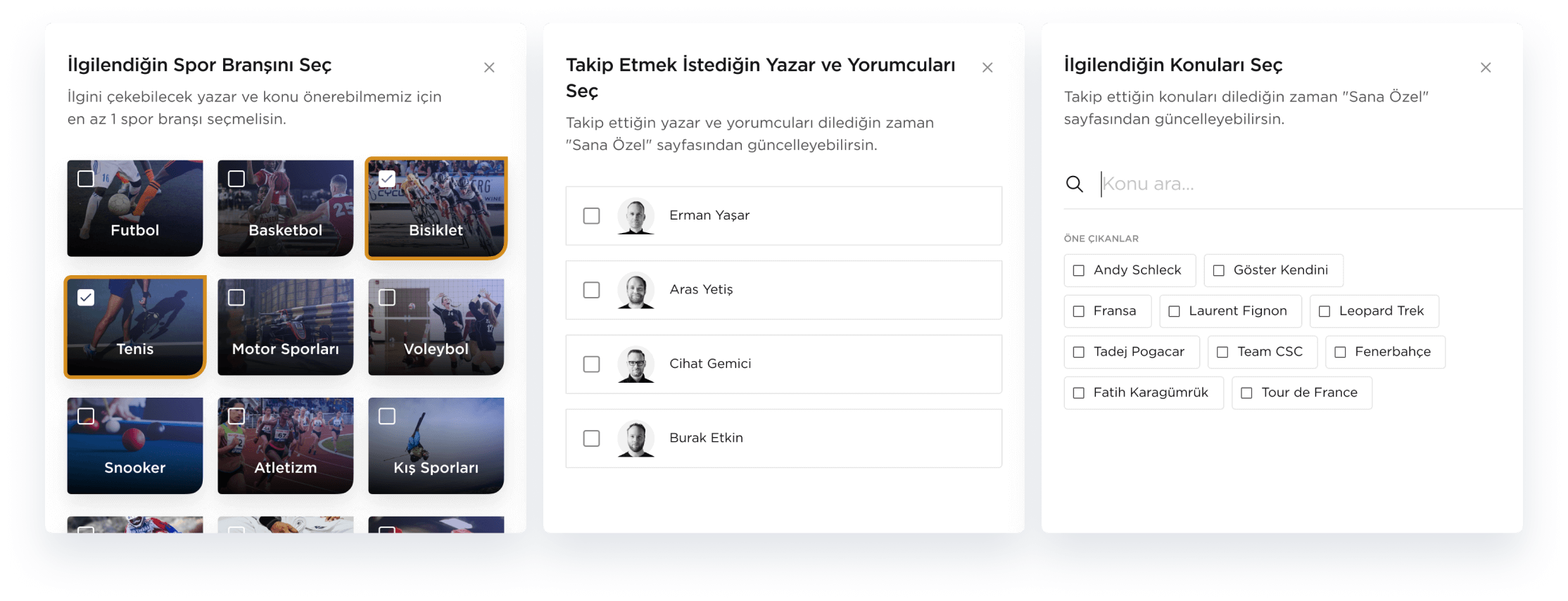

The tag structure, in which we reflect both content types and basic descriptive elements such as subject and author, provided an opportunity for users to follow and customize their experiences, while ensuring that contents in the system can be grouped and managed effectively.
Once we created the general structure of the system and the information architecture for content-centered pages, we began creating user and system flows for membership and subscription processes in which user interactions were the main focus.
We designed user flows intending to support the user at every step of the process and ensure they reach their goal successfully. Through simulations of all possible scenarios in flows, we aimed to fill any system gaps. With the help of the user flows, we were able to map the action-based parts of the user experience and created a foundation where we could discuss the necessary technical infrastructure.
Reflecting the brand identity
In the project, building a digital design identity based on Socrates's printed brand identity was of the utmost importance. It would not be an ideal solution to adapt the visual world created in the print magazine to the website as-is since the website has different dynamics and interaction requirements. To find a solution to this problem, we deciphered Socrates's existing brand identity. During this process, we observed a structure that was capable of presenting opposite qualities in harmony: being intellectual without abandoning street language, combining current events with timeless information, blending professional work ethic and amateur spirit. By using this contrast in site language, forms, and layouts, we managed to create a visual language that is both lively and peaceful. Furthermore, we achieved the flexibility and modularity needed by websites associated with digital sport broadcasting.
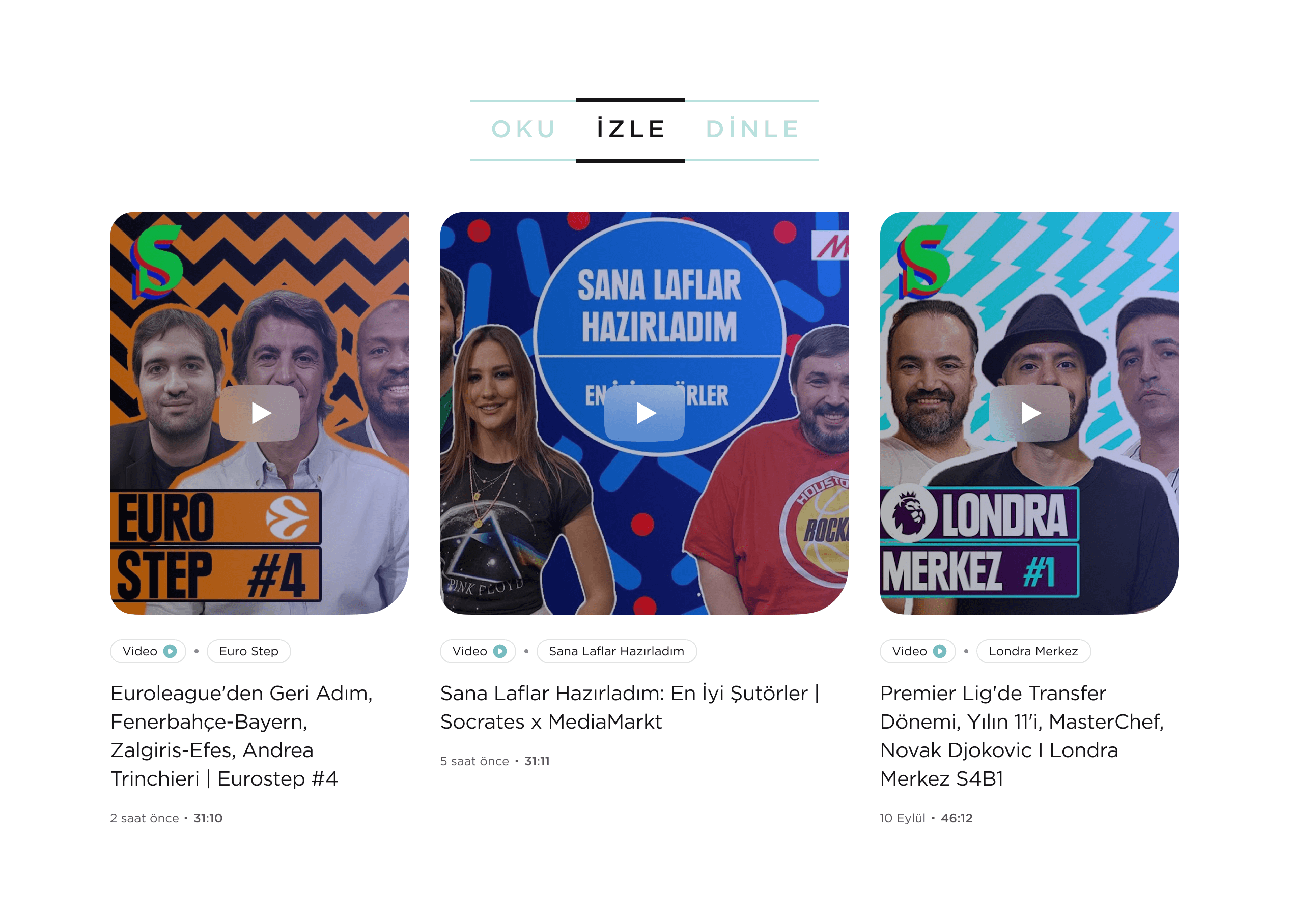

In light of our visual design, the characteristics of the content and current usage habits, we created modules that could be used both on desktop and mobile devices. In order to highlight the content, we designed cleaner and calmer visual modules for the content pages. On the homepage and listing pages we used more visual heavy modules to reinforce the new visual identity. By bringing together modular structures, which provided flexibility in design, we assembled user interfaces that reflect our user-oriented experience strategy with the unique character of Socrates. We completed the project by handing over the interface library (UI Library) to Socrates and the software team to ensure the sustainability and scalability of the website.
 TR
TR
