About the project
As the first digital and social insurance company in Turkey, the provider of a new generation of solutions, Quick Sigorta has a wide range of services including Compulsory Traffic Insurance and Optional (Kasko) Car Insurance services for car owners; also Compulsory Earthquake Insurance, Housing, Personal Accident and Travel Safety Insurance services. We, the SHERPA team have designed and started testing a brand-new homepage positioning for Quick Sigorta, which reflects their motto: "affordable, practical and instant insurance" and that directs the users to their desired product from the Quick Sigorta portfolio, in the fastest and most effortless way.
Our services
- Requirements Discovery
Analysis - UX Strategy
- UI Design
A new perspective
We started working by investigating how to increase the noticeability of the Compulsory Traffic Insurance form at the top of the Quick Sigorta homepage, and to make the other various insurance products in the lower part of the page more visible.
We viewed the user recordings and observed that the products on the home page can not be recognized with the existing icons and that the users make their product selections by using the menu. We also noted that there are many users who did not even notice the Compulsory Traffic Insurance form in the page showcase area. These results led us to develop this hypothesis:
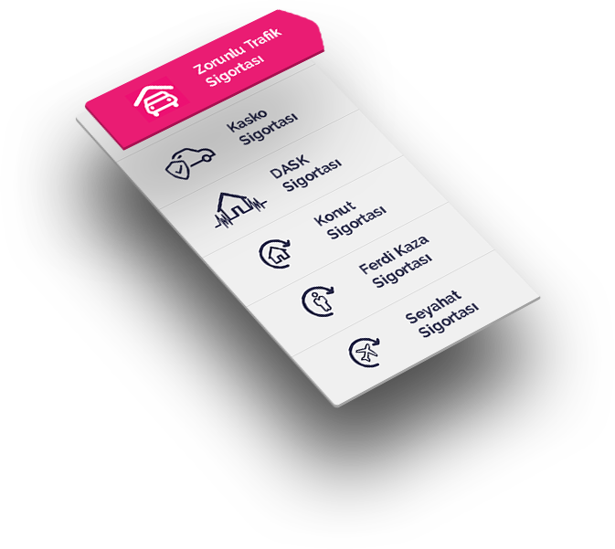
If the products are moved to the left side of the form field, in accordance with the order of content browsing; the visibility of the product portfolio will increase.
To validate our hypothesis, we started an A/B test, put the existing version and the updated version in comparison by letting the users to experience them.
The biggest difference between the two alternatives in our test, was the change in the number of transactions. Approximately 30% increase in conversion rate was achieved with the new version. In addition, after the new positioning, the 8% decrease in the number of bounces from the page was another success.
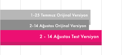
Rate of users who access to the product registration pages from home page

A positive change was observed in the rate of passing from the home page to all product registration pages. Between 2nd and 14th of August, when we tested the new version, access to product pages from the home page increased by 14%.
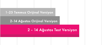
Rate of users who access to the product registration pages other than Compulsory Traffic Insurance from home page

The increase in the conversion rate of the users, passing to the product registration pages other than Compulsory Traffic Insurance from the main page was remarkable: Between 2nd and 14th of August number of users increased by 29.8%.
Eventually, using the new home page structure that we designed and benchmarked is reflected as 17% increase in revenue. Rising conversion and falling bounce rates proved how user-focused changes would make a difference. The success of our hypothesis in different areas, pioneered the decision to present the new version of the page to all users.

Levent Uluçeçen
Quick Sigorta - CEO
We are one of the leading companies in the field of digital insurance in Turkey. It is of utmost importance that the products and services we present are able to describe themselves in a digital environment and are useful and practical for consumers. In this sense, user experience has an important role in our business processes.
We are working with SHERPA which is one of the most important institutions in this field. SHERPA showed us the importance of small details and the fact that classic habits usually will not work. Now we have a showcase and service pages that are more comfortable to use and more enjoyable to our users.
User experience is a process and we are carrying out this process with SHERPA and we are pleased with the results. Thank you to SHERPA who served us with a positive and young team.
Visit Quick Sigorta Website.
QUICKSIGORTA.COM TR
TR
