Target: Conversion optimization!
Impressed by our earlier projects, KolayOto knocked on our doors with a clear expectation. December - the month of the year when the tire sales dramatically increase - was up ahead and KolayOto needed to optimize their shopping cart experience to the maximum. As the first Turkish partner of Optimizely in UX, we responded quickly and we improved their new sign up rates by 47% and their conversion rates by 30%
Curious about how we managed this? Let’s dive into the anatomy of our project.
Our services
- Requirements Discovery Analysis
- User Experience Analysis
- UX Strategy and Design
An iterative solution
approach
Discover, analyze, design, release and test!
First of all, what we did was to analyze the requirements. We defined the problematic areas, we prioritised them based on their effect on conversion rates, came up with hypotheses and we evaluated these hypotheses with the KolayOto team. We released some of these design suggestions directly and the others by testing them. What we achived was a measurable success!
The thing which let us to achieve this success in 4 weeks was the silent power of SHERPA: our sprint based iterative design methodology.
The conversion funnel of KolayOto at the start of the project
%11. 7

DROP OFF %88.3 (670)
CONVERSION %11.7 (89)
Requirements Discovery Analysis
We analyzed the current KolayOto experience first. In order to define the customers’ behaviour and the problematic areas, analyzing their web experience wasn’t enough: thus we also analyzed the KolayOto Call Center calls.
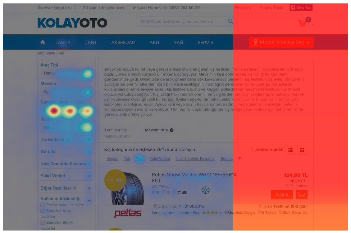
We analyzed the qualitative and quantitative data of KolayOto website and we documented our findings as a User Experience Analysis Audit Report, namely UXAAR.
We extracted the customers’ opinions by analyzing the content of the customer calls to KolayOto Call Center.

- %39Operator
- %24Purchase Issues
- %20Standing Orders
- %8Delivery, Payment, Stock
- %4Service Proposal
- %3Installation Support
In order to achieve a more satisfactory result, we did further analysis. We’ve analyzed 2 major competitors of KolayOto using SimilarWeb. Therefore, we could get to know more about behavioural patterns and expectations of not only KolayOto customers, but all customers who prefer purchasing this service online.
In addition to KolayOto's digital interaction, we payed a visit to their physical stores in order to do a field research as well. With the help of our findings and observations, we analyzed their customer segments to define our target users.
When it comes to user experience numbers may say a lot, but not everything. In order to come up with a holistic view we also conducted a heuristic analysis. Therefore we knew better about the KolayOto experience as well as the improvable areas.
We’ve documented all the findings of our analysis with a detailed presentation alongside an efficient production plan.
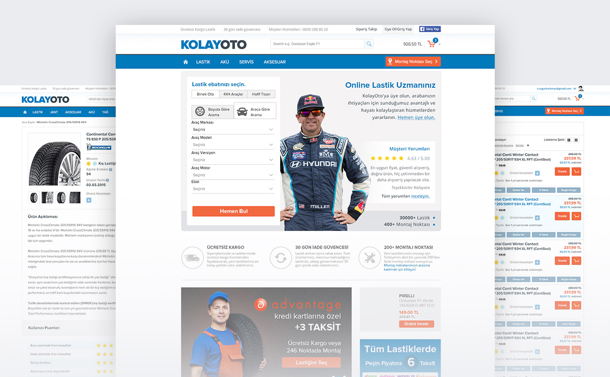
Designing the solution
We listed our improvement suggestions to improvable areas during Analysis and Requirement Planning as hypotheses. We supported these hypotheses with rapid sketches and reviewed them with the KolayOto team. Our objective was to implement these hypotheses, and keep an eye on their effect by continously evaluating them in order to achieve the maximum success.
We’ve divided our hypothese into 2 groups by their effect on the experience and the effort needed for implementation: New features and experiments.
Let’s take a closer look to our hypothesis workflow.
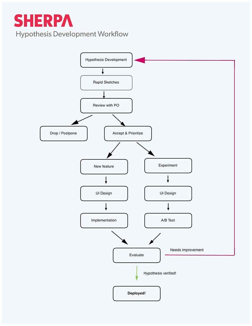
We’ve divided our hypotheses into groups. As we directly implemented the new features, we A/B tested our experiments.
In order to design interfaces for the new features and experiments, we used the KolayOto's UI kit. We’ve used Optimizely to A/B test our design alternatives.
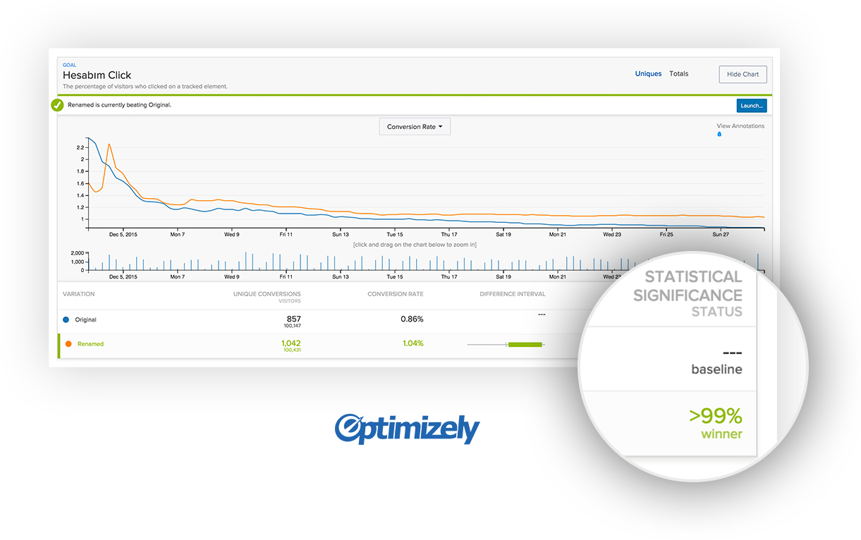
We continuously evaluated the results; the winner alternatives were directly implemented, as we came up with new hypotheses according to the results.

Onur Eren
Sekizgen - CEO
In order to have KolayOto.com audited - which we’ve been developing and managing with our internal resources - and to improve its performance; we brought in SHERPA as an external party to run a UX analysis for laying foundations of an optimization project to bring it closer to its potential. They went beyond analysing the data at hand, they’ve evaluated all touchpoints that may affect the customer experience by listening to our call center recordings, observing our order management in the field. They’ve come up with hypoteses bound to performance metrics and goals.
After implementing these hypotheses together, we’ve tested and measured each of them. As a result of an intense period as short as 8 weeks, we’ve measured 30% increase in our conversion rates, %65 increase in checkout funnel entrance and a 45% increase in new user acquisition. The precision of their projections was as impressive as these numbers.
We believe that, the story behind this success is both their solid approach and their willingness to diffuse into our internal processes.
In addition to all above, we enjoyed working with them, and we learned a lot from the synergy between our teams. We hope to work with them on our upcoming projects.
The improvements we made on the KolayOto experience achieved a measurable success. From new user sign ups to shopping cart experience, we improved the conversion rates of KolayOto by 30%!
Let the numbers tell about our success!

New sign ups %47increase

Checkout funnel entrance %65increase

Conversion rate %30increase
 TR
TR
