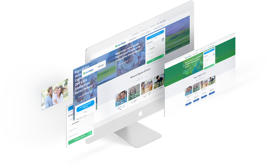
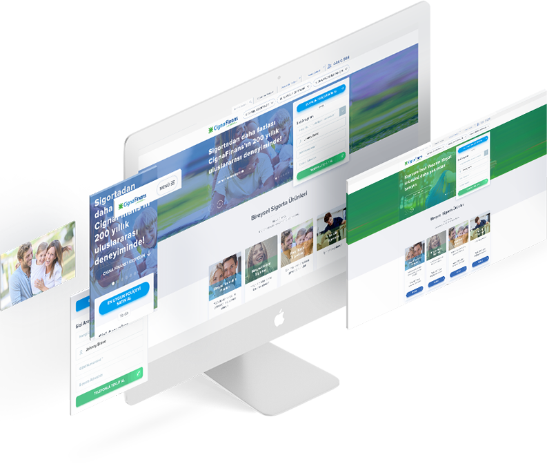
Redefining the digital components of customer experience
We integrated a wide range of digital insurance processes from decision to purchase and after sales in a dozen of offices across Turkey as well as the Cigna Finans website. We redesigned the Cigna Finans experience as a result of 10 months of hard work.
Our services
- Requirements Discovery
Analysis - Content Strategy
- UX Design
- UI Design
A completely digital
Cigna Finans experience
Cigna Finans began working with SHERPA to new and modern website where the users can purchase policies online. The goal of the project was not only to redesign their website which was mainly used for information and communication but also to give life to digital components to help them to provide better service to their customers at every location.
A solid foundation with a holistic strategy
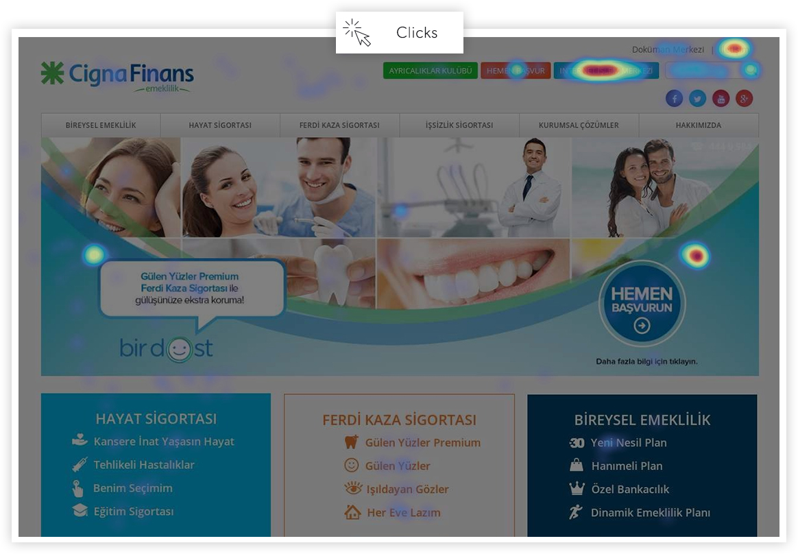
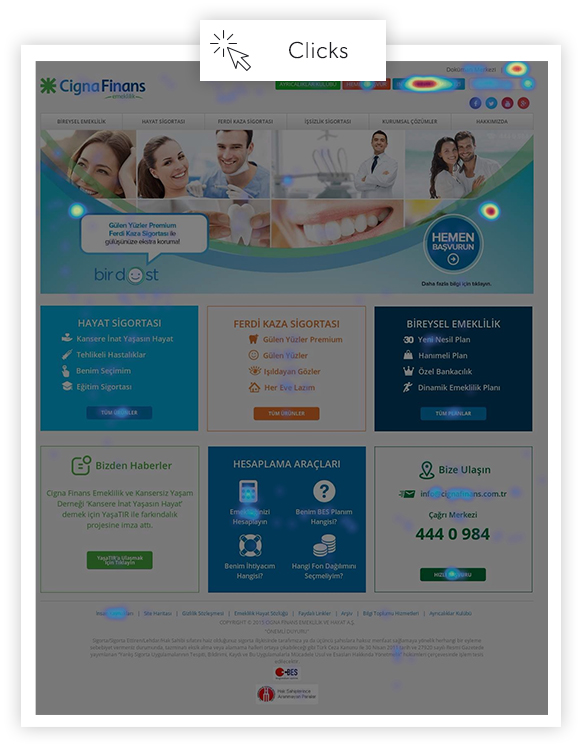
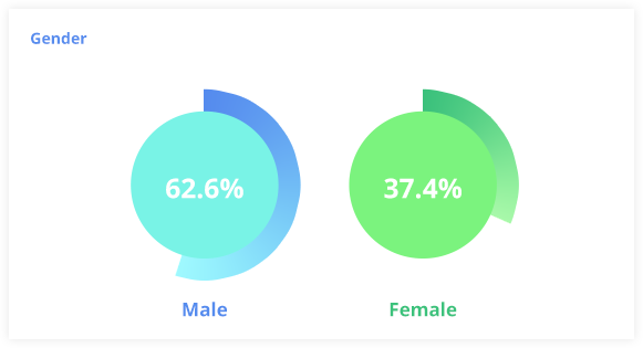
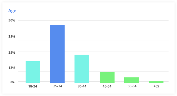
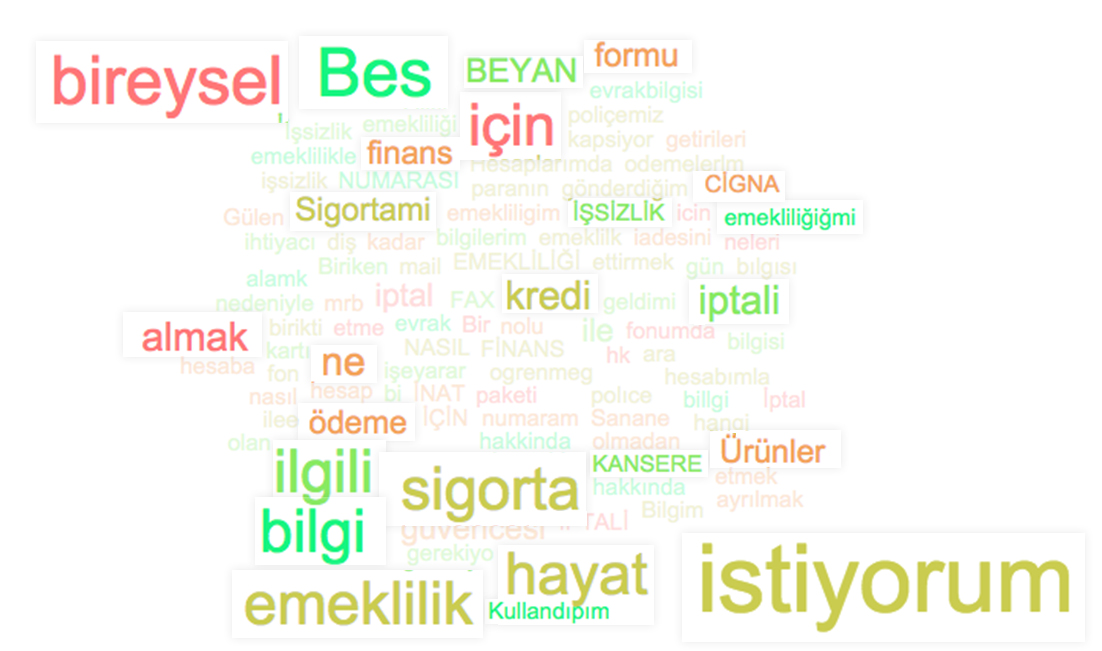
Designing a good digital experience depends on the right strategy, and the right strategy depends on a comprehensive analysis. We did a detailed analysis before starting to design a new digital experience strategy for Cigna Finans. We started with a content inventory analysis to disassemble every little piece of the Cigna Finans experience by listing and auiditing all the informative and interactive elements. After that, we attended a workshop with key Cigna Finans customers to examine their behavioural patterns, their expectations and their constraints. As an addition to our analysis over the analytical data of Cigna Finans website, we published surveys to gather valuable information from the visitors regarding their experiences on the website. By using SimilarWeb, we analysed the competitive position of Cigna Finans and we gathered insights and detailed information about the insurance market in Turkey. As a result of this detailed analysis and research, we came up with UXAAR, namely the User Experience Analytics Audit Report.

By merging the common UX principles and UXAAR insights with the assets in the Cigna Finans Brand Identity Guide we were able to design a solid digital experience strategy.
We designed the optimum information, purchase and after sales experiences based on this strategy.
Atoms first,
molecules later
We started designing the new Cigna Finans experience with designing the information architecture and the content. In order to provide the most efficient experience to our proto-personas, we grouped and mapped all the informative and interactive elements. After that, we created the simplest content according to this architecture. From headings to interactive elements, or content types to tone of voice, we designed the core of the new Cigna Finans experience.
Kurumsal Web Sitesi, İçerik Haritası

Flow and layout
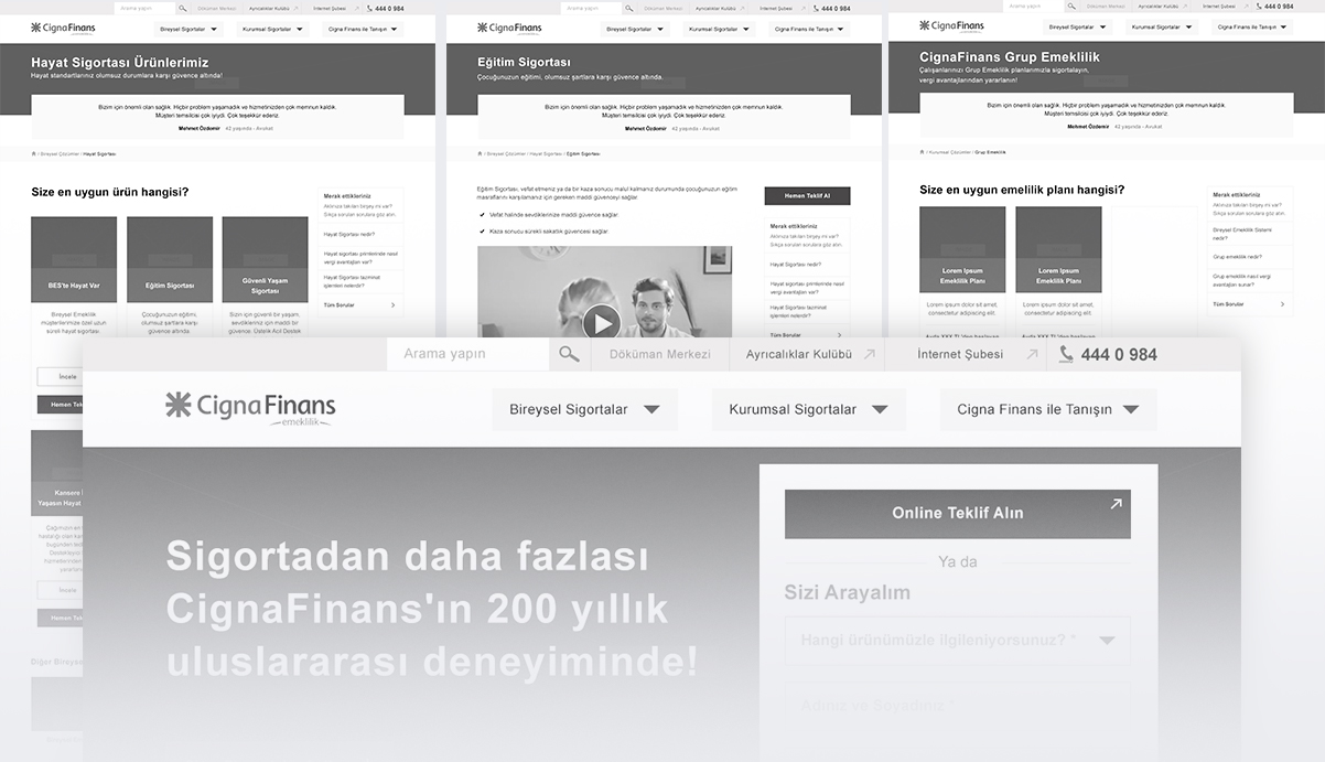
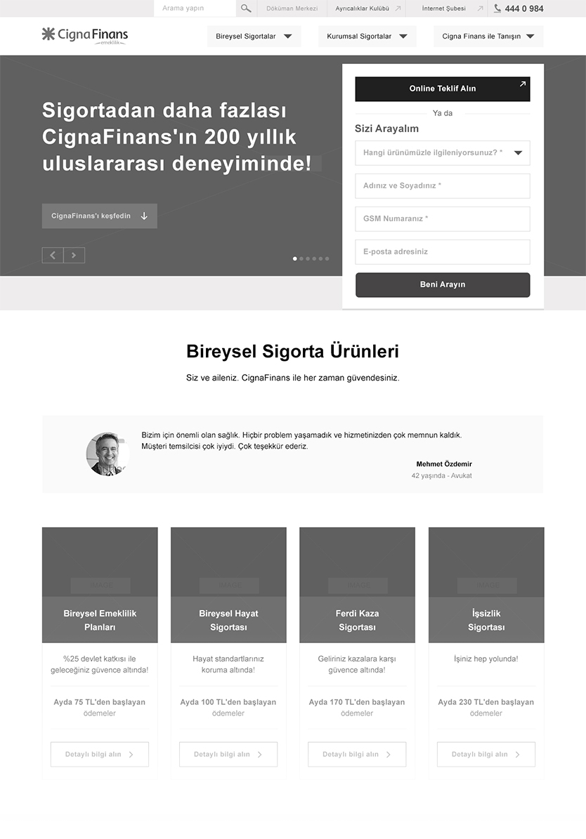
To produce the graphical user interface, we firstly designed high fidelity wireframes. From readability to simplistic flows, we processed all the details of the visual interface to be viewed in both desktop computers and mobile devices.
The next step was to integrate the visual hierarchy with the essence of Cigna Finans brand in order to design the graphical user interface.
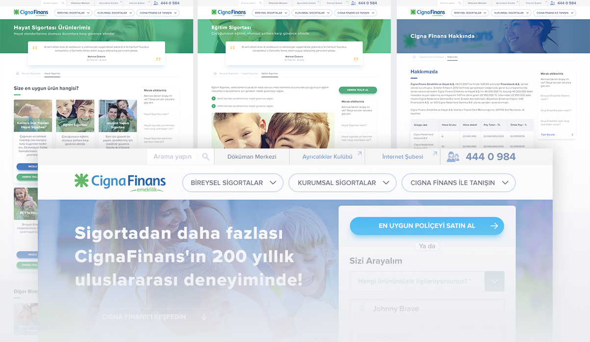
And the new Cigna Finance user interfaces
It may sound easy to design a beautiful user interface with the help of the right information architecture and the right content, but in fact, all the little details play a big role in usability and customer experience. We tried to design the new Cigna Finans interfaces keeping simplicity, readability and usability at the highest.
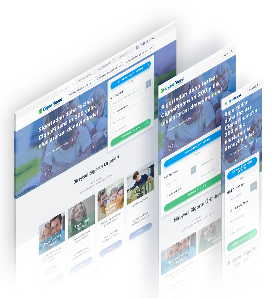
Visit the new Cigna Finans website.
CIGNAFINANS.COM.TR TR
TR
