We defined “shopping and payment experiences” from scratch
Since the early 1990s, Beko has been the first choice of 440 million consumers in more than 130 countries by carrying on its Turkish market success to abroad.
Beko has been holding the market leader position in POS payment devices in Turkey for years and it was time to set a whole new level in payment experiences.
Being proud to be invited, a team of SHERPAs joined forces with Beko teams to design a brand new payment experience which not only fulfils the expectations of both businesses and customers, but also proposes game changing approaches in interactivity and usability.
This, is the story of the new Beko POS Payment System.
Designing a future-proof experience
The majority of today’s payment systems in Turkey are based on server-client architecture which makes it hard to maintain and brings a number of risks. Most importantly they require a huge amount of orientation time for a single salesperson to be able to fully use the system.
What if we designed a system which runs on the cloud and is based on a sustainable user interface framework which makes it possible to adapt every business?
Our main goal was to propose and apply a holistic shopping and payment experience design based on:
- A solid information architecture for clarity
- A flexible user interface and interaction framework for sustainability
- A simple experience for learnability and customer satisfaction
- A smart infrastructure for extendibility
- An elegant look and feel for appeal
A new era of shopping and payment experiences bis about to begin.
Take a look at our project video.
Our Services
- Content Strategy
- UX Design
- UI Design
Our best resource:
The users
From various types of restaurants to major stores, we did 1 on 1 interviews with waiters, sales people, customer relations managers, IT managers, inventory managers, business managers and business owners.
During these interviews, we were able to pinpoint the positive and negative assets of the current payment systems’ customer experiences in detail to highlight how these affect the customer satisfaction and productivity.
Our field research enlightened us about the major productivity and efficiency leaks in current payment experiences. We’ve observed that the majority of the market was based on old-fashioned infrastructures, which made it difficult to improve or optimize. From customer relations to ordering and payment, the digital layer of the customer experience was cumbersome in key points. Running on client-server architecture, the point of sale devices were designed with a large set of functionalities in mind, but they all were missing the most important part of the problem: the customer experience.
From restaurants to retail stores, the customers weren’t the only ones who suffered from these outdated systems. We learned that the biggest issues have been emerging on the other side of the walls. We’ve found out that the sales, finance or customer relations teams had to “hack” these systems spending hours of manual operations and doing tons of paper work in the background; just to provide a satisfactory customer experience. Besides all these facts, the global solution approaches didn’t provide a holistic approach neither.
Keeping “sustainability” in mind at all times, we focused on the key elements of the customer experience. Based on our observatory research in a wide range of businesses and our interviews with personas, we pinpointed the problematic areas and lacking solutions.
Visualizing the hierarchy
of a usable experience
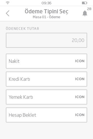
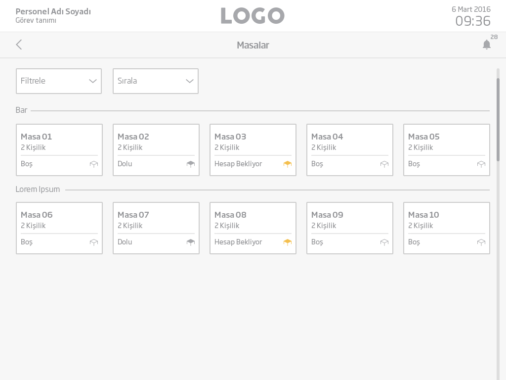
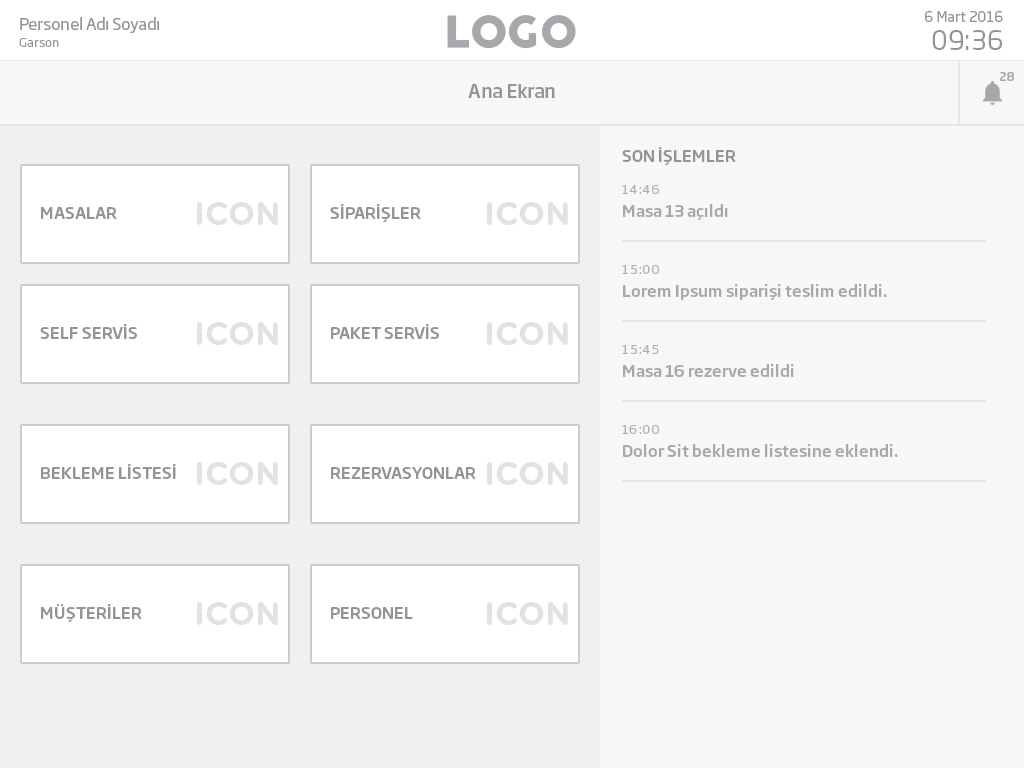
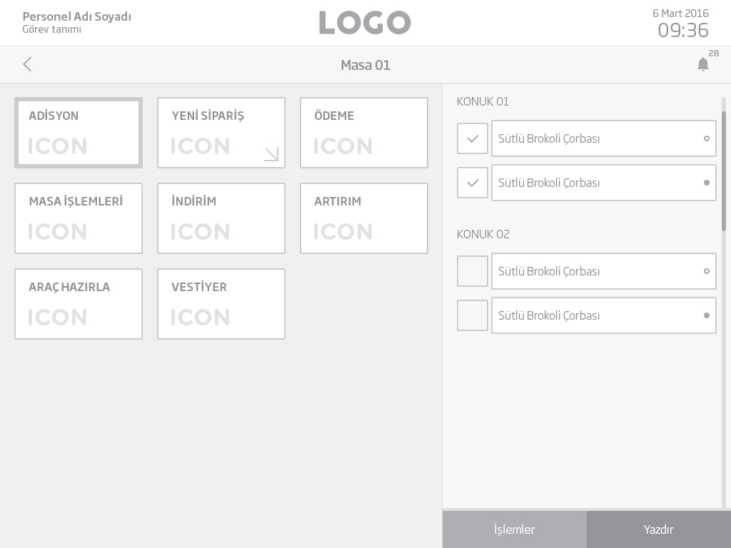
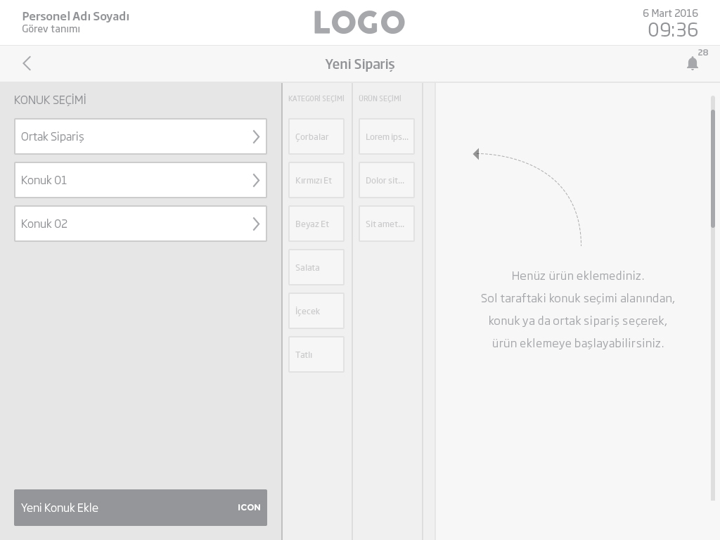
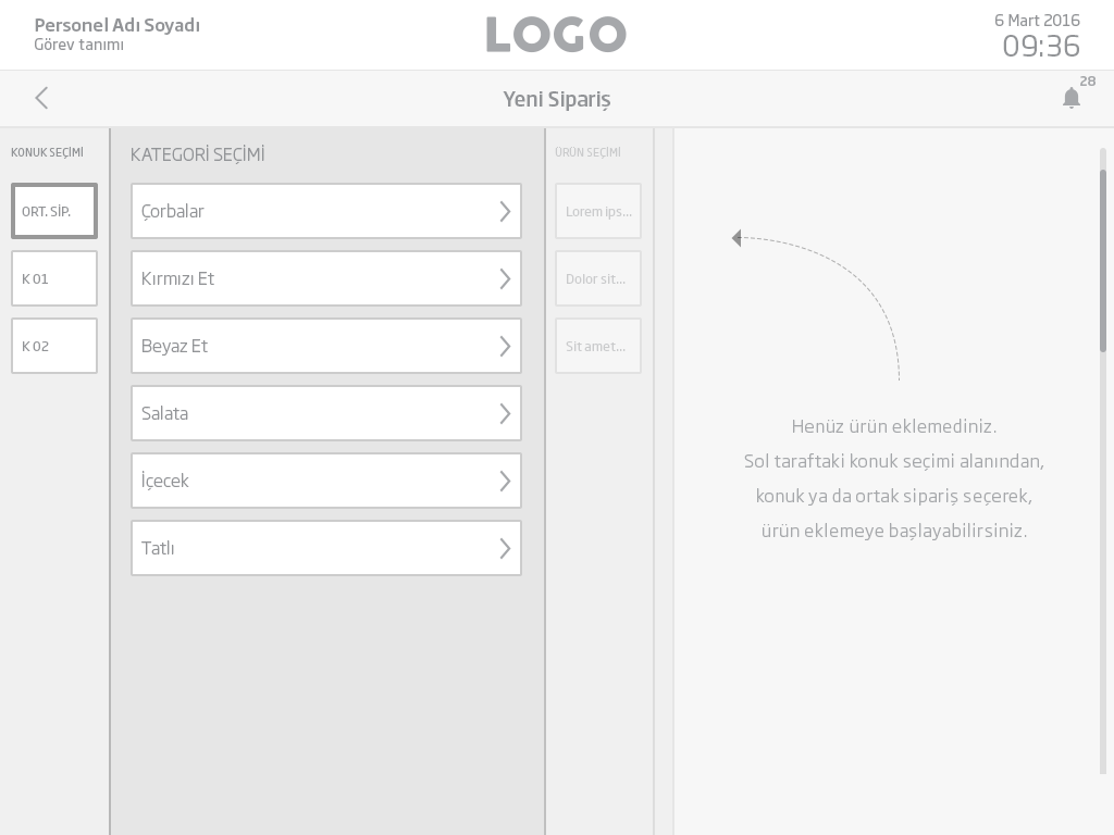
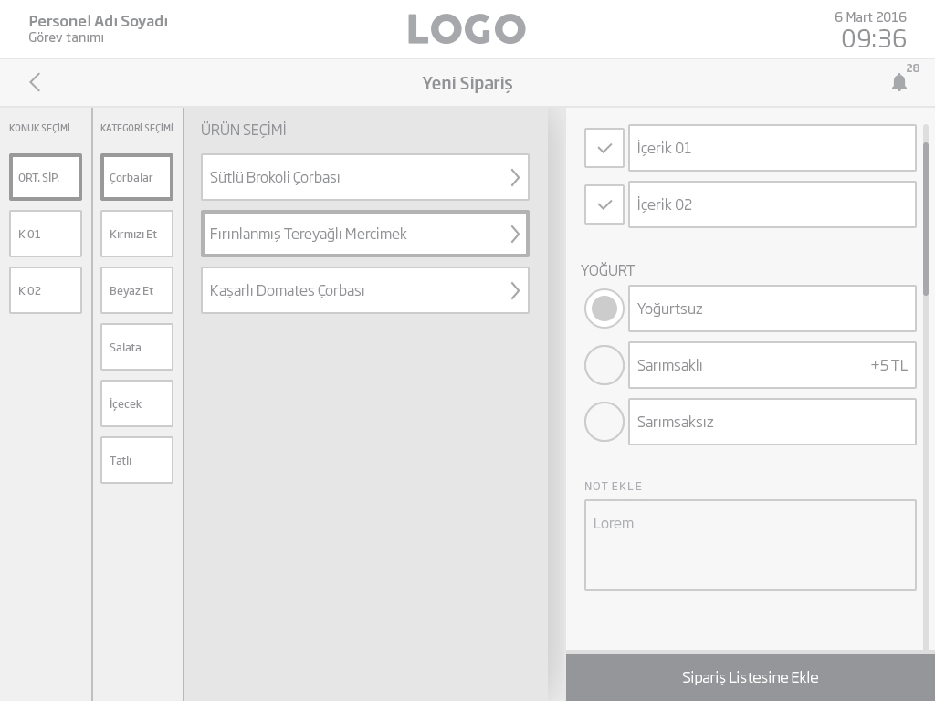
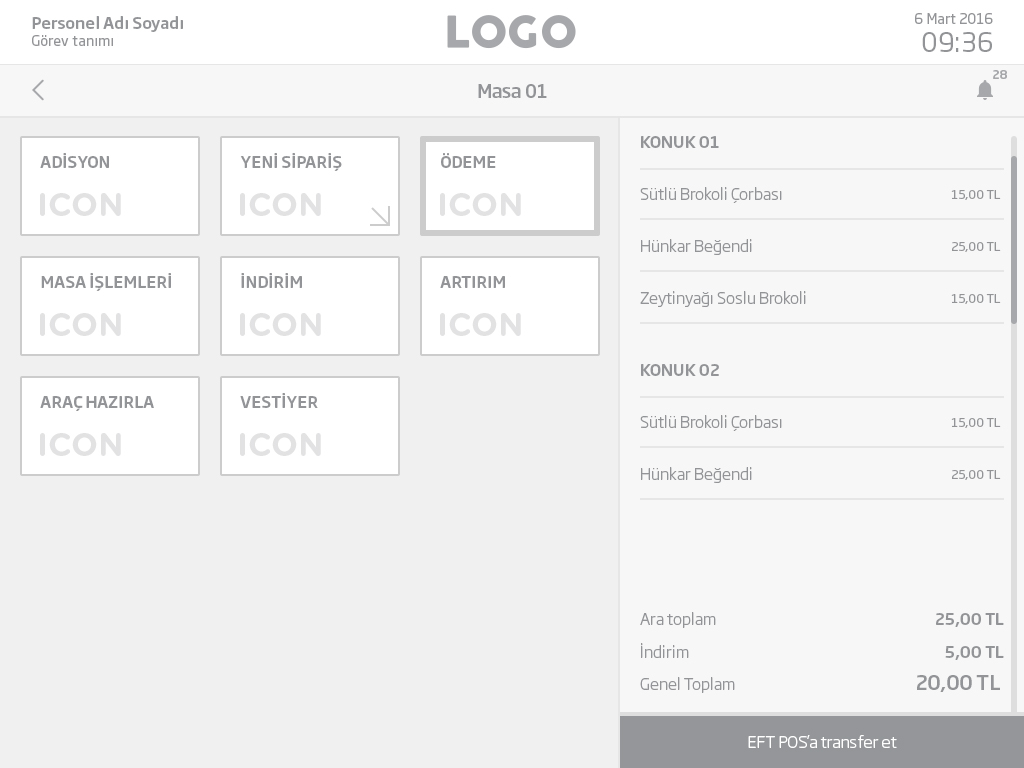
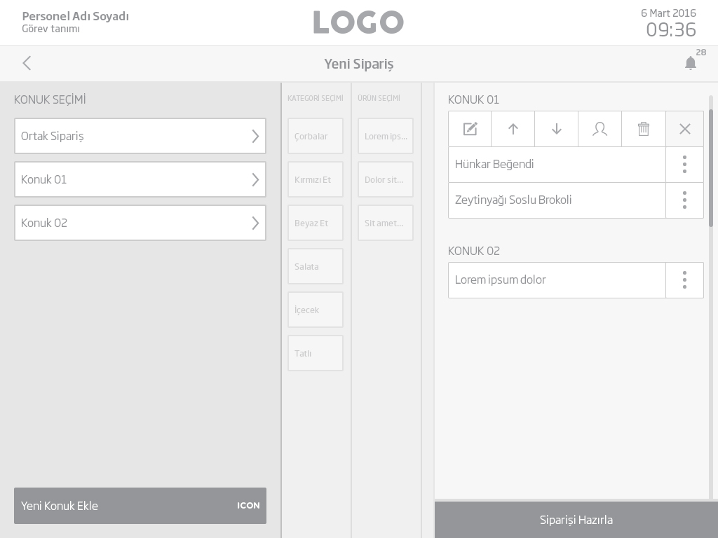
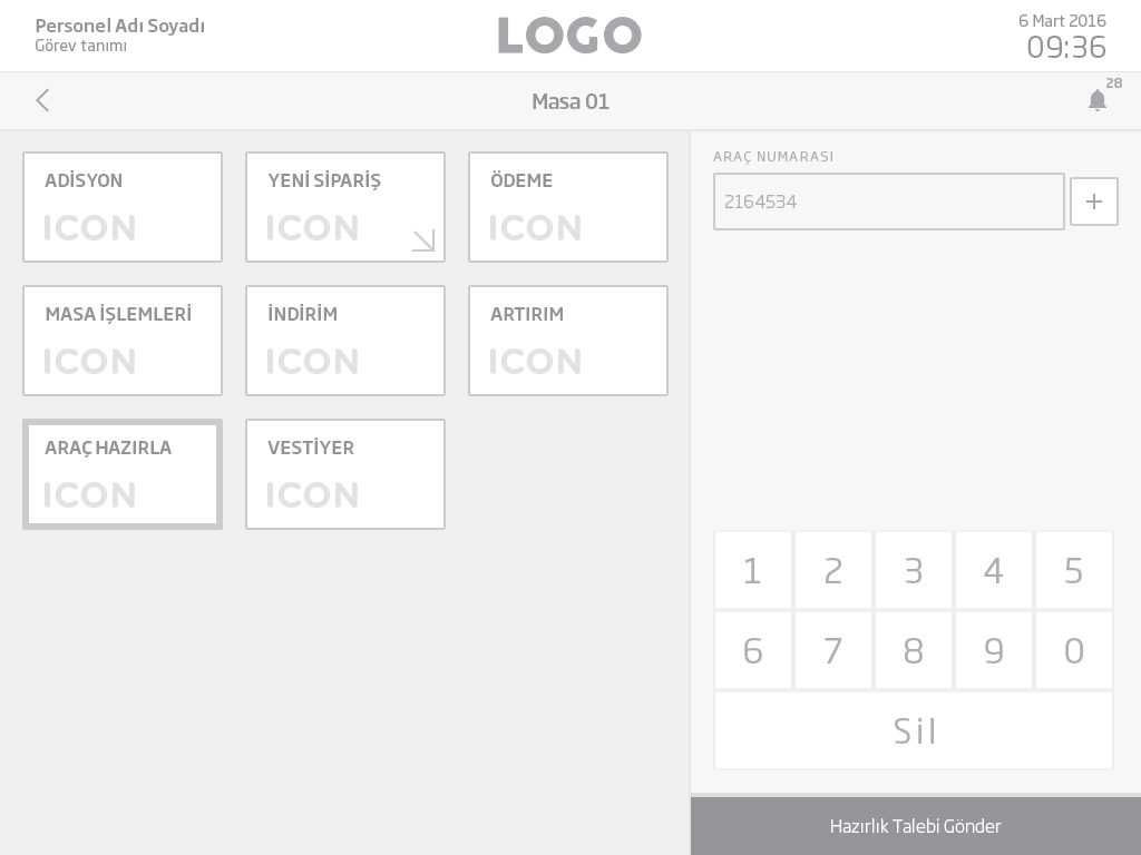
We created medium and high fidelity wireframes in order to create a solid visual hierarchy and modular user interface elements based on the user stories we’ve created earlier.
Thanks to this modular user interface structure we’ve designed, we were able to design reusable screens in the optimum time for different types of viewports and applications.
A sleek user interface
What makes a solid interface appealing is surely its look and feel. After we shook our hands with the wireframes, the only thing left was to design a sleek user interface. From the user interface elements to the color scheme, our objective was to come up with a sustainable user interface theme to be applied to any business or brand. This customizable user interface kit allowed us to come up with minimal and elegant interfaces out of it.
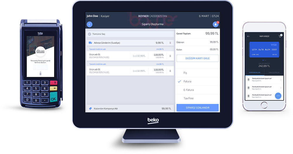
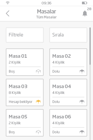
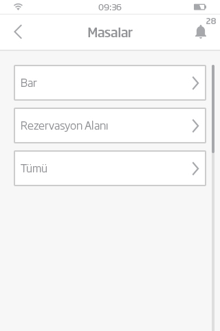
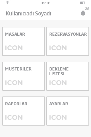
At the final stage of our design process, we have designed interfaces for several types of functions to be used by a number of businesses on different types of viewports, from POS terminals to smartphones.
- DASHBOARD
- PERAKENDE
- RESTORAN
- BEKO PAY

Ferhat Ünlükal
Business Development Manager / Arçelik
Thank you to all of the team for your excellent effort, your creative work and the high level deliverables for the user experience and user interface design of the new Beko Payment Systems. We are delighted with the design process, too.
We wish to see that the experience you have designed to be developed and released the soonest in order to create value for the Beko Payment Systems customers and our software development partners to release new value added services to the market. We also wish a long lasting collaboration with the SHERPA team.
I want to thank each of you for the value you have added to Beko Payment Systems.
At SHERPA, we believe that design
is solving problems and to solve problems
you have to define them.
From the beginning of the project, our approach was to pick and identify every asset of today’s payment systems. Thanks to the outcomes of this research and analysis phase, we were able to produce a simple, usable, learnable and productive payment experience across a wide range of devices and businesses.
Beko Payment Systems now provide a holistic and sustainable solution that simplifies management, customer relations, reservations, ordering and payments in any type of business in any country, thanks to its innovative architecture, its minimalistic and usable interface and brand new Beko POS devices.
A new era is about to begin.
 TR
TR
