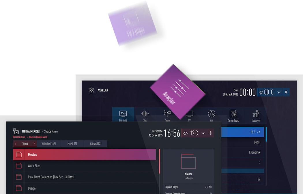
About the project
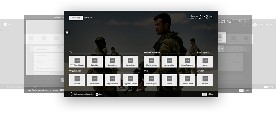
Humbled and honoured to be a part of an excellent team, we proudly announce the launch of the new look, experience and user-centered design of Arçelik, Beko and Grundig Smart TVs.
The project had a kickstart on the last week of November 2014. But, SHERPA’s Arçelik history lays quite a long way back, possibly to the childhood of each team member. As you would guess, the greatest motivation inspiring the team was to have the chance of participating in the user experience design of their “childhood heroes”.
We joined our forces with 14 other team members from Arçelik’s Product Development, Industrial Design, Marketing and IT departments have started by discovering the existing TV experience again. All the user touch points have been noted carefully and the big picture of user’s journey on TV have started to arise day by day. Spending time with real users during usability tests, watching them using the TV remote, asking them questions about the bottlenecks they were facing let us come up with plenty of suggestions. And that’s how the 3 months UX innovation journey started.
Our services
- User Research
- UI Design
- UX Design
- Content Strategy
A brand new smart TV experience.
But, how?
Our objective was simple and clear, and yet hard to accomplish: Creating a user-centered interactive TV experience with a predictable logic through a more appealing interface. Preferably, without touching a single line of code.
Our main goal was doing optimizations on the UX and the UI of the product, for especially the mostly used screens. But our most important of goal was to improve the main user experience logic to be applicable to all user interfaces of the product.
Starring:
The user
We started allocating a dedicated team and we created a project plan consisting of several contiguous sprints associated with every business objective. In each sprint we:
- Conducted user researches.
- Did heuristic analyses.
- Suggested a better information architecture.
- Created and optimized a better user experience.
- Designed and presented a more appealing user interface.
Usability testing was by far the most efficient and revealing method to pinpoint existing problems and gather insights from the actual users to enhance the overall user experience. Our test management team built a controlled testing setup, created test scenarios on the existing interfaces and let the users perform these test scenarios. With both positive and negative insights collected through observation and intervieweing, we managed to frame the most crucial parts to focus on.
The 10-foot experience
We looked for the sources of each problem firstly in the information architecture. Questioning the importance and the priorities of the informative and interactive assets, we defined and classified the information in the first place. While doing this, there was something that we needed to keep in our minds: the 10-foot experience. We blended our suggestions on the information architecture followed by building the visual architecture with the aim of creating the TV interface to be usable from this average usage distance of 10 feet.
We’ve visualized and shared our suggestions as wireframes in order to let the client, the developer and the designer to be able to take a critical look at the structure of the project, and allowing them to make revisions easily as well. Thanks to our productive team work, we’ve defined the information architecture.
User interfaces
integrating with brand values
While working on designing the user interfaces, we meticulously investigated the branding guidlines of Arçelik, Beko and Grundig. We’ve reflected the primary values of each brand to the elements of our user interfaces.
Brand values and assets were not the only thing we considered. Every little detail was an important component of the user experience. We’ve stylized all the user interface elements considering their interactive states. From the fonts we chose to supportive icons, even to the spacing between these elements, we delicately designed every single detail.
Let the numbers speak
- 153 Wireframes
- 70 days of production
- 12 Sprint
- 68 Team Meetings
- 14 Client Meetings
- 229 Emails
- 210 Tasks
- 1261 Hours Logged
Serdal Korkut Avcı
Arçelik Group - Director of Industrial Design
SHERPA has been a teammate who makes us follow our project. It has a team staying with us during the whole process and that has reminded us we run to the same goal with their inclusive approach. They quickly adapt to the developments of the world and succeed to keep at this level as a partner. They have a structure that readily, temperately and continuously experiment as the connotation of the name indicates.
We designed for the world
Talent wins games, but teamwork and intelligence wins championships.Michael Jordan
The synergy of the Arçelik and SHERPA teams not only bringed productivity, but also took the quality of the deliverables to the top most level, letting us design a more usable and appealing TV experience.
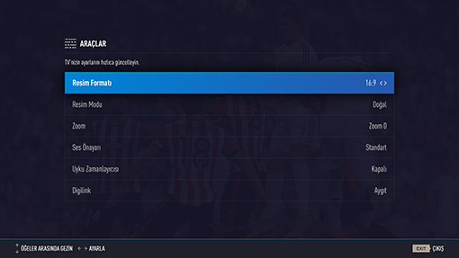
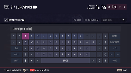
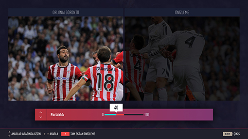
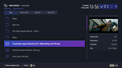
Our process for Arçelik, Beko and Grundig smart TVs which consisted of research, analysis, content strategy steps followed by user experience and interface design has finally brought results. We teamed up with Arçelik’s industrial design, product management and software development teams in order to make the new TV experience to be firstly available on Ultra HD curved TVs. The new TV interface we designed is about to be used by not only Turkish users, but by millions of people from hundreds of different cultural backgrounds in more than a hundred countries as well
 TR
TR
