About the project
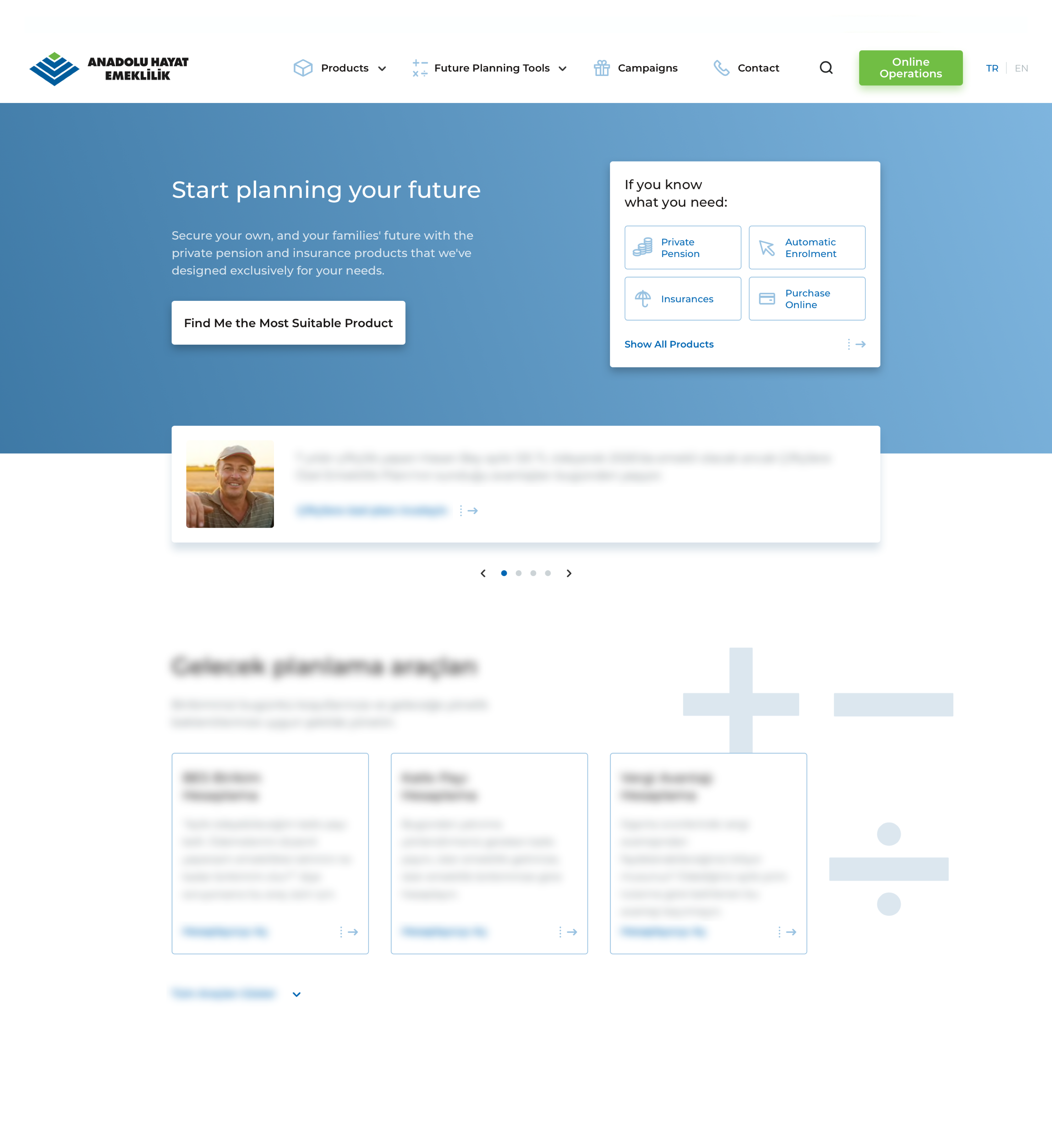
Established in 1990 as the “first life insurance company of Turkey”, Anadolu Hayat Emeklilik has generated Turkey’s largest funds in the aggregate of life insurance and private pension systems. We went about re-designing the digital assets including the corporate website and the online branch of Anadolu Hayat Emeklilik to provide an experience in accordance with their organization-wide commitment to "Excellence in customer experience".
We started our journey keeping the main objectives in mind; to offer the products & services in a clear and easily-understable manner in both context and provided value, and enable users to effectuate purchases and related activities in policy & investment products easily through online branches. We paved the way to a better user experience by producing deliverables such as UXAAR, UX strategy roadmap, user stories, user journey map, content maps, brand voice design, and user interface design during this process. Having designed the flow and architecture of this invaluable & informative project which enabled selling of private pension products online for the first time in Turkey, we are proud to crown this process with the Bronze Stevie Award in 2019.
Problem
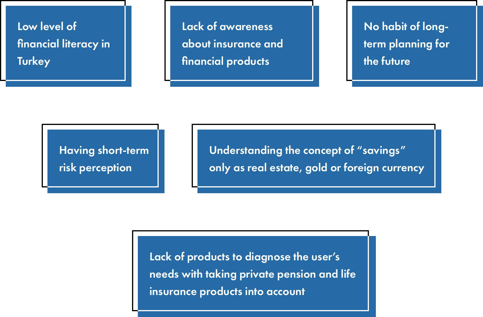
Before SHERPA was introduced to the project, user research was conducted, user personas and journey maps were created. All the insights from the research indicated that the product mix could be organized in a more clear way for the users. The root causes include:
Anadolu Hayat Emeklilik chose us to redesign their digital assets in accordance with the user needs, in line with their strong commitment to “Excellence in customer experience". Visually modernizing digital interfaces and building a structure that allows users easily reach the information they’re looking for, were some of the most fundamental areas we turned our focus on.
Our approach
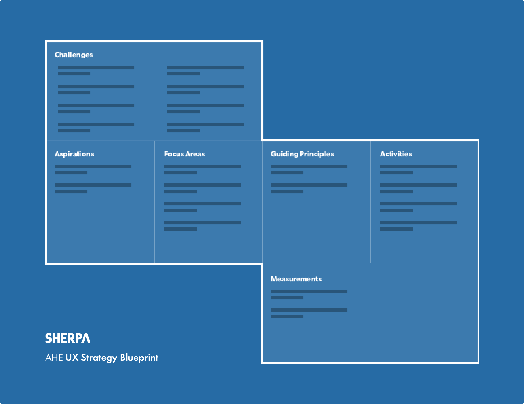
They say “if one does not know to which port one is sailing, no wind is favorable”. In this sense, we were aware of the need to set a goal and foresee the long road that lies ahead of us, before starting to produce any solution. So we took our time to fully comprehend this prospective target, anticipate the roadblocks, started planning to increase the efficiency of this journey, and created a roadmap at the very beginning of this journey. We sought answers to questions such as:
- What are our primary aspirations and the ultimate goal in this project?
- Which constraints and challenges should we consider?
- Which attributes can we define as our guiding principles?
- What are the most important focus areas?
- Which actions should we take within the defined context?
- How do we measure the user experience we design?
We paid close attention for the experience and interaction design to always be accessible, clear, comprehensible, informative and fast regardless of the channel accessed.
Our services
DISCOVERY & NEEDS ANALYSIS
- Draft Production & Resource Planning
- UXAAR Rerport
- User Centered Design Canvas (UCDC)
- H.E.A.R.T Framework (KPI framework)
BRAND VOICE DESIGN
- Online Channels Analysis
- Competitive Analysis
- Brand Personality Workshop
- Brand Voice Guidelines
CONTENT STRATEGY & INFORMATION ARCHITECTURE
- Navigation & Site map
- User Stories
- User Flows
- Content Map
USER EXPERIENCE STRATEGY & DESIGN
- Hi-Fidelity Wireframe
- User Interface Design
- UX Strategy Blueprint
The process
We started the project by going through the existing persona and customer journey map deliverables in thorough detail. Reviewing Anadolu Hayat Emeklilik’s digital assets in the context of First Impressions and Analytics Audit within UXAAR; we evaluated them in terms of usability and performance, while reporting prominent insights driven from the performance metrics gathered by quantitative user data.
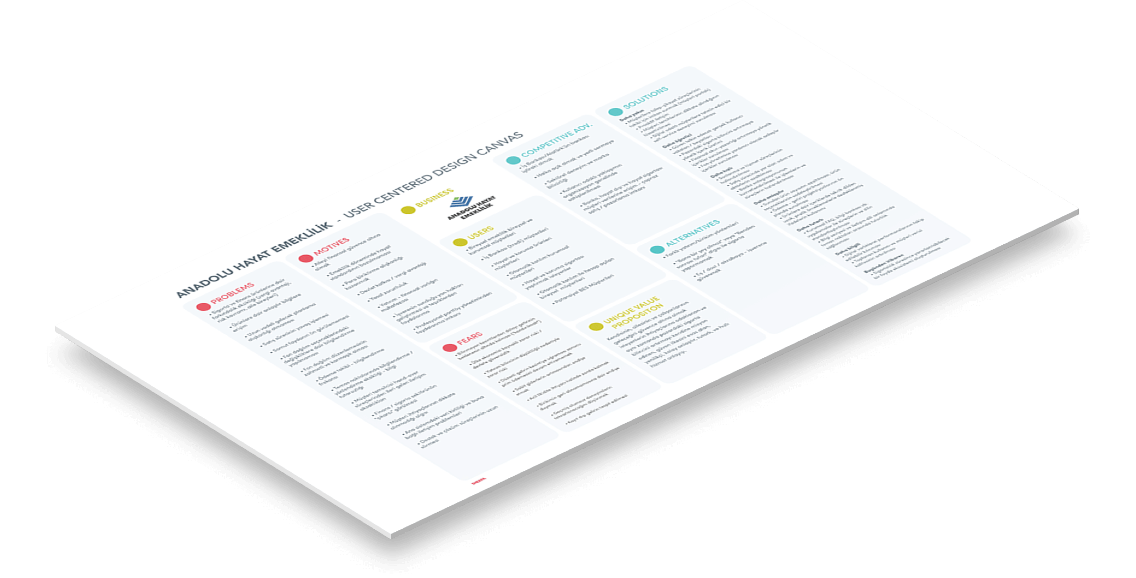
We’ve continued our process, conducting a User Centered Design Canvas (UCDC) workshop to discover and reveal a comprehensive analysis of the users’ needs and project owner’s business goals. This allowed us to present key insights from both sides of the equation on a single plane. We added the target audience’s problems, fears and motivations on one side, and the company’s competitive advantage, alternatives their users could gravitate towards, and proposed solutions on the other. What we see allowed us to craft the unique value proposition:
“A modern, simple, coherent and fast service that defines trust as a guiding principle; focusing on the needs of those who want to secure their own, their families and employees’ future, while aspiring to improve the insurance awareness of the market.”
H.E.A.R.T. framework by Google Ventures team was our go-to instrument to measure the user experience. As SHERPA, we decided to define this system as our north-star when creating UX measurement models, so we planned how to measure the experience in the context of “Happiness, Engagement, Adoption, Retention, Task Success". We aimed to keep close tabs on the process by clearly defining the goals for each category, the signals that indicate how close we get towards a goal, and the metrics that show us the performance of that specific goal.
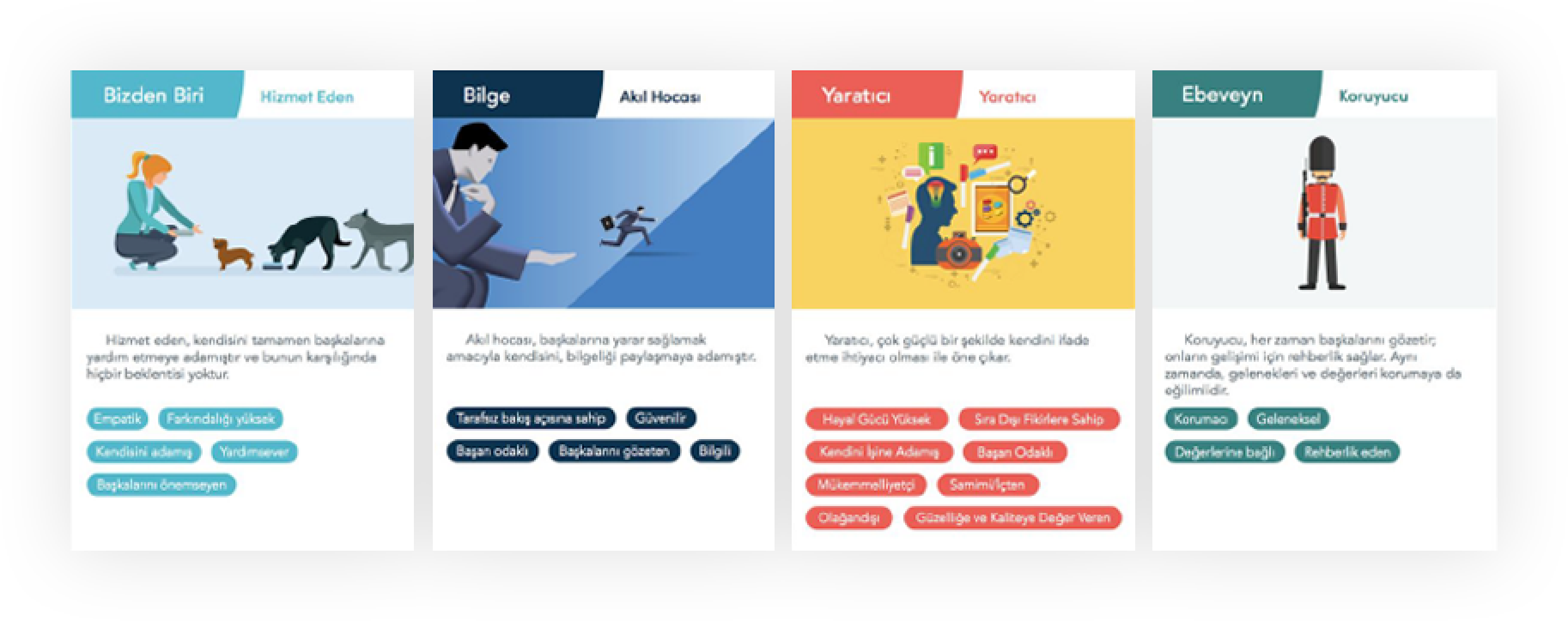
Within the scope of the project, we also created the brand voice guidelines as a final deliverable for all internal and external stakeholders to internalize the current brand voice. With this guideline —which aims to help all teams create clear, understandable and consistent content for current and prospective clients— we defined main principles and indispensable areas to adhere to, when creating content for Anadolu Hayat Emeklilik. And we began this by defining the brand voice with the help of archetypes.
The UX strategy blueprint we created in the ideation phase became the leading guideline during the experience design process. This guideline allowed us to track the mission that we previously defined as our main aspiration: “Helping our customers achieve a better and more comfortable life by enhancing their awareness and ability in financial planning,” and “having a positive impact on the national economy by increasing personal savings".
We laid the foundations of the new website with highly detailed information architecture and red route analysis we created in the light of the goals and guiding principles. In the design approach presentation; backed up by insights derived from previous deliverables, —qualitative and quantitative user research, UXAAR report, User Centered Design Canvas (UCDC), UX strategy blueprint, brand personality workshop, brand voice guideline, and information architecture— we proposed the solution hypothesis:
“Guiding our users and presenting the products that best address their needs in an accessible way will help increase their awareness in long term planning and risk management".
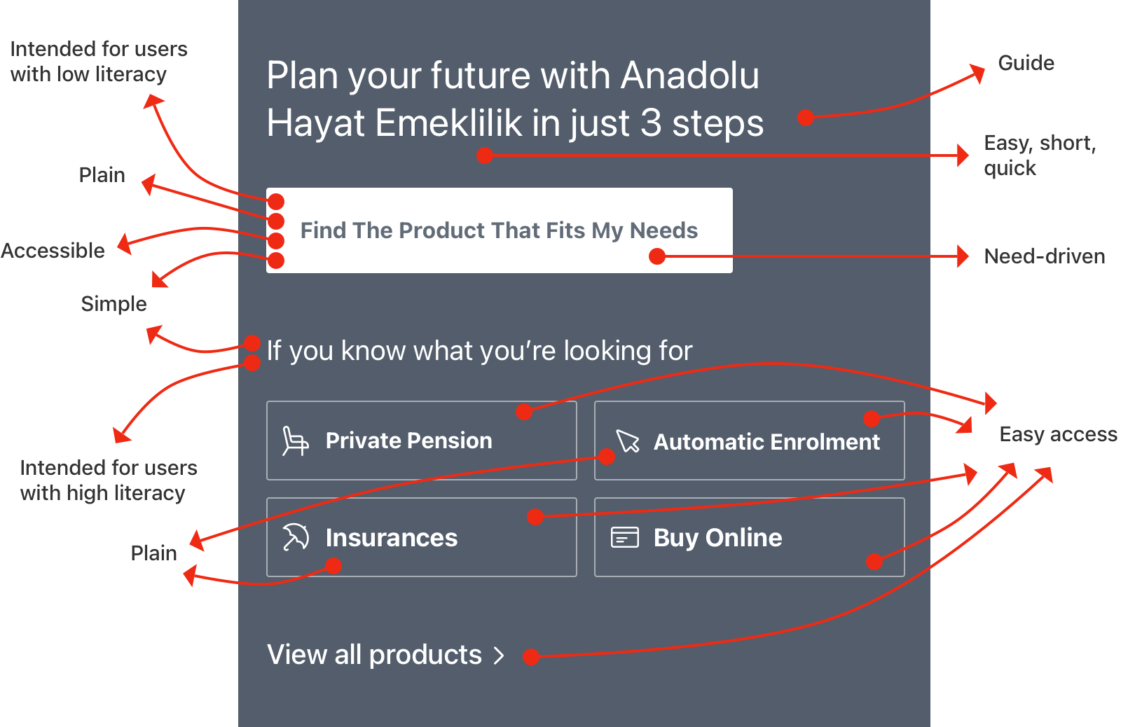
We defined the necessary qualities to strive for as “clear and informative, accessible, inclusive, simple and fast, reliable, current and tangible” to be able to verify our hypothesis. In this manner, we defined our central theme as “Accurate guidance”. We aimed to enable users with low financial literacy to easily access private pension and insurance products, and comprehend the benefits that suit their needs. One of the features that is representative of this focus is the “Easy Product Finder” positioned prominently on the homepage. With simple, fast, clear and inclusive questions; we were able to provide guidance to the users who do not exactly know what to look for.
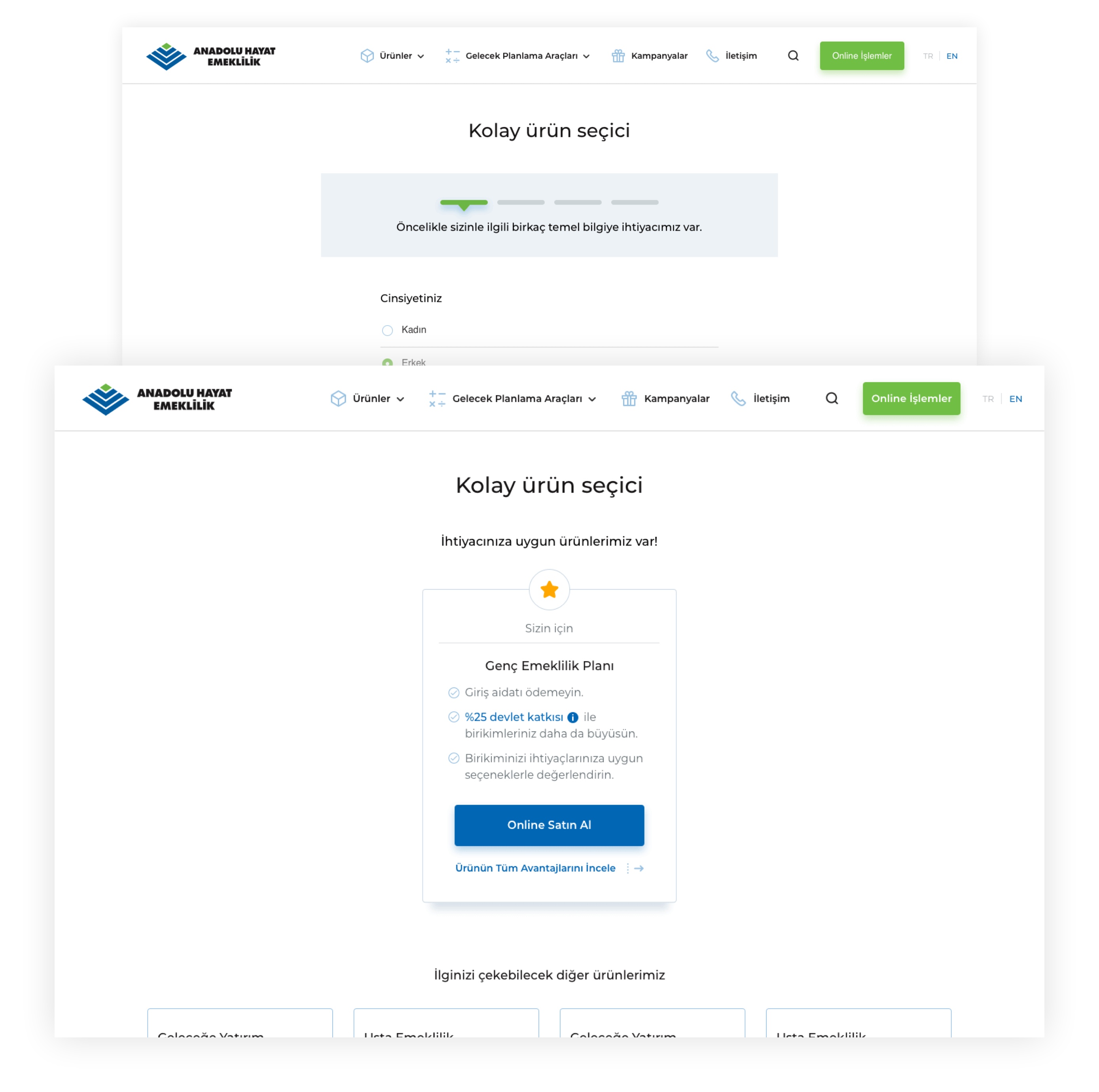
As the last step of the process, we created wireframes and user interface designs with a mobile-first approach. We concluded by delivering style guides to the project owner in order to ensure sustainability and consistency of the visual identity we created.

Başak Cengiz
Assistant Manager | Change & Project Management Directorate
SHERPA provided detailed analyses to produce solutions throughout the project and facilitated our decision-making process through their fact-driven approach.
 TR
TR

